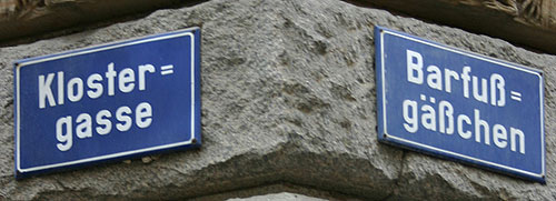
I'm currently working out the design of a German-language scholarly volume that quotes some texts from the 17th century. Now some of those quotations contain historically typical doubled hyphens (see Wikipedia entry on double hyphen).
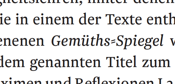
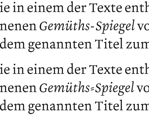
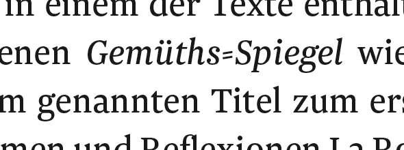
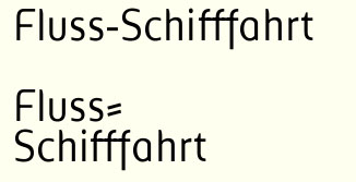
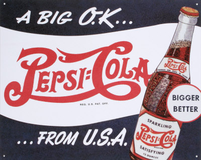
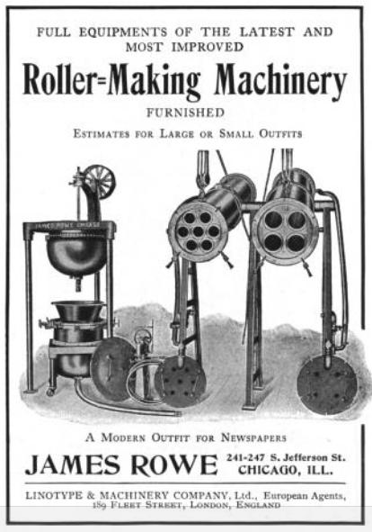
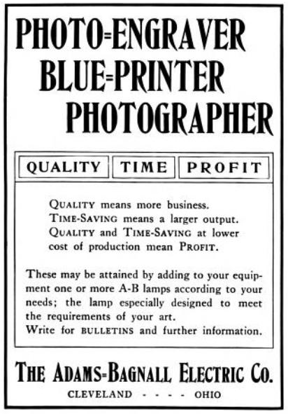
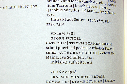
In their transcriptions of quotes/citations/titles, the authors have opted to represent this by using an equal sign ("=") in place of the hyphen:
Die in einem der Texte enthaltene Anspielung auf den 1599 in Leipzig erschienenen Gemüths=Spiegel…
I am doubting this is a good idea – mainly because the hyphen essentially is a hyphen, and its doubled form just a historical stylistic variant of the same base character; whereas the equal sign actually means something else. The "=" of course (and especially to typographic laymen, I guess) looks closer to the original than a single hyphen, but I wonder if it doesn't actually twist the original more.
Alternately, it looks like the double hyphen actually has a codepoint (U+2E17). It is however not present in the font that I'm looking at for this. I wonder if its usage here would be imperative.
Does anyone have experience or opinions on this? I will see the editors in a couple of days, but I'd love some opinions from the typographic side. Thanks.