Typophile

De Humani Corporis Fabrica, 1543

jp romo

These are images from Andrea Vesalius' De Humani Corporis Fabrica, printed in 1543 in the workshop of Johannes Oporini.

If anyone knows who cut the type and/or whether there's a good digital typeface based on it, that would be great! Otherwise, suggestions of the most similar typefaces you can think of are very welcome.
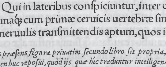
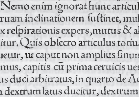

Thanks!

This family is based on historical sources from the same time period, although it's a little more erratic than the sample shown...

Oh, I'd love to get some more background knowledge about this type too!

A snippet of context – Oporin (Latin: Oporinus; Oporini is the genitive) was one of the Basel printers, working out of a building that still stands incidentally. He was a student of Froben's, arguably the most important Basel printer of the early 16th century.

I have a few more photos of the same book here, in case it helps (some closeups of both the Roman and Italic):
http://www.flickr.com/photos/ninastoessinger/sets/72157616517306105/

The German Wikipedia has some info on Oporinus ( http://de.wikipedia.org/wiki/Johannes_Oporinus ) and also links to some more photos of the Vesalius book here (but this is less focused on getting the type large): http://quod.lib.umich.edu/w/wantz/vesd1.htm

Oh wait a second – jp romo, where exactly are your photos from, might this be a later edition* or a reprint or something? I just realized the type is quite different from the one in my shots (which are of the original, I believe the first edition).
Sorry if I caused confusion.

[* Jelmar noted here that there was a second edition with different type.]

I made this trial 3 or 4 years ago:


You can read also: http://www.typophile.com/node/17260?page=1 (unluckily two of original four pages) and http://www.typophile.com/node/31349
BTW I have got somewhere roman to fit this italic...

Edit: Nina this ę is ecaudata, medieval latin character hijacked in XVI cent. as polish eogonek.

Captured from web.archive.org on 17 Oct 2013. view this capture