I hope to spend next academic year producing a faithful revival of Griffo's last roman in its 1499 state - the font, in adulterated form, of the Hypnerotomachia - and his 1503 italic for Soncino. 'Faithful' here means avoiding the potentially banalising effects of human interpretation; with incunables, it can't really mean the copying of selected printed letter-forms. That worked better for Justin Howes with the relatively limited variation of Caslon's printed letters than it would for the mess of an Aldine page.
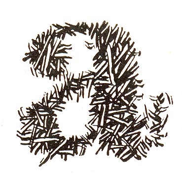
So I've written a little program which takes a large number of copies of a letter, normalises their colour, finds the right offset at which to superimpose each on a master-image, blends each with the master, repeats the process with the completed master from the first round as seed-image, and then thresholds the result to give a monochrome image around which to draw an outline. The degree of boldness from inkpress one wants determines the threshold. But I had previously had a very helpful exchange of emails with Sergei Egorov on his own method, by which tracings from a smaller number of characters were superimposed and an outline for the font drawn through the resulting blur. Still another method would be to try to model in software the Aldine printing process from punch to paper, which, run in reverse, could get to the punch - a thing at least of interest, even if an averaged character better represents Griffo's expectation of how the letter would look. The question: which method is best, and why? Would another method be superior?
A 'p' from the 1501 italic for Aldus is shown here, with Sergei's method shown in the second and his end result in the third image. My blended composite is fourth, and final image for tracing is fifth. This p shows, I think, something which I suspect Griffo practiced pretty consistently in his later work: rotation of the counter. I don't have enough data to be sure yet, but it's finding that sort of thing which makes painstakingly literalist revival interesting.
George