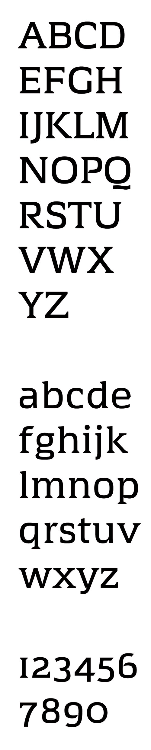
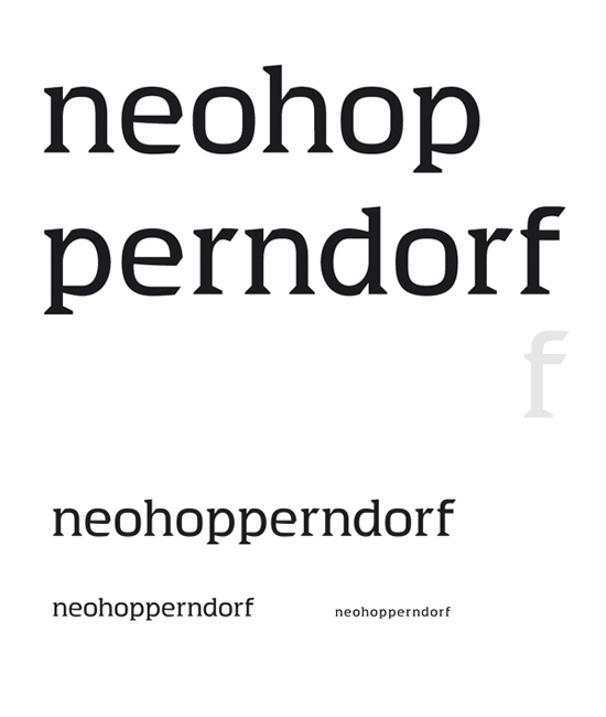
Hello everybody! This is among my first trials with letter shapes. I have in mind a squarish geometric with serifs that would work at text sizes.
I know it would be helpful to have some more glyphs to show, but my concentration is consumed for today and I am curious about whether you think this has some direction or no direction at all.
Thank you for your time!
| Attachment | Size |
|---|---|
| indesign test 2.pdf | 20.76 KB |
| book test.pdf | 22.61 KB |