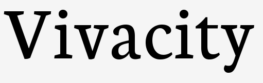
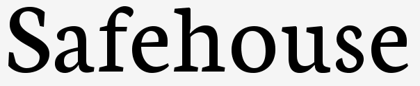
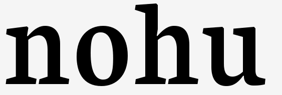
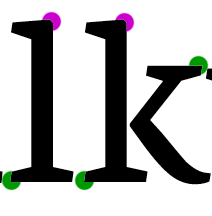
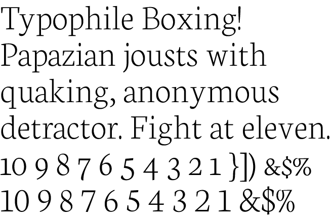
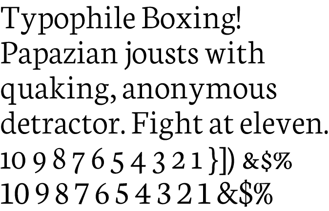
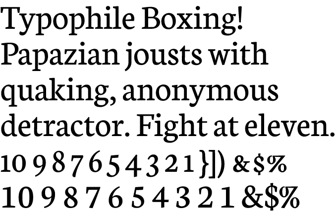
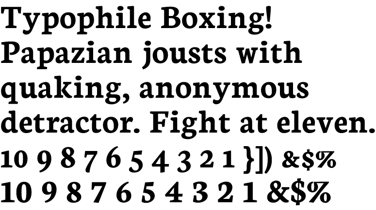
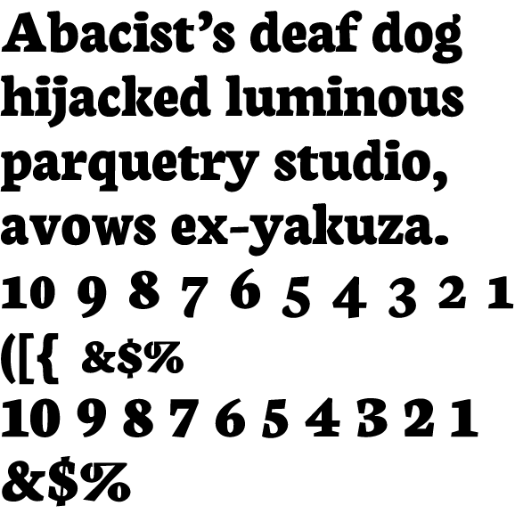
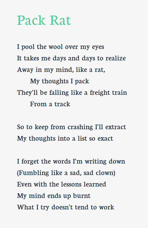
Newton is a dark, somewhat dutch-inspired serif font.
I had been working on this, however about a week ago my hard drive failed. Anyway, I am trying to catch back up on it now. Here is the lower- and uppercase. Numerals, punctuation, and ligatures will be here extremely soon.
I started a font earlier called Recut. It wasn't that great but I learned how to use Fontforge. I took a couple months break from font-making, and now I've got a new serif that's hopefully better.
Tell me your thoughts and criticisms!
| Attachment | Size |
|---|---|
| Newton.2010.3.11.pdf | 15.11 KB |
| Newton.2010.3.12.pdf | 19.53 KB |
| Newton.2010.5.10.pdf | 16.94 KB |
| Newton.2010.5.13.pdf | 20.24 KB |
| Newton.2010.5.18.pdf | 20.82 KB |
| Newton.2010.5.20.pdf | 21 KB |
| Newton.2010.6.25.pdf | 155.99 KB |
| 20120401-text.pdf | 513.79 KB |