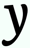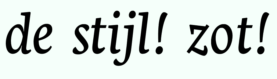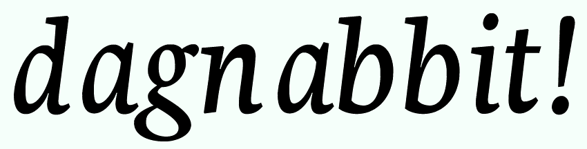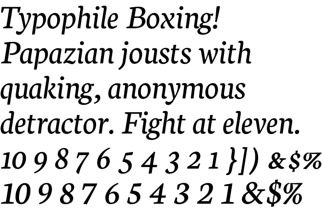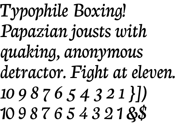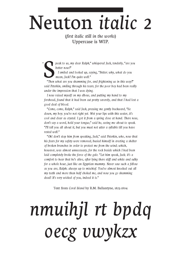
I was originally going to do only one italic for Neuton (another thread), however I was having two separate directions I wanted to go. A much more sober, perhaps "slanted" italic, and also a more cursive italic, the likes of Garamond or Caslon italic. I broke down and decided to have two. (Probably.)
Here is the second, the first is not quite nice enough to view in the light as yet, because I am completely redoing much of it. Make what you can of this, the spacing and some of the letters are quite rough, crits very welcome.
I don't have time to get anything more elaborate right now as I have to do some chores.
| Attachment | Size |
|---|---|
| NeutonItal-9.12.2010.pdf | 210.61 KB |