Typophile

Didot italic (1783)

ncaleffi

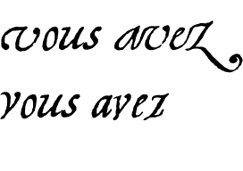
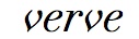
This is from an essay by Firmin Didot published in 1783 and set in his Cicero italic (12 point) - a text where, supposedly, Firmin shows his mother the peculiarities of the typeface. There's an interesting treatment of the lowercase v - when paired with a, like in the word "avez", it gets a different shape. Like this:

The v in "vous" is the standard shape; the one in "avez" is the contextual glyph, narrower and without the left top tail. The reason seems to be having an homogeneous kerning. I wonder if other typographers ever applied such a trick. Below is attached the full page from the Italic essay.

AttachmentSize
didot_italic02.jpg349.47 KB

The v in "vous" is the standard shape;

In that text, the v in "vous" is used only in initial position.

"In that text, the v in "vous" is used only in initial position."

Correct! So in Didot's intention the "contextual" lowercase v glyph was probably the first letter in a word; indeed, the narrow v is also used in other words:

Contextual type was common at that time. The short and long s would be a more common example.

Clearly informed from calligraphic tendencies.

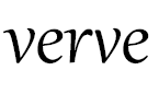
I don't have the original scans of the document handy, but here is a sample from one of my fonts:

I wonder if other typographers ever applied such a trick.

I do.

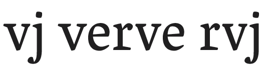
Tim Ahrens’s Lapture includes contextualization of diagonal l.c. letters as well, but in a more subtle fashion (as with John’s) and focused on the right side, rather than the left.

John Downer’s Paperback also has contextualized alt l.c. diagonals for specific situations.

Rob Keller’s Vesper has 4 contextual alternates for ‘v’:

When I was talking to the late Kay Amert, she said that I should look at the italics of Simon de Colines because they were full of contextual and alternative glyphs. I have yet to do this but I expect that she is right about this. However I will be looking at them quite soon to see if they bear on my work.

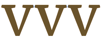
In the meantime here are my contextual v shapes from my not yet released Reading MATD type - Arrotino.

The blue portion at the serifs is the portion contextually removed. The middle one has a bit of both sides removed because it has two diagonal neighbors and the ones on the left and right just the the side next to a diagonal letter. All the diagonals in Arrotino roman have this behaviour when set against a fellow diagonal (y, v, w and x). The idea is to be able to present the letter optimally in all contexts. The example shown is unlikely to be a final solution for this letter as it was put together fairly quickly - more in order to test the code to control it than as a matter of highly deliberate letter design. Still, could a little thing like that make a difference? I think it can - yes.

Subtle! And this is intended for text sizes, right?

That's pretty darn subtle, Eben, to the degree that I wonder whether it might be simpler to make these shorter serif v glyphs the default letter and dispense with the broader ones altogether. I had a similar thought regarding Rob's Vesper alternates, but they are not nearly as subtle as yours.

That's pretty darn subtle

Didot was was much less subtle indeed, so much so that when I look at a "v" in initial position (using Linotype Didot), I get the feeling that a big chunk is missing.

I'm thinking about doing something a bit like this Didot v in my Brill Italic typeface. The style is derived -- more directly than most types -- from 18th century formal cursive writing, but I'm forced to make a pointed rather than a rounded v because the rounded form is a separate letter in IPA and some orthographies. My default v is quite similar to the Didot initial form, which of course causes spacing or collision problems when following some other letters. I probably won't use the variant form after every letter, though, only after those in which problems occur.

Captured from web.archive.org on 16 Dec 2011. view this capture