
Hello Typos,
We've got a project on creating a brand for
organisation that plan deluxe holidays for people
in the Northern Hemisphere; Norway Scotland, Russia, Finland and Canada.
Any ideas for some typefaces for inspiration?
Mr Brown
x
Hello Typos,
We've got a project on creating a brand for
organisation that plan deluxe holidays for people
in the Northern Hemisphere; Norway Scotland, Russia, Finland and Canada.
Any ideas for some typefaces for inspiration?
Mr Brown
x

How about this one?
PS: Moderators: the original post appeared twice, could you delete the other one? Thanks.

I'm from Norway, and it seems like the Hardanger area is how people view Norway – so do some research on Hardanger:
http://images.google.com/images?client=safari&rls=en&q=hardanger&oe=UTF-...

Maybe browse some scandinavian type foundries.
http://www.autodidakt.se/
http://www.fountaintype.com/
http://www.type.fi/SuomiHome.html
http://www.kontrapunkt.dk
http://www.fontshop.com/fonts/foundry/norwegian_fonts/

This instantly makes me think of the north. Hardanger (specifically “stavkirker” and wood carving) should definitely get some attention among typophiles, but given the destination being somewhat broader it might not be perfect for this project. Something along the lines of those quircky old DIN like straight-sided grotesques that are used in a lot of city signage all over Scandinavia might be something to look in to.

Telefon, a Nordic geometric by Sindre Bremnes...

Some info on Gerhard Munthe here might offer inspiration.
@wormwood
I wonder what's so Nordic or Norwegian about Telefon. It looks - basically - like a Futura with Frutiger a and e to me. Rather weird combination of geometric and humanist sans characteristics. Nothing new under the sun.
Telefon is drawn by a norwegian, based on the letterforms of Televerkets phone booths which almost every habitable place in Norway have had or still has. The title of this thread is all about Norway, but the title post is more general. Care to elaborate?
Frank, I don't think all the facts you quote from the thread wormwood pointed to will make the font look "Norwegian" to customers of a travel agency. People planning their first holiday in Norway will not say "hey, that looks like the writing on Norwegian phone booths" ;-)
That's one thine often overlooked when someone asks for a theme font: Most people looking at printed paper don't immediately associate the nationality of the font designer. The more the typeface business becomes international, the less a particular font has a local flavour. Maybe we have to get used to it that not every idea or feeling can be conveyed by a font.

Well, I noticed that the more north you go in europe, the more slap-serifed the typefaces get.
Though Giza is pretty american-looking, I think it could work.
Giza OneFive

Andreas, Telefon does not have a Frutiger "a" anymore, that was an early mistake. And it has other sources of inspiration than the phone booths, old Norwegian street signs and handpainted signs are just as important. My typeface in the works looks distinctly Norwegian to me, but that's not very important: I'm just a beginner trying to learn the craft of type design. By the way, it's much more inspired by Jakob Erbar's types than Paul Renner's.
@Fontgrube
Are your self contradictory, irrelevant and nonsensical comments for real or are you just being a troll? Either way your remark about Telefon suggests you have an undiscerning eye. And so, also considering that your first post on this thread was, presumably, a joke and your website is such an eyesore from 1994, I can't be bothered to reply with rational argument.
"Rather weird combination of geometric and humanist sans characteristics."
Sounds ideal to encompass the gothic, constructivist and humanist sans traditions of the Northern hemisphere, including Norway, Scotland, Russia, Finland, and Canada, as was requested.
Gerhard Munthe's Draumkvæde-typeface is a good suggestion, it's very relevant to the dragon style-architecture of 1880–1915 (a Norwegian take on art nouveau, rooted in Viking-æra and Northern mediæval ornamentation), that's still very visible on popular tourist destinations here. See it here (in Torbjørn Eng's nice interpretation), order it here.
Wow thanks to (almost)everyone for your intelligent responses.
I did not expect input from genuine Scandinavians!
We are less after novelty tourist feel as the brand will be advertised
alongside high-end watches, See below for more detailed explanation.
Perhaps closer to this? A modern Scandinavian without being too cold [excuse me]
Does this give anyone ideas?
Mr B
x
CONCEPT OF THE BRAND:
The concept behind our brand is inspired by the Norwegian ‘friluftsliv’
philosophy, meaning ‘free-air living’. This restorative way to engage and live with nature is at the heart of our holidays.
--
TARGET AUDIENCE:
one of the largest categories of client revealed in market research was ‘educated urbanites’ – wealthy
professionals who could afford to take five-star, luxury holidays but want adventure instead.
Hello I just found this!
Can any one tell me what it is and think of similar faces?
Does this feel right?
The Fjordtours website type choice is typical for Norwegian design (although not the style of the most interesting designers). It does not however reflect “friluftsliv” very much. How about looking in to the signs Turistforeningen (DNT) use in the wild?
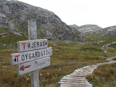
Good suggestion, Frode. Though much of that signage seems completely random, it looks like squarish grotesques with slightly humanist proportions are much used. Here's another example.
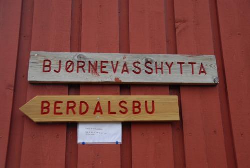
This actually reminds me ever so slightly of this, a neutral, squarish grotesque by a Norwegian type designer wannabe.
Sindres Ethos is great! Hello, foundries: Give this guy a day job!

For the north? Take something cool:
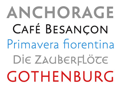
Captured from web.archive.org on 22 Mar 2015. view this capture
