Typophile

Fleischmann No.48 (for Kent Lew)

John Hudson

Over in the interesting Scotch Roman thread, I mentioned Johann Michael Fleischmann’s Long Primer Roman No.48 as my favourite example of the narrow proportioned type that Fournier probably had in mind when he spoke of types dans le goût Hollandois. Kent Lew queried the identity of this design, looking for it in the lovely facsimile edition of the Enschedé Proef van letteren of 1768.

I’ve now had a chance to compare the settings in that volume with those in the Harry Carter English edition of Charles Enschedé’s Typefoundries in The Netherlands, and hope in the next couple of days to also post some scans.

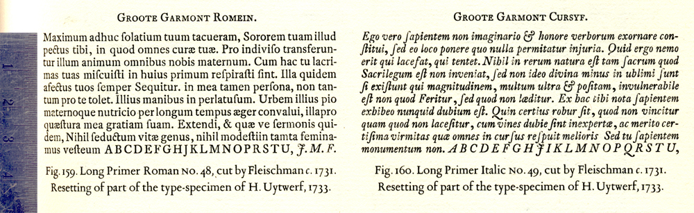
The same design is differently identified in the two books. On page 195 of the Enschedé/Carter book, it is labelled ‘Groote Garmont Romein’ and identified as ‘Fig.159 Long Primer Roman No.48, cut by Fleischmann c. 1731. Resetting of part of the type-specimen of H. Uytwerf, 1733.’

In the Proef van letteren, this design appears as ‘Garmond Romein No.1’ (with the English name given, again, as ‘Long Primer Roman’) below a setting of a different typeface labelled ‘Groote Garmond Romein’. The Proef van letteren also gives a different date for the design, 1736, but if this type did indeed appear in Uytwerf’s 1733 specimen, this later date must be incorrect.

I am more inclined to trust the information in the Enschedé/Carter book. The ‘No.48’ is the Enschedé inventory number. The type was acquired by Enschedé in 1799, along with other early Fleischmann types, from Ploos van Amstel.

I always thought “le goût Hollandois” referred to a large x-height.

hhp

Thanks for the cross reference, John. I’ll give a closer look and comment in the morning.

Hrant — If you look at the faces that Fournier labelled thus, I think we can conclude that narrowness was the more overriding characteristic. Visuals to come tomorrow when I’m back in my office.

John — That Garmond Romein No. 1 is certainly a fine example of Fleischman’s art. Are you sure this is the same as your Long Primer Roman No. 48? John A. Lane’s notes to the 1768 specimen list this Garmond Romein No. 1 as Enschedé matrix inventory no. 56.

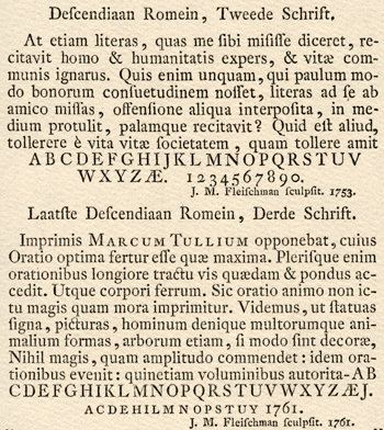
Also, I’m not sure that particular face is the best example of what Fournier was thinking of when labeling his “dans le goût Hollandois” cuts. I think that what Fournier perceived as the Dutch penchant for narrow economy is better exemplified in Fleischman’s second and third Descendiaan Romans, for instance:


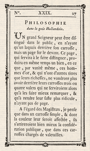
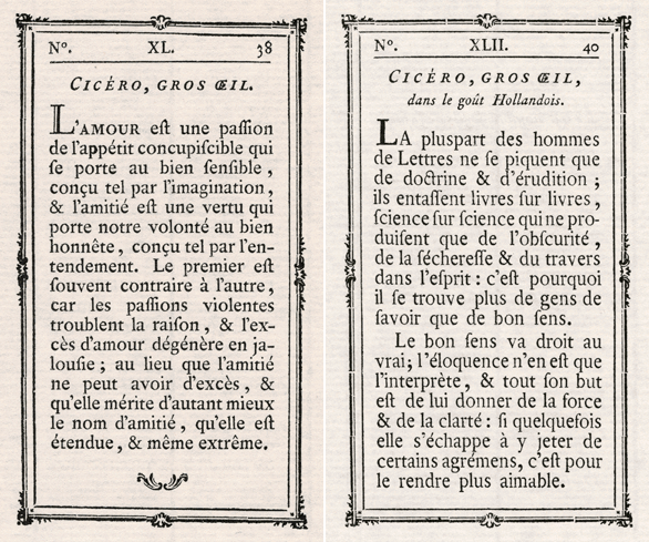
Hrant — In support of my contention that Fournier’s goût Hollandois was focused on narrowness, I offer these examples from 1995 facsimile of the 1766 Manuel Typographique:

 
(The French Philosophie is approximately the same size as the Dutch Descendiaan.)

 
In this example (Cicéro is the next size larger), you can see that Fournier uses gros œil (large eye) to designate the larger x-height, adding dans le goût Hollandois for the narrower variation. Fournier also offers a variety of petit œil and œil moyen cuts in different sizes.

I do think Fournier exaggerates that so-called “Dutch” quality.

Kent, makes sense - thanks for correcting my long-held misconception.

hhp

Kent, yes, it looks like I was wrong: the Romein No.1 in the Proef van letteren is the later ‘Long Primer Roman’, which Carter identifies as being cut in 1736 for Wetstein and records as No.56 in the Enschedé inventory. The caps in particular are very similar to No.48, and it was these I was looking at when determining that the ‘Groote Garmont Romein’ in PvL was not the same as No.48 but that the Romein No.1 might be.

I think No.48 is more interesting that No.56. It seems larger on the body, and gives the appearance of being a bit narrower. Here it is, as shown in the Carter/Enschedé book in a resetting of part of the Uytwerf specimen (scroll right for the — less interesting — italic):

John — This is definitely a narrower face than the No. 56. But what nice, even color.

That looks like an uncharacteristically high-waisted R, more Parisian to my eye than what I think of as the typical Dutch Baroque R.

Thanks for the image.

Captured from web.archive.org on 3 Jan 2010. view this capture