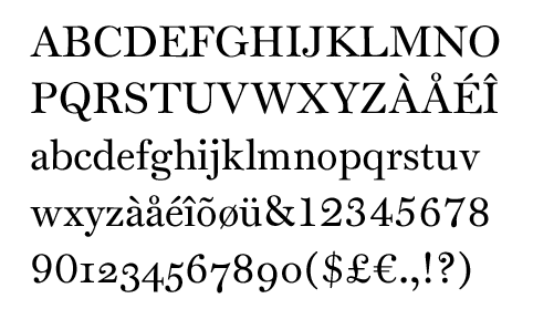
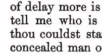
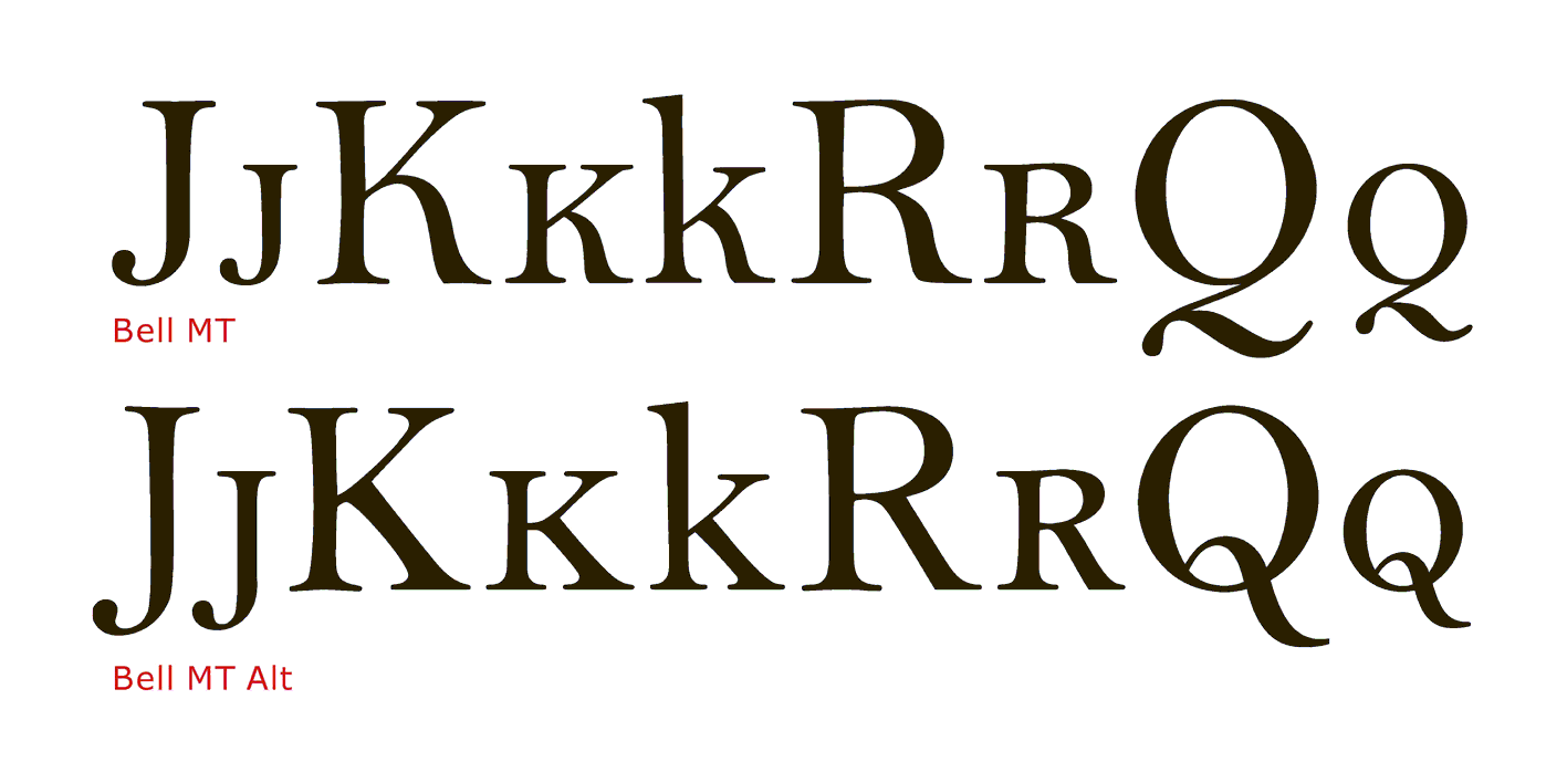
As I've expressed the opinion that there are both good and bad Scotch Roman types, it makes sense to explain more clearly what I mean by that.
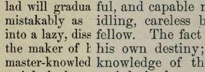
On the left is what I consider to be a "bad" Scotch Roman, and on the right a "good" Scotch Roman. Both samples are from the same old type specimen book.
I had noticed that to find examples of "bad" Scotch Romans, it seemed as though I had to look at specimen books sufficiently old that the types were sold by the traditional named sizes instead of on the point system: another old specimen book, which had types of both kinds only had the "bad" Scotch Romans in the older sizes.
The example of a good Scotch has somewhat lower stroke contrast than the bad one. But the most obvious problem with the bad Scotch is how condensed it is, and there are types overly condensed from a viewpoint of readability in all type families - although generally, only in Scotch Roman had they been considered fit for text instead of for specialized display purposes.