
The band's name is Big And Loaded and the concept is pretty self-explanatory: The 'Big' is big and the 'Loaded' is loaded.
The music they are playing is some kind of 'Pop-Punk', close to Bands like Blink 182 or New Found Glory.
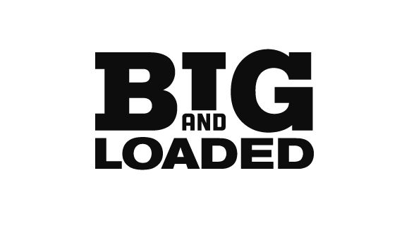
Since this is for some friends of mine and there is no budget, I decided to make a Slab-Serif on my own. It's based on Akzidenz-Grotesk and very much inspired by Memphis.
I'm a little concerned about the 'and' and that it might get lost at smaller sizes. The 'loaded' feels a little off right now, but I want to check your opinions on this before I move on. I am especially doubting the distance between 'Big And' and 'Loaded'.
Ohh ... and the center of 'I' is the perfect center of 'BIG' -- reminds me of the Simplease-Logo.
;)


