My new side project.
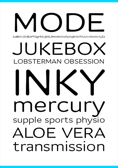
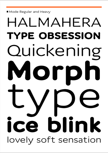
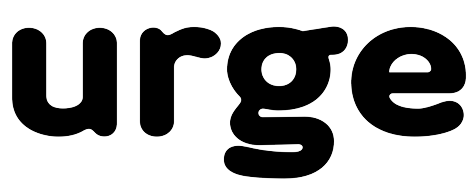
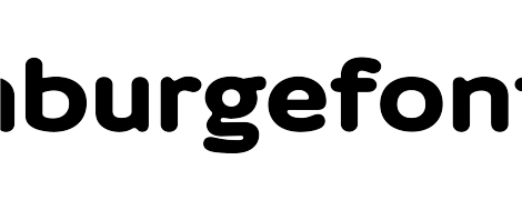
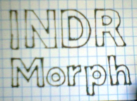
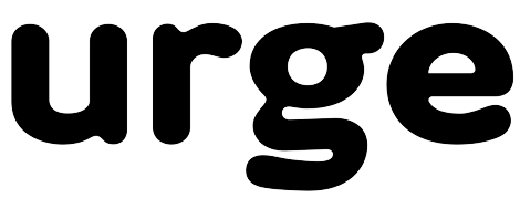
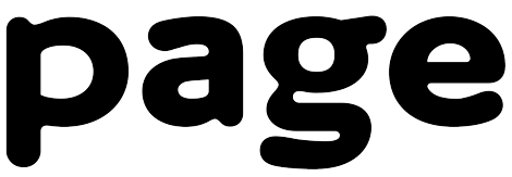
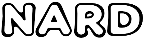
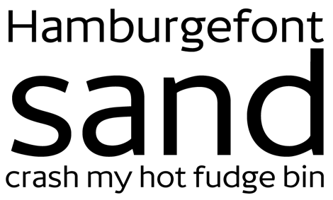
This was the result of another type experiment. I wondered how it would look if I took the underlying architecture of Mint and made a rounded, extended version. The forms are boxy and the junctures follow the same rules as Mint.
I wanted to reconcile 'flared' with 'monoline', so most of the stroke contrast from Mint has gone, leaving the quite interesting blobbiness in the counters and on the terminals.
I haven't yet really thought about spacing or kerning so I haven't put a sample of running text. And of course with my lack of skill at numerals, those haven't appeared yet.
I think this might work mainly for titling and/or small bits of text like addresses. I plan to try a bolder weight which may be more suitable for words in sentences.
| Attachment | Size |
|---|---|
| Mode.pdf | 394.51 KB |
| Mode 2.pdf | 459.11 KB |