Typophile

The Flea's Knees - Handmade Subpixel Type Family with 3px x-height

miha

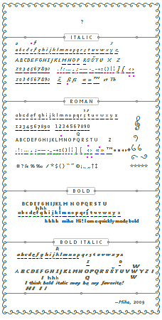
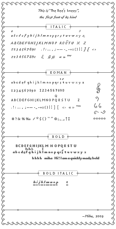
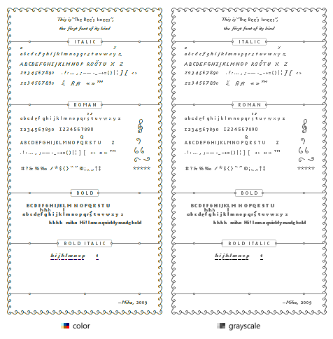
It has x-height of 3 pixels, it is italic, inspired by old masters and most important – made by hand. You must not look too closely, because colors get visible. It's work in progress. Here:

I am also writing a program which will set text automatically. These horizontal lines in the picture is actually information about glyph unicode value and positioning.

It can be used in favicons and for … well, one reason is enough :-)

Scroll down for additional weights of roman, bold & bold italic.

The title was "First Handmade Subpixel Type Family, Ever*".
[* Moderator's note: Miha's enthusiastic use of the claim "first ever" has been seriously challenged by StoneCypher. Read on for the drama and sub-pixel intrigue, if you dare!]

PS: Ken Perlin's work is interesting too.

It's the bees knees!

This is impressive. It *is* legible (I even found a typo ;-) ).
FWIW, the "B" and especially "D" look decidedly blue to me.

So, why an italic? Did you actually find it easier to make an italic than an upright font at this sort of size?

Interesting how the lowercase s and z require descenders to work with a 3-pixel x-height.

T

Piotr, thank you and welcome to Typophile. I think you just found a name for the font!

Nina, "e" is not done yet (it's copied "c") and this is why there are typos :-D. But I agree about glyphs being too blue, I have to correct them. As a consequence the counter will be darker.

Italic was chosen because the benefits of subpixel design are the most prominent. There just can't be a normal pixel font (in italic) and with such or even higher x-height – and still looking remotely as good.
Well I think italic is actually harder to do, but there are nicer glyphs possible! ("f", "z", upright parentheses, etc)

Well, 3-pixel x-height is certainly interesting! Small caps are going to be hard to do :-D

(Oh, and if you asking yourself why are there two lines of numbers. First line are old-style numerals, second will be lining.)

I didn't know png could hold subpixel information. What kind of software do you use?

I use Photoshop – when you see one pixel enlarged, you can control just its one color. But if you were watching physical pixel very closely (with microscope) you could find its three subpixels were changing. This thing is possible because of hardware. Specifically, this works only on LCD screens.

When you mix a color for one pixel, you use three sliders: each slider is actually for one subpixel. The tricky part is that you have to imagine color components, because full pixel colors which are displayed are confusing.
(Read about it on Wikipedia and here.)

I was thinking more why I started italic and not roman. I think because of all beautiful color patterns at 1600%. Also a little suprising fact, maybe: in all lowercase letters there are only three gray pixels (and all three are in "z")! Else are colors. Evenmore: in italic, there are no spaces between letters visible at 1600%.

This typeface is best seen on monitors with higher PPI (I have 133).

The possibility of subpixel lettering isn't exactly exclusive to LCD monitors, but they certainly help.

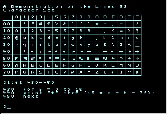
Long ago I used to do subpixel editing for graphics in Pinball Construction Set on the Apple ][, including lettering with a technique not entirely unlike what is shown here. Back then, though, it was the limitations of the graphics system, including the relatively low screen resolution that made it possible, though crude, on a CRT monitor.

The Atari home computer systems (late '70s/early '80s) used a similar system with the character set. The "high res" graphics mode actually addressed half a "color clock" on color tv screens. To get a fully white dot on a black background, you had to plot two adjacent coordinates. Otherwise you would get a red or blue dot. You could also get solid red or solid blue by plotting only the odd or even coordinates. It worked very similar to the Apple II. In fact, Pinball Construction Set was able to be ported to the Atari with very little modification because of this (not to mention the fact that they had the same microprocessor).

Oh, and I was sure this is the first such font. Well maybe it is the first for LCD screens.

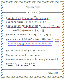
I have worked some more on it. I added a normal weight, which was much more easier to create than italic. Of course, it's clearly … or not so clearly not finished.

You said " Oh, and I was sure this is the first such font. Well maybe it is the first for LCD screens."

Are you kidding me?? You invested time and energy into the basis of what already exists? You have these titles of profession in your profile - yet it doesn't add up ! I can say I'm a plumber if I can put some pipes together properly - if you want to play these games. Maybe you should do 2 minutes of historical research on development of modern digital typefaces and the technology they are displayed by (crt / lcd / plasma / phosphor) before you come to the conclusion what you are doing is BASIC research when adapting - calibrating for technology and general accessibility of computer users. You are backwards in your logic and do not commend your lack of observational ability. It's not a first! It's astounding to me you would truly think you made this up.

BUT - you said it best about your approach " I would be a perfectionist if I wasn’t so lazy." That's even pushing things. To be a perfectionist would imply you understand fundamentals.

What is your intended application of such tiny fonts - ? I look around and people even in their 20's are wearing eyeglasses due to poor eyesight - and people over 40 have a hard time even with newspapers... is this for the micro version of Iphone tech? But funny thing is they are pushing now a larger iphone - going to the ipad size. Oh - right for the i-watch. Regardless this is redundant and pointless as others already have this perfected if needed in application.

What I find equally disturbing is your audience just laps it up readily. Amazing lack of basics happening with all this available information. Oh but I must remember -the information most are lapping up - is what is channeled to them from their personal google robot aggregator. Old stuff is for the dust bin - right?

This is really cool!

How did you decide how to choose the pixel colors to address the subpixels? Are you using the [1/9,2/9,3/9,2/9,1/9] filter described by Steve Gibson in the link you mentioned above?

I am amused and impressed.

Isn't the hardware going to pose a problem? I mean, the color LED arrangement is not always R-G-B, there's also R-B-G and diagonal arrangements etc.

Believe me, I am amused myself :-). Specially when thinking whether it's worth to do monospaced numerals, case-sensitive parentheses and such.

Some colors were copied form Windows rendering and maybe mixed further (I have saved them in palette a very long time ago). I have five shades of both blue and red and three grays, but it's more important how you combine these colors.

In italic, stem is just a little less than 1 pixel wide. It is mostly presented with two pixels of red and blue: sometimes, it's dark red & light blue (pixel seems to be more on left); dark blue & light red (pixel seems to be more on the right); or both pixels of equal lightness. Actually I use this mentioned filter, but more from experience.

Italic glyphs always start with red and end with blue, because this way they can be set in words together without problems. For some glyphs, such as en dash, 70% (or less) gray color is used.

Hardware may be a problem, but most LCDs have the same positioning of subpixels.

Very impressive!

I'm also very impressed! The roman looks surprisingly legible on that size. I think the "s" with a descender would disturb the reading process a little bit.

Nicely done.

Has anyone built a chart that shows the relation between the specific colors needed to trigger the individual combination of sub-pixels?

Amazing work.

It would be interesting to see if legibility is different for a colour blind person.

Just a hunch, but colorblindness might improve legibility. The colors (I assume) are used to trigger a combination of the 3 sub-pixels.

Maybe 4 pixels in x-height could be also a good experiment. The "e" baseline alignment would be probably impossible using 3 of them.

Thank you for your kind comments! I had similar feelings, this is why I hurried and just had to post the typeface even with some glyphs not done.

Darrel: You can start by reading the two links I posted above and then study The bee's knees in detail. If you look at italic l or [ you will notice how pixels start to repeat and how diagonals are made.

I think legibility is the same or just minutely better for colour blind people. There was already discussion of this on Typophile, but some arguments were not even mentioned (for example, various combinations of color blindness type and text color give different legibility).

I decided to make the hard glyphs on the end … my excuse is until I finish program for automatic layout I can't quickly enough test them. Indeed the "e" and "s" are the most problematic. Maybe I can help with a two pixels x-height font? (here)

I just had a colour blind friend check it out and he confirms it is legible, and made the same suggestion that the condition may improve legibility. Probably one of the very few occasions where colour blindness could be of use.

Very interesting. When I look at the large, magnified .png above, it is illegible until I sit back and squint, thereby reducing the size and colour factor. Great work.

Amazed by the 3px x-height! Really impressive work, congratulations! :)

Adding some experimental bold weight (there could be bold and black weight) and some glyphs of bold italic, which will be as interesting to create as italic. Well, I chose to make additional weights first instead of mastering italic and roman.

This image is actually a new font format :-)

It couldn't be any more different from David Farey's Beesknees so I don't think anyone would confuse the two, but you may wish to rethink the name of the typeface to avoid arm wrestling with ITC, Monotype, Linotype and Adobe.

Wow! that works distubingly good.

Just registered here to say that I think this is great. Well done! Keep up the great work.

ps: on the latest images, I see some background colour that is not quite white, especially around the lowercase italic m,n,o

Thank you for the tip, John, I really should checked this before … although there are small differences in names I think I will change it. Truthfully I didn't think a lot about it before. So, any suggestions? It could be deviant and represent something physically very small :-)

Ingrid, Matt, welcome to Typophile!
(there is indeed this not-really-white color, but unluckily not only there…)

"tnyfnt - a font so compact, we had to get rid of all the vowels in the name." ;)

It looks lovely, and is shockingly readable. Great work!

You could call it 'The Bis Nis', which could be read as either beesknees or business.

Really breathtaking. Keep going, I've never seen anything like this before.

You could call it Antonie.

Fleas' Knees?

Thanks for the welcome! I've already made a few blog posts on here ;)

I was chatting to a friend about this earlier and they said that there have been sub-pixel fonts on Nintendo DS for some time now (before 2005). Mainly on the homebrew scene, where they are used to fit more text on screen (text viewer, nethack game). They don't look as cool as yours, though! I am yet to see them first-hand on a DS.

http://gbax.gp2x.de/gbax2005.html
http://ds.qj.net/Textviewer-for-the-NDS/pg/49/aid/1520
http://stuartp.commixus.com/nhds/

ps: in Photoshop you can use the selection tool (with zero or low tolerance) and the "similar" menu command to select all the not-quite-white... if you want to change it to real-white.

Firmin Didot would've loved that ornamented specimen :D
The lining figure 1 is ambiguous the old style one is awesome though.
Is there a font format that supports colour?

Amazing work. I have never seen this before; really cool concept.

as for the name, I think mites are pretty small. 'Mite-y' or 'mite-sized' or something...

"mites"
Acarina sounds pretty good.
Or maybe a small venomous spider? Envia, Missulena? (There's more here.)

Thank you all for the suggestions! I was combining some names and made names such as The lengthy legs of little bees, Antonie van Leeuwenhoek's type, Lawyer's fineprint, sbpx_fnt and Micrommata virescens' diary font (also possible Zilla diodia's diary font etc). Hard to choose one!

Johnny, this lining 1 is already on my to-do list :-) I chose to do such specimen (actually, this is font format, specimen will contain some short text!) because it nicely contrasts with new technology. The mix of old & new.

About this font being the first [subpixel] hand made … well maybe just bold italic is the first one? Here is the lowercase, still having troubles with e, s and this time also spacing:

This is really amazing work. Being somewhat graphically challenged myself -- and having tried to create readable favicons in the past -- I am just blown away by how readable it is.

I would definitely like to make use of this...Any idea what kind of license you'll be releasing it under? (Creative Commons, etc)

The enlarged image posted by miha suggests that it could be an effective captcha: I could only read "ipsum dolor" only at a distance and by crossing my eyes (and it looked black and white...). I wonder what a bot would have to do... Did you ever experiment with this?

I support 100% "Flea's Knees" as the cutest mini-"Bee's Knees" name.

Evan, I think I am going to release it under free* license (not yet, it is not finished). I know this has a drawback of a lot of potential misuses, but anyway. I also think I could sell it as well if I wanted, but its use is very limited – only for screen, only for small amounts of text.** Furthermore, it did take some time to create it, but time is not even remotely comparable to time spent drawing "normal" typefaces.

*CC, No Derivative Works & modified Attribution.
** I know creating bold and bold italic may be a sign of text typeface, but I just like doing it :-)

Of course, there will be a small Flash app to set text. But be patient :-P

About using it as a captcha: since letters start to repeat, it would't be so good.

BTW, welcome to Typophile, Evan, P.B. and Matthew.

This is very impressive, congratulations!

I have two monitors, one of which is rotated 90deg to the right. As expected, the font does not display as well on that rotated monitor. I was actually surprised it was readable at all!

I don't know that the pixel ordering in these panels is.

Bee's Knees is a FANTASTIC name for this font. Kudos for thinking of that when Piotr posted.

But please, in the name of taste, not "The Bis Nis" - ewww.

ah! jwr brings up an interesting issue with sub-pixel smoothing. I imagine that could be a big issue on iPhones.

I'm sorry if I'm pissing on the bonfire, but it looks just like the Mac OS X font rendering.

That is Gill Sans Italic Size 6, in TextEdit

Uh, there's a pretty big difference between first subpixel font ever and first one you're aware of. I hate to be the one to break it to you, but the Apple ][gs shipped with one in ROM; you missed this boat by more than 30 years.

The GameBoy Advance homebrew development community has been using them actively for more than ten years. I released a program that automatically dumped SPAA fonts for the GBA in probably 2003 or so. My old webpage has a 3xV (typically 2) font on it - significantly smaller than yours.

Please don't claim first ever when you haven't even tried looking to see if someone beat you to it. There are three bitmapped subpixel fonts on the first page of google hits for subpixel font.

This isn't actually impressive at all; the font on the GRC page from ten years ago looks just as good as this does. This is just a two-filter matrix applied to a larger font. Big whoop.

You'll find people get really bitter when you claim to have beaten them to the punch on something that's actually 30+ years old.

It's dishonest.

John Haugeland is http://fullof.bs/

This is outstandingly neat

Sooooo miha is dishonest for not thoroughly researching some obscure font that hasn't been in use for over a decade that no one has ever heard of?! Call the cops! He's a thief! Oh puh-leeze...

Fact is, this is brilliant work. It's perfectly fine that it may be copied work (or derived from another work), even if he was not aware of the prior works. He's not selling it as original art, but if he does, he would be fine there too because it IS original work. And besides, it's a typeface, not the Mona Lisa (sorry miha, it's good but not a priceless work of art).

One point to keep in mind is that there are usability considerations when using this typeface online. Just be careful what you use it for. Using it to depict thumbnails of documents or text: GOOD. Using it to render your entire blog post: BAD.

I love it! The colour fringing certainly brings back memories of the 8-bit days.

It looks good (although I see noticeable "rainbowing" on most glyphs, particularly on '<' and lower-case 'v' and 'w').

It'd be very useful for mobile phones with the little ~3cm x ~5cm screens - you should see if Opera and Google are interested for the mobile Java versions of Opera Browser and Google Maps.

Registered just to say I'm red-green colourblind and I can read it easily, from right up to the screen to about 1.5m away. :)

Amazing, Miha. We are working on kind of the same thing.

http://henrybirdseye.tv/art/legos/legos.html

Firmin Didot would’ve loved that ornamented specimen

I was thinking more Fournier. Actually, the proportions and slant of the italic also suggest Fournier to me. Congratulations on the first manual subpixel French neo-classical type.

Isn't any font "subpixel" if it's anti-aliased?

Squidbilly
"Sooooo miha is dishonest for not thoroughly researching some obscure font that hasn’t been in use for over a decade that no one has ever heard of?"

No, Miha is dishonest for claiming first ever without having put in any serious effort to find out whether that's true. (I maintain that not google searching the simplest possible phrase, subpixel font, is evidence that no serious effort was put in.)

Don't worry, Erly, I know yew kin't reed tew gud-like. I'll try to speak slower when you're around next time. (Miha: it's a reference to the television show from whence he draws his username and icon, not slander.)

Miha

  1. "I am very sorry if I was dishonest, I had no such intentions."

    I realize that. The reason for the journalistic precept of not making sweeping statements without researching them first is to prevent unintentional dishonesty from still making one dishonest. Notably, your blog entry's title has not yet changed, nor has yet the text been amended; noting a wrong as intentional doesn't mean you shouldn't still clean it up.

  2. "I suggested that maybe this is first such font for LCD screens"

    Well, you'd be wrong there too. Hence the bit about "please try checking before making the claim." Don't worry, Dorothy, you'll get there. Eventually.

    The Apple Newton and the Palm III both had SPAA color fonts. Incidentally, your font isn't for LCD screens; it's for right-bar screens. Many screens that aren't LCD are right-bar, and many LCD screens aren't right-bar. For example, the two screens on the Nintendo DS, which have had SPAA fonts in commercial use for nearly five years, are aligned differently to save on cable length, so your font doesn't apply to one of (I think the top, but forget) those screens.

    I'm sure there are earlier examples of LCD screens SPAA fonts, but I'm not a fontologist with a domain name that implies a deep familiarity with type, so I can only think of about a dozen counter-examples off of the top of my head. (Without research, the gameboy advance, the nintendo ds, the palm 3 and all following it, windows mobile both as bitmap and as cleartype, my apple iphone, the sega nomad, the apple newton, the google android, my canon vixie hf-200 camcorder's screen, the cybiko in monochrome, the Sony PSP, the Game Park GP-32 and all following it, and just to make it a baker's dozen, let's say the Nintendo DSi is a different machine than the DS.)

    But that's cool: if you don't know enough about the thing you're saying "first ever" in public about to think of those dozen plus obvious examples off the top of your head, there's always research.

    Try it some time.

  3. "I also did a google search"

    Wow, one whole google search? That must have taken ages; I can see why you'd be surprised that such thoroughness might come up empty handed.

    So far I've been unable to think of a reasonable google search which doesn't find an example in the first two pages. Let's call it Google Anti-golf.

    What search did you use, please? I'm unable to replicate your failure even at the single attempt level. (Note the lack of pluralization in order to help you understand the quality and diligence of your research before declaring a world first, by the way. It's instructive. And hilarious. But mostly instructive.)

    If you didn't look at the second page of results, then it's a little easier to find queries that might fail; I've tried around 40 so far, and two have so far failed to give a first page result.

    And as we all know, there are only in fact ten things on the web, so looking at a second page before declaring a world first would be a waste of time.

  4. "but I found only automatically rendered subpixel fonts."

    Well, that's curious. They're not hard to find. For example, my old website, sc.tri-bit.com, has four rendered PNGs of complete SPAA fonts in every flag combination of [bold, italic, underline, strike-through] (16 renders per font per size) at about half a dozen sizes per font, covering the entire publically released microsoft T series (tahoma etc), V series (verdana etc) and C series (candara etc).

    I mean it's not like they're on a page rank six blog too, or anything. Really, really hard to find stuff.

    And I mean, in the two minutes it took me to stop sadbear laughing, I found about a dozen bitmap SPAA rendered fonts in things like FLTK and older projects from SWAG.

    One of my font renders was the default font in the linux shell compiled for the Nintendo DS, last time I looked, if I remember correctly (if I'm wrong, Pepsiman will set me straight, but I think he was using one of my Consolas renders.)

    So yeah. I guess you looked pretty hard, huh?

  5. "Only later there was a comment that it is indeed not the first font"

    Yeah, generally people can't leave comments about the wrongness of a claim to a world first before the claim is published. "Only later" is a side effect of our not being able to see web articles through time. You know, not being John Pertwee, it's a little hard to rustle up that kind of defiance of physics just to get some luls in on a blog.

Please amend the article and title (and this doesn't mean to a third wrong guess, this means to something simple and factual like "my first subpixel bitmap font"). The mistake is excusable; to err is human. Making a new false guess claim after your last false guess claim didn't work out isn't fixing an error, it's repeating an error.

Subpixel fonts are nothing new. They're 30 years old in a field with a 40 year consumer presence. You aren't getting a first here. Stop pretending, please.

-

John Haugeland is http://fullof.bs/

DevilsAdvocado: no. Subpixel antialiasing is the practice of using the independant color channels in the pixel as if they were distinct grayscale positions, instead of using them as color, in order to triple the effective horizontal resolution (assuming a standard three-band arrangement like one finds in most LCD, plasma and OLED monitors), along with a little math hokey pokey to prevent color fringing.

You can see the difference by zooming way in on a screenshot of traditional AA and subpixel AA. The subpixel AA has colored edges because it's using the physical position of color channels like a mask, which the eye can sort out when it's at scale. There's an earlier post on this same blog about the youtube favicon; that's an example of the effect (the newer one, which is nicer, has colored edges because they're the rightmost and leftmost channel - red or blue respectively - being turned off to get graceful curves.

It's the difference between old style anti-aliasing and ClearType, if you're a windows user; ClearType is Microsoft's sub-pixel technology.

If you're interested, here's a pretty good beginners' tutorial. http://www.grc.com/ctwhat.htm

Subpixel antialiasing isn't actually antialiasing; it's a different addressing mechanism for physical screen positions. Boolean SPAA looks better than most antialiasing, but you can mix antialiasing with SPAA (that is, in that GRC tutorial, use the narrow grid but then use grayscale anyway) and get really gorgeous results.

The downside is the math for that is moderately expensive, because you have to do some filtering (usually a 1-2-3-2-1 filter) to get it to work, so if you're working on an embedded or portable device, you can expect slow results or large battery draw or both, depending on the device.

But it's totally worth it.

John Haugeland is http://fullof.bs/

so when can I put this on my eeepc?

Miha: here's some of the extremely easily available documentation of your "first" for you, showing where Apple was implementing it in 1976 (so 33 years right there). Amusingly, it's a right-bar system on a CRT, because none of this has anything to do with LCDs, only with the physical color bar arrangement.

Oh, and it's on the first non-wikipedia site to come up on Google for subpixel.

Oh, and it's linked to on every single page, using the link text "the true origins of these ideas."

Oh, and he cedes that he has no idea where it comes from, despite having been involved with it probably before you were born and having seen it in use at Apple, IBM, Xerox, Microsoft and Koala. Because he doesn't have time to do the research.

http://www.grc.com/ctwho.htm

Research.

Seriously, this information could not be any easier to find if it was nailed to your door by Martin Luther himself with a knife and a blood signature.

And GPS.

NeoArch: your EEEpc already does this.

Oh, also:

When you mix a color for one pixel, you use three sliders: each slider is actually for one subpixel.

Yeah, this isn't actually correct. This is correct when-and-only-when Photoshop's color model matches the monitor's color model. PNG has color model adjustment because that's essentially never true; even disregarding things like color temperature, the color base constants aren't actually fixed points, but rather chosen points in a range, and many manufacturers use subtly different colors (which is why photoshop has all that color registration stuff, so that different monitors working on adjacent projects wouldn't cause clashing results.) That has to do with what the underlying chemistry of the dyes used to mask the LEDs, dope the phosphors or light the OLED/Plasma are, and are the reason why certain manufacturers have such better performance in certain color ranges.

This is why Samsung makes a five channel monitor, too.

What you tried to say was:

"In a three color colorspace, the color output value can be used as a lightness control when thinking of the subpixels as grayscale values rather than chrominances. This is compounded by the fact that I'm working in Photoshop, which is going to screw with the colors I output in ways I apparently don't understand, which is why I'm having such difficulty with straight lines. But that's cool, because everyone's monitor is just like mine, which is why my LCD font looks wrong on about 20% of LCDs, and works on lots of CRTs and OLEDs and so on."

Stop using PNG for SPAA unless you're going to learn colorspaces, which are hard for color scientists (no, that's really a job), so you won't. Photoshop and PNG conspire to try to fix your work in colorspace, which is usually a good idea but murderous to SPAA. Switch to Targa or TIFF instead. PNG is lossless in a lot more ways than pixel values, and you actually want colorspace channel loss here, because otherwise it screws with your per-pixel calibration.

Incidentally, a photoshop user should be intimately familiar with that colorspaces don't match, that photoshop colorspace isn't monitor colorspace even when the names match, and that photoshop can switch between colorspaces within a single document, so those sliders obviously aren't subpixel values.

Here's X11 doing it in 1987: http://keithp.com/~keithp/subpixel/

John Haugeland is http://fullof.bs/

I love this! Here's my little homage: a jQuery plugin to replace text on a page by characters from this font -- incomplete, impractical, and probably not compatible with very many browsers, but hopefully fun. http://osteele.com/sources/javascript/jquery.subpixelate/

Wow, StoneCypher is on a mission LOL.

He did this by hand in Photoshop, it doesn't matter if X11 did it in 87, ClearType does it now. He does it by hand. Are we seeing the difference here? I can barely appreciate the genuinely interesting things you had to say about color because you're so wrapped up in your bad attitude.

"Isn’t any font “subpixel” if it’s anti-aliased?"

It's rendered that way, though that info isn't necessarily a part of the font.

miha is pretty much hand-hinting letterforms specifically for optimized sub-pixel rendering at an x-height of 3px. So that's not the same as just letting the font-smoothing software do it for you.

StoneCypher: maybe so, but it doesn't look quite as good as these imo. my font size only goes down to 6 for most fonts.

StoneCypher: Six consecutive posts to snipe at someone's work is at least six too many. You've dragged the intelligence level of the whole site down by a full order of magnitude by subjecting us all to your verbal abuse of miha. Talent, which miha has clearly manifested in spades, trumps moral self-righteousness. It's a f**ing website, not a court of law. You pretty clearly created an account here specifically to put miha in his/her place, to accomplish what?

Grow up and let someone have a moment to enjoy being rightfully impressed with themselves for pulling off an impressive feat. Next you'll be telling kindergarteners that Santa Claus isn't real just to watch them cry.

Btw, what you tried to spell in your first post was "independEnt."

Spellchecker.

So easy, you don't even have to DO anything. You just wait for the little red line to show you that you're dumb. If you're going to be a pedantic pain in the arse, at least do us the favor of being impeccable yourself.

Please amend your post by typing out "I will not misspell independent" twenty times.

Would you like to verify for us that these previous subpixel fonts are in fact handmade, like miha's? My google finger is too tired to check.

aaaannd in comes StoneCypher with the Bonerkill...

John Haugeland: You wrote such a lenghty posts, but I am still missing an example of handmade subpixel font. [other than for Apple II]*

When I said "first subpixel typeface, ever" I meant a handmade typeface – because "pixel fonts" are handmade and most obviously, fonts are rendered with subpixel technology for millions of users for a years now. How on earth could mine typeface be the first one that is "rendered" using subpixels?

“Because he [I] doesn’t have time to do the research. http://www.grc.com/ctwho.htm”
Did you even read my post earlier in this thread? I already gave the link to this wonderful website, which BTW doesn't mention hand-optimised subpixel fonts.

“unless you’re going to learn colorspaces”
Actually I already know about it a lot. I had one semester of Color mesauring and another of Color managament. Also, I had an assignment for Color managament in Photoshop. Believe me, I know what I am doing. A single statement on which you based your whole comment was simplified. Ironically, your comment about color managament is simplified too.

Oliver, can you add a license information that generated images are released under this license: CC by-nd 2.5 with an addition that all generated images will be changed once I finish my typeface. I may latter also change rather restrictive conditions for attribution to less restrictive ones.

* I was able to find only one subpixel font for Apple II (of course font doesn't work with current technology of most web users). And is't only a typeface, not a type family.

This thread is becomming a negative one. Some of you may be more polite, although if you are saying the right thing. :-(

I recommend ignoring John Haugeland

This is great work, even if it might be lost on the majority of people :)

Nice work!

Regardless of weather this is a first in any sense, I like your design.

I've not seen, in samples posted here by your detractors, or elsewhere, subpixel coloring used to make such fine little glyph shapes.

Keep up the good work!

PS: Mr Haugland, you made your point in your first post. With every extra post you add you seem ever more obsessive and weird. If you browse around this site you'll find that the tone of conversation here is polite and grown up. Criticism is usually constructive (and not repetetive, we're trying to help each other, not win an argument that no-one but us wants to participate in), and to the point. And you've made yours.

Oliver, can you add a license information that generated images are released under this license: done.

This thread is becoming a negative one: This and this might be useful.

Very neat. But alpha blending to anything other than white will be cumbersome. Using your palette and brush method you’ll basically have to redo it all each time. With a more automated method you could do alpha blending in each RGB channel separately.

dst.r += (src.r - dst.r) * alpha.r;
dst.g += (src.g - dst.g) * alpha.g;
dst.b += (src.b - dst.b) * alpha.b;

John Haugeland, your style sucks, but thanks for a lot of interesting information.

Miha, I can feel your enthusiasm. Wonderful work!

totally awesome. congrats miha! nice work, indeed.

the name should be simple...i like 'tiny' or 'fine print'
also, i have a question (non-typographer here so forgive me if it's stupid)...do the letters overlay? i.e. is the leftmost pixel in the 'e' the same when it follows an 'o' as when it follows an 'l' ?
also, you got some love from metafilter...

David Jones, thank you very much for the link! I really didn't know wether it was my typeface that it was first or not, but now all doubts are gone. Well, probably mine is still the first type family [like it says in the title], but anyway: all the glory should go to Ken Perlin! :-)

About his font: he actually had a little different intentions than me. I also wanted to design the smallest typeface, but with style comming before being the smallest (actually, I like style in both italics). My typeface has 1 pixel lower x-height, but has ascenders & descenders; and even by cropping them I wouldn't fit more text than him.

I like his typeface! But for my taste there are a bit too much pronounced colors. Despite stronger colors it has one huge difference: not all its glyphs are made the same, which leads me to conclusion that it was actually at least partially programmed. I would love to know more! If it was programmed, rendering engine was probably programmed specifically for this font. In this case, I would still consider it "handmade", and mine respect would even deepen.

Maybe it's strange, but I am not dissapointed because of this. I think I am getting more excited!

Matt Sephton: "I recommend ignoring John Haugeland"
I will, I see it was my mistake responding. His posts are actually the most impolite I've seen for some months on Typophile.

Tobias, I think that you can't do it as easily. While alpha is correct, color should change too. Because I used a consistent color pallete searching & replacing each color with a different set of colors would be trivial. I used 4 shades of red, 5 of blue and I think 3 grays. With white as a background.

"Actually, the proportions and slant of the italic also suggest Fournier to me. Congratulations on the first manual subpixel French neo-classical type."
John, this was almost exactly what I tried. I wanted to do a garamond-styled italic. I have still more room for experimetations. I will certainly try more slanted italic "A" and "f". Also I really love OsF, they are really appropriate.

This time, there is no update in design, I am too busy reading retweets :-P. But just for fun, can you guess what is below:


Original size is in my post with specimen of bold italic.

Steve, this is also new for some type designers.

Letters are almost always the same, but sometimes when manually setting the text you have to erase the leftmost pixel to get the spacing right. I think you may read Wikipedia page about subpixel rendering and maybe this.

Miha: I'm impressed with your font, Miha. I'd really love to see it when it's complete.

StoneCypher: Even if you are actually correct, it is not at all acceptable to speak to people the way you have been. There are ways to communicate without making everyone hate you. As someone who doesn't even disagree with you, it is hard not to completely disregard what you have to say due to your overwhelming arrogance. You're obviously intelligent, so I'd suggest that you behave than a thirteen year old forum troll.

Miha: oh, now it has to be hand made? That's quite new. If you had said that before I would have pointed you to the several I've made or the dozen-odd I've collected over the years. I can also direct you to the webpages of various people who have made them and released them freely on the web. I'm sure you'll then change your blog title to "first hand-made subpixel font in photoshop ever", which will also be wrong.

There are about a dozen in circulation for the GBA, all of which were hand made. Many of the fonts I've pointed you to were hand made. And, of course, the very first example I gave you, the Apple ][ ROM font, was also hand made, as were about half of the other examples I gave you.

You're just making claims based on guesses and acting like there's nothing wrong with that.

I notice that you've picked a third completely wrong guess about your being first, and used that as your latest false unresearched claim about your world firsts.

Please stop making false claims. You aren't even trying to research them. People are repeating your claims as if they were fact. You are building a reputation based on things you made up.

The first time it was an understandable mistake. The second it was a not-understandable mistake. By now, the third time, I'm hoping you'll learn your lesson about basic honesty: don't make claims if you don't know them to be true.

Unfortunately I'm learning that you won't do that, and your readership is becoming extremely abusive.

Please fix your post title to something that is honest, instead of making yet another false claim to a first. You've made the same dishonest class of statement three times in a row, now. The first you posited as an honest mistake. I notice you haven't tried to explain the other two as such.

Also, now there are people on MetaFilter claiming I'm wrong, based on that they developed fonts for Newton and believe that means they know everything any Newton application ever did, and I'm not willing to pay five dollars to set the record straight. One fish Two fish Red fish Blue fish, if you would like a hand finding apple newton applications using subpixel fonts, please contact me directly instead of telling a bunch of people I won't pay to talk to that I'm wrong. I'm not hard to reach, and you should probably ask me where those applications are before saying I'm wrong in public.

I released some of the software you're claiming I'm wrong about, so you might feel like an authority, but hey, so do I. It seems likely that I know more about the software I released than did a guy who made vector fonts.

It is unfortunate that the people here are so happy to condescend to me, when I was initially polite and did not become rude until the dishonesty was repeated, yet are all over a minor font designer who has hand-rendered a subpixel font 33 years after the technology went to market, and made repeated false claims about firsts afterwards.

It's almost like you guys aren't offended by being lied to.

"PS: Mr Haugland, you made your point in your first post."

Obviously not; the post is newly dishonest twice, and still is as we speak, on the back of data which is refuted by said first post. Indeed, Miha has ceded the first to Ken Perlin, who acted more than 30 years after the examples I gave her, yet still has not amended her blog title or text.

If you hadn't realized, she's trying to become famous by claiming something she didn't do, knowing that most people who repeat the work won't read the comments, and so her name will be on everyone's blog for achieving something she even now admits herself she did not actually achieve.

It's bothersome that someone would claim someone else's success this way. I'm friends with several of the people who performed these steps most likely before Miha was born, and they are legitimately offended by this person lying and stealing their thunder.

If you guys are angry because I brought facts to the table? Well, too bad.

This doesn't go to Ken Perlin, who is a great guy, and who I miss talking to.

This probably goes to Steve Wozniak, who as I already told Miha a day before she decided to credit Ken, hand-made a family of fonts for right-raster subpixel rendering in 1976.

She just doesn't care to be honest about the data she was provided because her fans have decided to tell me I'm a bad, bad man, in much harsher tones than the tones they're complaining about.

Compelling stuff, really.

We'll see whether Miha ever becomes honest. At this point, I'm not holding my breath.

Well roared, lion! But drop it now please.

Besides, probably the »first page of google hits« would have revealed the likely gender of a person from Slovenia named Miha.

John: I think your argument is absolutely fine, but I still want to ask you to tone down the angry voice. Being ridiculed in public is no good experience, not for any of you. My advice is to continue this talk in private. I'm sure, if you let him, Miha can learn tons from you! You clearly have a lot of interest in the subject, and he seems eager to learn.

Frode: I'll speak as I see fit, thanks. Should someone ever take credit for your work thirty years late falsely in public three times in a row, I should hope you also have a friend who will stand up for you.

I was polite the first time. When the false claims continued, that changed.

As far as Miha learning from me, I have a fascination with honesty in those I choose to teach. Given that Miha has already made three distinct false claims, and that Miha has chosen to say her mistake was to respond to me at all, I don't think either party involved is interested in such an arrangement.

It's been more than a day. It's been several distinct communications. It's time for the masquerade to end.

"Besides, probably the »first page of google hits« would have revealed the likely gender of a person from Slovenia named Miha."

Yeah, I used to date a Slovak named Miha who was a girl. I'd have thought had I that wrong, s/he would have said so.

As I understood it, it's like Dale, Carol or Sammy: it can be either, but it's usually female. If that's wrong, s/he should probably mention it.

SexyRobot: what you're looking for is called "kerning", and is handled by most type systems, including bitmapped font type systems. As these are actually images, not a font at all, there is no kerning information, and as such you would have to position them manually. Since these are images, not a subpixel grid, you are constrained to whole-pixel positioning, which loses the 3x kerning benefit normally inherent in a subpixel type system.

However, this is actually an understandable limitation of this work: subpixel bitmapped font systems are barely present at all, and difficult even for programmers to locate and use, let alone people who don't work with code.

There is a subpixel font system from 2003 in pure portable C on my webpage if you want it, but the work involved with converting this image set of letters into an actual subpixel font is significant; it means writing something to break down the color channels independantly and re-assemble the grid.

On the bright side, an actual subpixel font would not be locked to RGB screens, as this one is, so if you intend to use it in software without losing 20% of your customer base immediately, you should probably get cracking.

"Very neat. But alpha blending to anything other than white will be cumbersome. "

It's actually not too bad. Using the 1,2,3,2,1 filter which may be read about at GRC, you get color balance without burn or channel burn, and since it's so small, you can implement it in the registers on basically any modern embedded CPU (or in matrices in a SSE machine, but I can't imagine anyone would worry about font alpha on a processor that large.)

I had subpixel truetype with alpha rendering working for full-screen 8-pixel Arial on the GameBoy Advance (an arm7 running at 16mhz) in single frames (1/60, roughly, of a second.) The GameBoy Advance is approximately half of nothing, in terms of processing power.

Granted, all I was doing was using FreeType 2, so my role in that work was basically typing #include and hitting compile, but the point is, alpha actually isn't expensive at all, in any practical sense. You spend a whole lot more CPU power alpha blending every single window border on a Vista machine running Aero without DX10 shaders.

It's basically a blitter, honestly. Generate the font grid and then apply it to the background like you would an alpha texture. It's pretty much the same thing you'd use to draw sprites on a Commodore 64, but with three multiplies per pixel (or four shifts and an XOR, if you do your old-bear reading.)

"This is really cool!

How did you decide how to choose the pixel colors to address the subpixels? Are you using the [1/9,2/9,3/9,2/9,1/9] filter described by Steve Gibson in the link you mentioned above?"

No, this is a simple boolean channel rendering. This is subpixel, but it isn't anti-aliased.

If you take the time to write out each combination of the three channels in a pixel, then do the math to see what they turn up, you get the top eight colors from ANSI, except with gray as black instead. A web designer would call them #000, #00F, #0F0, #0FF, #F00, #F0F, #FF0 and #FFF. Each F is an on (or "white") subpixel, and each 0 is an off (or "black") subpixel.

The key to understanding the effect is to forget about the relationship between color channels and composite pixel color, and instead to view things like the cerebral cortex does - as a black mask over a varying-color background.

The brain processes the mask _before_ it composites the color. The fineness of the subpixel line is present explicitly because it is position independant of color. Color is honestly forgotten. You forget it too.

Look at the top of a capital A. It'll just be one sub-pixel, but it still looks black in a white background, even though whatever pixel that's in is down one color channel. Why isn't it magenta, yellow or cyan?

Because the brain sees a black mask there, and interprets the background color as an iridescent range which is *later* blended together.

GRC's 1,2,3,2,1 filter is for anti-aliasing within that mask. The reason that filter exists is that raw anti-aliasing spreads artifacts over the color channels, which then become visible as net color changes.

But this font isn't anti-aliased at all. It's subpixel. The two are seperate concepts which can be applied together, but have not been here.

GRC's capital A example is exactly what's going on here: there is no anti-aliasing at all, but since the effect of subpixel is stronger than AA, it still looks better than AA.

1,2,3,2,1 is about doing both at the same time while managing color fringes.

Aluminium:

"Has anyone built a chart that shows the relation between the specific colors needed to trigger the individual combination of sub-pixels?"

On RGB (~80% of the market), the web color #RGB, where for each pixel you want dark you fill in a 0, and for each color you want light you fill in F. So, for example, if you want the right and center subpixel mask-black, but the left unmask-white, it's #F00, or bright red.

On BGR (~20% of the market), use #BGR instead.

There are only eight colors per arrangement, and in the real world, only RGB and BGR exist.

The germane observation though is that this is actually a boolean triple, not a color. The reason that it matters which screen orientation is used is that these are images, not a font; a subpixel bitmap font is just a collection of boolean or integer valued pixels, as some grayscale range.

This is a serious problem in practice: one of five of your customers using LCD screens will not be able to read this font. It'll look like tiny color blobs. Larger fonts can usually be resolved with some head pain, but at this scale, the human can't usually put it together if the color set is wrong.

An example of where this matters is the Nintendo DS. That device has two screens. The manufacturer of the screens (Sharp) put the connection cable on the bottom edge. To save on extra cable, Nintendo installs the top screen upside-down and reverses its addressing order so that it shouldn't affect programmers.

Except that changes the top screen to BGR, so if you want to do subpixel on the DS, you have to have *both* orderings (or an actual font).

An actual font would just be {1,0,0}, {0,1,0}, ... , and the colors would be worked out at runtime to match the monitor in use. A font renderer would, as such, also be able to position the font characters at subpixel boundaries instead of pixel boundaries, since it's just a big 3:1 boolean mask it's painting, instead of precalculated color pixels meant to trigger the subpixel effect. That means 3x the fine-grained positioning of the spacing between letters, and if you're a fontographer, you know how important that is for kerning, for justification and so on.

Which isn't Miha's fault: subpixel bitmap font software is brutally difficult to find and has essentially no customer penetration, so unless you're also writing the dependant software (which is why you see this in cases like the nintendo ds, where that's always the case, but not on PCs), it's generally an exercise in futility to attempt that sort of font.

Just saying.

Incidentally with regard to color blind effects, it depends on the kind of color blindness in question. There are two general groups of color blindness: people whose cones for one or more color ranges have developed to report as a different range (most common) and people whose cones for one or more color ranges are absent, either because they didn't develop or because they were destroyed, typically due to disease.

People whose cones are for the wrong color (say, red-as-green, green, blue, the most common color blindness type) will see roughly the same quality that normal visioned people will see. Those people still respond to the third light color, but cannot differentiate it between that and the other color stimulus. The blue light is caught, but is responded to as green. There is a minor difference in that the human eye is more sensitive to certain light ranges - we're much better at green than blue, which is why YUV encodes only one quarter the blue range to save on bandwidth - then when one of the photoreceptors reports in the wrong range, it reports a diminished signal, so it's like having dark stripes on whichever of the color pair is less responsive, but the human visual cortex is made to remove partial alpha patterns, so that doesn't really matter much in practice (which is also why most SPAA systems don't try to adjust their output to the sensitivity range of each color).

People whose sensitivity to a color is absent will see a significantly degraded quality of text, because there will be stripe gaps in important curves and angled lines, and the human brain doesn't like to guess, because that leads to optical illusions, so it decides you must be looking through a fern instead, and interprets the missing rows as a second mask of vertical lines, which is very distracting. However, this kind of color blindness is rare.

You can tell the difference by holding up a white board with primary red, green and blue circle on it. People whose sensitivity is there but mis-labelled will see red, green and green, or whatever. People whose sensitivity is absent will see red, green and black, or whatever.

If they see two colors, one repeated, they'll report a quality font rendering. If they see two colors and black, they'll report a very poor font rendering.

Here's HRCG (High-Resolution Character Generator), which is Apple doing a handmade subpixel type family in 1976, US Patent 4079458:

https://www.patentstorm.us/patents/4079458/claims.html

Three years later they released a font editing application, US patent 4345244. It's basically what you're doing right now in Photoshop, except that it also had a grid 2:1 mode (because apple screens weren't actually 3-color back then).

By the way, Apple originally did it actually by hand: numbers in code. Using a paint program like the one they released in 1979 isn't by hand at all. But they had that as a sale product on the market in 1979, and more than four hundred fonts were released by people like you. This was a product you could buy in Radio Shack in the Carter era, during the Arab Oil Embargo.

None of those font authors claimed to be the first, though.

.

Here's a collection of hand-made subpixel fonts (he brags about how hand-made anti-aliasing makes a difference, and brags about how Microsoft heard about the Cleartype practice from him) for the Mac from _1999_, which went offline in 2006, but is still held on the Wayback Machine, offering eleven different face families at varying scales, boldness and italicness of which five are lost forever:

http://web.archive.org/web/19990128033152/http://www.airwindows.com/shar...

.

Here's the list of Microsoft patents that apply to subpixel bitmapped rendering. Just replace the patentstorm number with the one you want to see. 6,188,385; 6,219,025; 6,239,783; 6,307,566 These are all from the early 1990s.

.

Here's the Chinese doing it for Han in 1985:

http://www.springerlink.com/content/1953461l532x341g/

.

I half-wrote a bitmap subpixel font editor in 2006 for the web:

http://sc.tri-bit.com/outgoing/fonteditor/

.

Here is a hand-made subpixel font demo for the GameBoy Advance from the 2005 GBAX coding competition. It is a larger type family than the one here. It's near the end; search for guyfawkes.

http://gbax.gp2x.de/gbax2005.html

.

Here's AstroStorm, a game written for a 2002 competition for the commodore 64, with subpixel bitmap font face rendering and subpixel *level* rendering, from hand drawn fonts. This is primarily hilarious because the Commodore 64 died long before screens which could ever have rendered this game, which the author notes in his readme.txt in the competition entry. It's a programmer joke.

http://www.cling.gu.se/~cl3polof/minigame/results.html

.

Here's XFT, which has been doing this since 2003:

http://www.freedesktop.org/wiki/Software/Xft

.

Here's Anti-Grain Geometry, a graphics engine which can subpixel render vector fonts at any angle since 2004, because it's actually subpixel rendering, not just pre-calculating colors:

http://www.antigrain.com/

He has an extremely long and detailed explanation of half a dozen forms of subpixel rendering, from 2007.

http://www.antigrain.com/research/font_rasterization/index.html

.

Here's Cairo Graphics, which can do the same thing since 2005:

http://cairographics.org/

.

Here's Adobe GIL, which can do the same thing since 2006:

http://opensource.adobe.com/wiki/display/gil/Generic+Image+Library

.

Here's SubLCD, which can do the same thing since 2007:

http://www.oyhus.no/SubLCD.html

.

Here's a Nintendo DS universal text reader from February of this year which uses a different subpixel font.

http://www.richwhitehouse.com/index.php?content=inc_projects.php&showcat...

.

Here's Tonc's Text Engine, a standard library in almost every GBA and DS toolchain, which is portable and has builds for a dozen or so handheld devices, including basically everything targetted by DevKitPro. It's a real subpixel font engine: it has subpixel positioning, subpixel kerning, more than a dozen fonts with a variety of faces and the ability for users to add more, and can support color subpixel text. TTE began in 2004 if I remember correctly, though it was actively maintained until 2008.

http://www.coranac.com/tonc/text/tte.htm

.

Here's the 2006 port of Angband to the Nintendo DS, which has a variety of subpixel font options.

http://www.qj.net/Remember-Angband-Playtesters-needed-for-DS-port/pg/49/...

.

Here are half a dozen subpixel implementations, some vector and some bitmapped, for the GP32x.

http://www.gp32x.com/board/index.php?showtopic=26341&st=0

.

Here's discussion of the Amazon Kindle 2 getting SPAA in February.

http://www.metafilter.com/79104/Kindling-an-interest-in-reading-or-liste...

.

Here's Microsoft explaining how they handle bitmap subpixel positioning post vector font rendering in 2004 at an astoundingly technical level:

http://www.microsoft.com/typography/ctfonts/WordRecognition.aspx

.

Now would you please stop pretending you invented, what is it this time, the "hand made subpixel type family"? Even a cursory look around the internet reveals dozens of counter-examples from the era of Disco.

This was old news to KC and the Sunshine Band.

I said:
"But is this the first font family? […] I changed title to this. […] BTW, I would love to see some examples of your (or someone else) hand-made subpixel typefaces."
Replies with almost two thousands words followed, but there was no link or embedded image of what I asked.
David responded with four (!) words and a link. I was very glad he posted it, and I modified first post to mention Ken Perlin.

I said latter:
"Well, probably mine is still the first type family [like it says in the title]"*
Again, replies followed with now more than three thousands words. Yet I stil haven't seen an embedded image or the link to typographic family.

Strange, there were also no direct responses to what I directly responded to him after he made almost two thousands words.

I see this as a trolling.

I also strongly dislike discussing about discussion. I am not satisified that this happened in my second blog / thread post post I ever made here (and I am a member for more than a year!).
* I am not sure if non-compatible rendering on LCD of old technology counts, but I didn't see an example for it either.

I suggest ignoring StoneCypher. He obviously has 1) way too much time on his hands, 2) can't spend it in a creative way, instead destroying what others have done.

John, I'm only giving an advice. It's up to you to make something of it or not:) Cheers

MIHA!

I've just been slung here via the glories of MetaFilter

Just wanted to sing your praises, I LOVE your teeny tiny font family! Its just great!

Is it available yet? If not, any idea when it will be complete and where can we all get it from? Id absolutely love to use it if possible, just on my own site?

I started reading on the comments, and to be honest didnt really understand a lot of what was been said so I skipped through :-)

One thing though, Mr. John Haugeland ('full of bs' - how very apt!)is there really any need at all to be so enraged, angry and adamant? You are seemingly the only one on this post so 'effected' by any genuine oversight on Miha's part....bit dramatic don't you think?...thats rhetorical by the way.

To err is human sir, remember that!

Cheers again Miha!

miha, did you beat up StoneCypher in Junior High or something? He seems to be holding a serious grudge.

StoneCypher, you seem to know your stuff. Maybe edit your replies down a bit and calm down on the rhetoric, though. We always welcome knowledge here. Not so much flame wars.

StoneCypher:

Here's "Eve" which dependent on your belief system was the first woman ever created (not via Apple, but there was an Apple around somewhere).

http://2.bp.blogspot.com/_sQEkFKSm1IA/R1Y8JNpdq6I/AAAAAAAAAYI/UXgaKONXra...

She is what is known nowadays as a "woman". Admittedly from the above image you are unable to tell the sex, it could actually be an image of yourself (check Facebook) trying to reach that little bit further to appease whatever your desires may be.

Now, back to the woman. Patent 5.33, 5.22, 2.43, 14.38, these women (collective term of more than one), although perhaps we'll stick with just 'woman' in your context, have powerful powers over men folk. This power is often called the "vagina".

http://anthro.palomar.edu/biobasis/images/female_reproductive_organs.gif (WARNING MAY UPSET)

Now as you will no doubt notice, it does look a little like a horned beast - perhaps a symbol used by your favourite heavy metal band. But that entire object fits neatly between the 'woman' legs, in place of her pee-pee.

After reading your comments about typography, fonts, and all that fun stuff, I come to the conclusion that your pent up anger and frustration is not always going to be sorted out by Baywatch reruns, and so may I suggest these following sites to help you on your way:

http://www.artofseductions.com/how-to-talk-to-girls/
http://www.ehow.com/how_5238428_speak-girls-stimulate-attraction.html
http://www.ehow.com/how_2095206_use-jokes-pick-up-girls.html
http://russianbrides.com/

Good luck with all of the above, and hopefully you will be able to once again return to this thread and join with the rest of us by telling miha what a great, and aesthetically pleasing job he has done.

Autacraft: this isn't error anymore. I said that originally when it was a mistake. Miha has been provided now seven counter-examples, two from the 1970s, yet retains a dishonest blog title (the third s/he chose) and retains dishonest notes in the blog post attributing this to Ken instead of Steve.

Aluminium: There is no rhetoric. I'm not sure why you guys keep telling me how to behave; I'm obviously not listening. I find it fascinating that you continue to focus on my tone, without saying a word to Miha about his/her now thoroughly displayed honesty. It isn't a question of error anymore. Miha has been told repeatedly, and continues in public to make false claims to other people's accomplishments.

Miha: Please stop lying about what you've achieved. You've been given more than 20 counter-examples, including a list of eighteen links which contains seven counter-examples to your current version of your claim.

It's time to change the post to something honest.

"Yet I stil haven’t seen an embedded image or the link to typographic family."

Then you aren't looking at the large list of links I gave; there are in fact quite a few.

Strange, there were also no direct responses to what I directly responded to him

I have responded to everything you've said to me, Miha. If there are specific things you'd like me to address, please mention them. However, the fact that you're now claiming on the heels of that enormous list of links, many of which go directly to lists of fonts, that you haven't seen any fonts suggests that the reason you think I'm not responding to you is you aren't bothering to read what I say.

I wish I could feel surprised.

Start with the web archive link. There are a list of type families right on that page. It's got images of all of them, and download links on the right.

Every single one of those links satisfies the criteria you've just lied and said I failed.

after he made almost two thousands words.

Time enough to count the words, but not to read them?

Aluminium: "miha, did you beat up StoneCypher in Junior High or something? He seems to be holding a serious grudge."

I already explained this. Miha is stealing credit for the work of my close friends, who are very angry about the matter but fundamentally non-confrontational. One of them punched a wall and broke a finger.

I should hope that if you ever have close friends who achieve something, and that some random person on the web gets caught repeatedly lying in public, then claims that they aren't seeing real counter-examples, you would be a good enough person to stand up for your friends too.

I will settle, however, for you ceasing to make comments like "did you beat him up in highschool", then proceeding to complain about my tone.

Another thing I find fascinating is that the vast bulk of what I'm writing is answering people's questions in a polite, helpful way, in far more detail and with far more correctness than the blog author. You guys all seem completely blind to that, and seem to want to attribute those words to me being a big mean bully at your poor little Miha.

Grow up. Plagiarists - that word means "someone who steals someone else's credit", not work - deserve a lot worse than a series of originally polite but increasingly disappointed comments giving concrete counter-examples.

Miha is lucky I'm not responding on every single blog that cross-posts this page. However, I'm getting to the point where I will no longer do Miha the courtesy of letting this be fixed by his/her own hand.

It is inappropriate for you all to defend a plagiarist against someone being "mean" to them, by being substantially meaner, all the while ignoring the significant dishonesty you're looking at because you're exposed to a modest quality subpixel font which hasn't even figured out the s/z stacking problem.

Each of you should ask yourself a question before admonishing me again with something I probably won't even bother to read: would you prefer pleasant lies or frank honesty?

Don't waste my time telling me it's about my tone again, or repeating my own words about error being human; my tone didn't begin until after Miha had repeated the dishonesty once, and you can't make an error of understanding twice in a row, let alone three times as you all seem to want to believe Miha has.

It isn't the first subpixel font ever. That was changed.

It isn't the first subpixel font family ever. That was changed.

It isn't the first hand-made subpixel font family ever. Miha has been repeatedly informed of this, but continues to make the claim in public.

This is the sort of behavior one expects from Fox News participants: "don't you put facts in front of my hero! you're mean to the person who keeps making sweeping claims without research after learning they're wrong! don't call the person lying a liar!"

Yeah, yeah.

I may be mean, but at least I'm honest.

John, if you would read my post again I said “I think your argument is absolutely fine”. Miha is just a young student, and you should cut him some slack!

StoneCypher!....will you cool your boots! seriously!

Has it not occurred to you, that perhaps - just perhaps! - the reason Miha hasn't altered the post title, is because people generally don't respond too well the demanding (and almost paranoid!) behaviour you display. The more you harp on about 'rights/wrongs' in the manner that you are doing, equally people will continue to burn you down regarding your attitude, myself included.

Few people are even disputing your 'honest'points (albeit ranted) but your histrionics and arrogance is now becoming boring, seriously. Put your dummy back in and shush please. If you cant stop crying about the damned title, then email admin. Your obsession is slightly disturbing.

>>> One of them punched a wall and broke a finger.

Oh really? mhmmm...

Has it not occurred to you [to John Haugeland], that perhaps - just perhaps! - the reason Miha hasn’t altered the post title, is because people generally don’t respond too well the demanding (and almost paranoid!) behaviour you display.

The reason is I haven't yet seen a handmade supixel type family other than mine.

And if his series of posts weren't so impolite, I could easily, just like that, change it to somethink else. But now I have to see the proof. Image (or link to image), 1x zoom, lossless, all styles, link to site where it says it was handmade.

Nathan: I am working on it, be patient :-) Also, read this comment.

I think this is the right time that moderators say something.

StoneCypher,

Seriously, you don't like the title of this thread so much that you will continue to post and whine and yell until it gets fixed? Is it hard for you to accept that you don't have absolute control over what other people do?

You would win more friends to your truth squad movement if you weren't so annoying.

Your links are informative and you seem to know what you talking about, but man, calm down. It doesn't matter if people don't agree with you, that doesn't count against you.

Seriously.

"I find it fascinating that you continue to focus on my tone, without saying a word to Miha"

Sometimes one's volume and behavior drowns out any valid points they may have had.

Frode: I did cut Miha some slask.

Miha: I don't care why you continue to be dishonest. You might want to look the word "paranoid" up; I have not expressed any fear, let alone any irrational fear.

Please stop taking credit for the work of my friends, no matter what reason you've chosen not to.

As StoneCypher registered on Typophile just to attack Miha, I've registered to defend him and to praise his work.

I started reading this thread a few days ago but I was disappointed to see the trolling that has overshadowed the fascinating discussion.

StoneCypher: Two words: ‘Messiah complex.’ You're not rectifying history, you're just singing “liar, liar, pants on fire.” That the title of a forum discussion bothers you so much is kind of pathetic. We see a lot of things we disagree with on the web. One just closes the website and moves on. Just quit while you’re... Never mind, just quit.

Keep up the good work, Miha. Any updates on where you're going with the name? I suggest the you take the egotistical route and call it "Miha" since your name is short. But come to think of it, maybe it should be a name with three letters to match the x-height?

Wow John H/StoneCypher: member for 2 days and you're already an obnoxious, arrogant pain in the ass - pre-existing condition, or just a special for us? Please get a new hobby before Typophile cuts you down to size.

Now I’m waiting for a sock puppet or two. Preferably the one with the broken finger.

Guys, I think you should stop the ridiculing as well. Let this rest!

Hi again Miha,

Regards that link to an earlier post (referencing when the typeface might be ready?)...my browser sent me to a section which included:

"Oliver, can you add a license information that generated images are released under this license: CC by-nd 2.5 with an addition that all generated images will be changed once I finish my typeface. I may latter also change rather restrictive conditions for attribution to less restrictive ones."

Is that where it meant to lead me - I'm a bit unclear what you were trying to tell me :-(

Sorry for my lack of knowledge!

And that, folks, concludes the definitive guide on proper forum trolling. Tune in next month for our series on spam bots. Thanks for coming, everyone!

I'm posting some more progress, this time uppercase in bold italic. Still the long way to go! I will have to add numbers and additional characters; then, I suspect, automatically setting the text will reveal spacing problems in both bold weights. In the end I will add suport for pretested color combinations.

It is still very rough around the edges :-) (not literally)

Nathan, I should be more specific. I can understand that you didn't want to read all the irrelevant information. Actually, I was refering to my comment that you quoted, meaning that type will be released under CC license – basically this means for free. (and Oliver already made a quick engine for setting text, although I prefer not to use it before the typeface is finished…) Also, I really don't know when it will be finished. I think it has been nine days since I started from nothing.

Matthew, thank you! I think I won't name it after myself. Did some fonts before [but none of them really finished] and they didn't have my name. I think I am going to chose a really unusual name.

Nice work Miha. I'm amazed at the way you've made the interletter space consistent between the glyphs, and that it still looks black on white.

What format is this font in? And would it work on different coloured backgrounds or inverted?

Keep up the good work ;)

Thanks, Ben! Yes, I was specially careful with spacing when I first started the italic. With bold italic I was just making glyphs, and this is not the only reason why there are going to be problems.
I think the text looks relatively light. The downside of fonts rendered with subpixel rendering is that they look lighter (not as black) as pure pixel rendered fonts.
Well … this "specimen" is the font format. A little flash app in developement takes this little lines which begin with red dot, copies the corresponding glyphs and sets the text (only for italic, tho, and still has some problems).
As for the colors: they will have to be changed by the application, since every color combination needs different colors. But not all colors will work equally well, even theoretically.

Please stop taking other people's credit, Miha. You have been provided ample evidence of prior extance.

Whether or not this is the first handmade subpixel font family or not, this is still a remarkable piece of work, cleverly executed.

Miha, please stop taking credit for other people's work now.

I'd really rather you clean this up yourself, Miha. You were apologetic until everyone decided to complain.

However, if you'd like me to go to the moderators, we can do it that way.

I really hope you'll choose to be honest on your own, instead of insisting on keeping a false claim in public just to be spiteful to the person making the request that you be honest.

You shouldn't need a reason or help from others to be honest.

And I think we all hope you'd shut up now. You have made your point. It's there for posterity to see. OK? Goodbye.
(Do we really need to repeat that ad nauseam too?!)

Altaira: Why do you feel it appropriate to tell me what you think I should do, but that I should not tell Miha what I think s/he should do?

The difference between Miha and I here is that whereas I've been gruff, I'm not taking credit for anyone else's work.

miha, keep up the great work and well done with the youtube thing!

Can you describe the format a bit better, in noob terms. The color of the line under the characters are the hex value of the chars, but I don't see any line under the capital characters. Neither do I understand the relation between the white/red/"black" pixels,

I know there is a nitpicking from my side, because difference between first such typeface versus type family (more weights) is a rather small, and maybe just unimportant … (I changed the title only once, to reflect this).

Because there were (are) very impolite posts not showing a type family – but million other things instead, I didn't want to change it. Ironically, if he said he was sure there was such type families before, but just can't find anything, I would change it as well. Even more ironically, I think the title such as "The name, a 3px x-height typeface" would be better.

Maybe it was a mistake not responding to his lies after I saw discussion is impossible. And now, I just can't change the title, because regular users of Typophile may think I am indeed dishonest … and after thousands of words and dozens of links which no regular user clicked on & studied them it may really seem so :-(
_

Matt, thanks!

Fran, I am noob myself (sorry if you are not!). I wanted to make the format as simple as possible for designers. And you are right about hex values, but you couldn't know that typeface is not finished in this aspect either. There are no lines under capitals because I haven't added them yet. Also, in the last posted file there should be no red dots in bold italic.
Relation between white/red/"black": all "black" dots under one glyph represent the width of that glyph, from left sidebearing to the right. But a part of the glyph can extends even more on the left or to the right, this is why there is sometimes white dot after the red (see f for example). A glyph ends with another red dot (which is used for next glyph). But what if glyph is the last in the line? There should be another red dot to "stop" it. (but if you look at my example you will notice there is no dot after z :))
The beauty of this is that you can move glyphs around in any way you want, and make it look exactly as you want (I made the curly border, for example). The downside is you can't use exactly red pixels elsewhere (and some other colors for additinal weights and feautures).

Glad to see you've been making so much progress, miha. Even if someone's built such a thing before, it's still impressive to see it come together from scratch :)

On a wider subject, may I suggest that everyone *stop feeding the troll*. Stop acknowledging his existence and he will eventually disappear in a puff of self-importance. Instead, he may even find a magazine to subscribe to.

I propose we just change the name of the thread to:

First handmade subpixel type family, ever*

*and 'ever' meaning nothing necessarily literal but more as a catchy headline as there may very well be documented examples of this being done before. But, of course, no one really cares too much about that. Well, except one particular forum troll. So, for his sake, we've added this long wordy disclaimer to the thread so that he may go back to his friend with the sore hand and let him know that all is right in the world once again.

How about "Little Prints"?

Come on, everyone, let's all give grumpy ol' John Haugeland a hug and turn that frown, upside down!

Here's wishing you rainbows and puppy dogs, John! Mwah!

Sorry to divert from the actual typefaces Miha is trying to produce – the topic is not one I am familiar with but I'm finding it quite interesting. The 'John Haugeland' question is impossible to avoid. His 'educational' posts are well tempered and informative and add to the topic. The 'first' related posts are something else. As John keeps on berating people for not reading what he says I have been trying to follow through on his weblinks but so far I am struggling to see in them any physical examples that prove that the current claim 'First handmade subpixel type family, ever' is totally erroneous. My total ignorance of the subject matter is a hindrance but I have already come up against a few problems:

Wozniak for the honour first 'handmade subpixel typeface'? Or not?

John Haugeland claims:
"Here’s HRCG (High-Resolution Character Generator), which is Apple doing a handmade subpixel type family in 1976, US Patent 4079458."

Firefox warned me against accessing the website John supplied, so, from a different website http://www.freepatentsonline.com/4079458.pdf, I see the inventors for Patent 4079458 'High resolution character generator' are listed as: Rider, Ronald E. (Menlo Park, CA) and Lampson, Butler W. (Portola Valley, CA) with Assignee as Xerox Corporation. Where's Wozniak? Where's Apple?

In the patent I do not see any typefaces let alone type families and the patent seems to be concerned with 'character generation' which is an automatic process not a 'handmade' process.

Then on the Wikipedia page on subpixel rendering http://en.wikipedia.org/wiki/Sub_pixel_rendering does not appear to tally with John's opinions. It currently reads:

Originally invented by IBM in 1988, subpixel rendering . . .

Subpixel Rendering and the Apple II:

It is sometimes claimed (e.g. by Steve Gibson) that the Apple II supported an early form of subpixel rendering in its high-resolution (280x192) graphics mode. However, the method Gibson describes can also be viewed as a limitation of the way the machine generates color, rather than as a technique intentionally exploited by programmers to increase resolution.. .

While the quote from Apple II inventor Steve Wozniak on Gibson's page seems to imply that Apple II graphics programmers routinely used subpixel rendering, it is difficult to make a case that many of them thought of what they were doing in such terms.

Plagiarism

John says

"Grow up. Plagiarists - that word means “someone who steals someone else’s credit”, not work - deserve a lot worse than a series of originally polite but increasingly disappointed comments giving concrete counter-examples."

The definition did not chime with what I would describe as a plagiarist so I looked up the definition of plagiarism in the Oxford English Dictionary. It said to 'take (the work or idea of someone else) and pretend it is one's own work'.
So John, I will refrain from telling you to "grow up", but you are plain and simply wrong in your definition of plagiarism. You have to steal the work first before you can steal credit for it. Miha did not steal Steve Wozniak's work, anyone else's work, nor pretend it was his own work. Yes, he claimed to be a 'first' but he did not steal someone else's work and pass it off as a 'first', he applied it to his own work. But I agree Miha's claim should be accurate and thus changed if proven false. Similarly you should retract your claim of plagiarism as it is based on your faulty definition and is not true.

Conflict resolution

Given my ignorance and the esoteric nature of the topic it would appear to me the accuracy of Miha's claim to 'First handmade subpixel type family, ever' would be simply resolved by John supplying not a multitude of ripostes and weblinks but a simple image (with provenance) that we can all see immediately proves his point. To do this, in my mind, it must satisfy all the following criteria in order to convince Miha his claim needs to be amended:

a subpixel font showing a family of weights, not just a single weight, which have not been generated automatically but where the subpixel composition of the different weights of characters was selected and refined by human not machine.

I hope Miha is happy that my wording matches his claim.

guys i found out why john is so pissed....

http://profile.ak.fbcdn.net/profile5/1091/18/n662132227_8727.jpg

I got linked to this from YouTube's blog, and I say JOB WELL DONE to Miha! To affect the change of a Top 10 internet site's Favicon is extremely impressive, indeed. More impressive than anything Mr. Troll claims to have done, without a doubt.

I am nearly crying with laughter after reading this comment by aluminium:
"I propose we just change the name of the thread to:
First handmade subpixel type family, ever*"!!! LMAO!! And to see it was truly changed. Troll begone!

Clearly StoneCypher doesn't play well with others, lacks even Kindergarten-level social skills and does have a Messiah complex as others have noted. Forum moderators, proceed with the ban hammer.

Firefox warned me against accessing the website John supplied, so, from a different website http://www.freepatentsonline.com/4079458.pdf, I see the inventors for Patent 4079458 ’High resolution character generator’ are listed as: Rider, Ronald E. (Menlo Park, CA) and Lampson, Butler W. (Portola Valley, CA) with Assignee as Xerox Corporation. Where’s Wozniak? Where’s Apple?

Apple and Xerox have a long standing relationship. HRCG is Apple's commercialization of Xerox' technology. It's relatively easy to find examples of output, or to get copies of the DOS Tool Kit ][ disk, which still has a copy of HRCG, for emulators. This is the relationship which later led Apple to commercialize Xerox' GUI technology as the Lisa, then later the Macintosh. Most of the technologies commonly ascribed to Apple's early wizardry actually came from the Xerox Palo Alto Research Center.

http://www.mrob.com/pub/xapple2/index.html

In the patent I do not see any typefaces let alone type families

Not particularly surprising. However, with cursory research, they're easily findable, for example at that page I just gave you. They're also all over a bunch of my other links. I'm sure you'll manage.

Then on the Wikipedia page on subpixel rendering http://en.wikipedia.org/wiki/Sub_pixel_rendering does not appear to tally with John’s opinions.

http://sc.tri-bit.com/outgoing/NeverBelieveWikipediaTechnicalArticles.png

However, the method Gibson describes can also be viewed as a limitation of the way the machine generates color, rather than as a technique intentionally exploited by programmers to increase resolution

That's a little like saying that the method Ford describes can also be viewed as a limitation of the way engine blocks stably store gasoline, rather than as a technique intentionally exploited by engineers to derive motive force from explosions.

You know, in that it's completely wrong-headed and ignores the clearly stated intents of the programmers in question when explaining their system in public. And also, that it misses the significant increase in resolution as compared to the prior text system, which used how the monitor actually worked to produce letters that looked less good.

It would be best if you considered the quality of the sentiment before citing it as contrary evidence. Whoever wrote that is the reason Wikipedia is not taken seriously as a source.

The definition did not chime with what I would describe as a plagiarist so I looked up the definition of plagiarism in the Oxford English Dictionary. It said to ’take (the work or idea of someone else) and pretend it is one’s own work’.

Contrary to popular belief, the OED isn't actually a very good lexicon; they shovel anything they can half-explain sideways into the book, because size, rather than selectivity or quality, is the OED's selling point. A better dictionary of British English is the Collins; I personally prefer the American Heritage.

That said, yes, that's exactly what's being done here. To take the idea of someone else and pretend it is one's own work. I fail to see why that's difficult to associate.

Miha did not steal Steve Wozniak’s work

No, but the idea, yes. You're narrowing that definition too much, and in direct contrast to how I explicitly used it. The definition supports my usage explicitly, albeit parenthetically.

Which is silly, since their parenthetical is actually the primary, not the secondary, meaning of the word.

So John, I will refrain from telling you to “grow up”

Apparently you will not.

but you are plain and simply wrong in your definition of plagiarism.

Well, you've chosen a very poor source, for one, but frankly I don't see the definition you've cut and pasted disagreeing with me.

But I agree Miha’s claim should be accurate and thus changed if proven false.

Er. Are you taking the remarkable position that in that list containing ten websites at least ten years old which contain downloadable subpixel font families made by hand, that this falsification has not yet occurred?

I confess I'm not sure what to say to that.

simple image (with provenance) that we can all see immediately proves his point.

Er, I provided several. I even took the time to point out which ones had such screen shots.

However, if you cannot be bothered to click several links before telling me I haven't made my point, here's one of many such examples, which is in the monochrome editor, but otherwise contains all the information you need. This is a grid mapping; it reduces in width by half when displayed, but could not be done so in realtime due to the way Apple ][ character sets were loaded into video memory during the boot process for an application.

http://www.mrob.com/apple2/lin32-set.jpg

It only shows one of the weights at a time, but given the limitations of the machines of the late 1970s, and the fact that it's discussing the font name, character set and weight on screen, I hope you'll trust that screenshot in as far as to actually look this stuff up before questioning its already linked veracity again.

Frankly I'm not used to being asked to repeat easy research on grounds that the proof already given is too voluminous. It's quite frustrating, as is the exceptionally poor behavior of the people complaining about my behavior. A fine round of Tu Quoque for all.

I retain my observation that anyone who bothers to look into the matter even slightly will find pile after pile of evidence.

Miha: Please amend this blog title to be honest soon as you already promised twice, thanks.

DontBugMe: That would be primarily because I haven't claimed to have achieved anything here. That said, subpixelling an icon is tremendously simple work; subpixelling the YouTube icon is about a ten minute job. Give it a try yourself, using the rules I outlined above, the tutorial I wrote on how to do that in 2005, or the editor I half-wrote and posted in the links.

Or, you could use the subpixel icon editor I wrote for the Nintendo DS in 2006, which runs natively on the embedded hardware and gives you the use of the pen and touchscreen.

Seriously, it's really easy to subpixel an icon; you should try it, as it's an interesting learning experience. Would you like for me to subpixel your favicon, to make the point? It would need to be relatively monochromatic outside the green range.

Which is not to suggest that those accomplishments I just listed, which are germane, are in any way impressive; writing embedded software for a closed videogame platform isn't that big a deal.

But I do believe it compares favorably with a subpixel icon.

Incidentally, did you notice that the favicon for my site is subpixel also, and has a file date of 2006? I didn't bring it up because it's not actually that much to crow about, but maybe it'll help you with that trying to make comparisons thing of yours. I didn't want to compare myself to Miha, but you've sort of forced my hand. It's unfortunate.

Also, you might want to look up the several subpixel fonts I released several years ago; they were much more work than the favicon. I suspect Miha will say the same thing; fonts are way, way harder than a single tiny geometrically aligned icon.

chris_n: In the future, please use the canonical URL, in case I some year bother to update my picture. That URL is

http://fullof.bs/outgoing/ILookTehDumm.jpg

Thanks kindly.

StoneCypher,

You've made your point, and I understand your argument. However, you are now doing nothing but turning this thread into rubbish by harassing people and throwing a temper tantrum, and we are getting complaints about your behavior. By all means, continue to discuss this in a civil manner as you clearly have a lot of knowledge to share and we welcome that, but tone down the insults.

Chill out - we won't tolerate bullying behavior, so I recommend you take it offline.

Typophile

Zara: The fact remains that things are still dishonest here. I am at this point only replying to people like you and repeating my request calmly and politely.

Disengage the "stop insulting people" rhetoric. It's been days since I've said anything remotely insulting, and it's disinteresting on grounds that you ignore the people here actually participating in serious insults, posting of personal information and threats.

I respect that you are staff, but it is inappropriate for you to apply rules to just one person, when so many people here are behaving so much more seriously.

Please apply your rules to everyone equally, if at all. Thank you. Your reaction in the future will make clear whether Typophile is in any way bothered by well documented fictions.

In the meantime, you have false claims on your site. Will you please step in soon? The nature of this post is entirely inappropriate.

John Haugeland is http://fullof.bs/

Incidentally, to everyone telling me I've made my point, as long as the false claims are retained, I clearly have not; you might consider discussing this with me in a different fashion, as that viewpoint will not sway me.

I'm not here to have my say. I'm here to right a wrong. The wrong is not righted, so I will continue to calmly, politely ask for this site's staff to correct a false claim.

This is not as unreasonable as this crowd continues to paint it as being.

John, thanks for your kind words, and for you e-mails. I expect I will see more of those in the future.

In the mean time, I suggest everyone simply ignore this guy, he is harmless and he is clearly on a mission for attention. If in fact his claims have any legal consequences (copyright, intellectual property, etc), then please present legitimate information clearly so we can take action, if necessary.

Aluminum: ROTFLWCMEO

(Ahem, that's rolling on the floor laughing while crying my eyes out.)

There, I did what I could. Enjoy.

Stoney babes, are you sure you're not just a complete penis?

@Bloodtype. Dude. Uncalled for. Seriously.

@JoePemberton: I'm really not worried about what people say to me; I'm a harsh man and I would be a hypocrite to complain about what others say to or about me if I didn't allow others to be harsh towards me, and the tone has been thoroughly set here by the significantly more severe things other people have said. Since Zara failed to say anything to the various highly abusive regulars here, thereby implicitly condoning this behavior here, I would contend that Bloodtype is just following the social norm at this site. (Besides, Bloodtype is right; I am a penis.)

Actually I find it vaguely amusing, though I admit I wish they'd be a bit less repetitive. The use of my photo by chris_n made me lol hard, as did DontBugMe's suggestion that I think I'm jesus; I wish other people would put in that level of effort to be novel. It'd make the rahr worth reading.

All I want is for this well explained as false claim to come down. I don't see what is so difficult here: this isn't the first handmade subpixel type family ever - not even close - and Miha should not be attempting to gather notoriety for something he didn't do.

And then I'll happily disappear like so much smoke in the wind, because it's obvious that despite the answers and information I've brought, I'm not wanted here. That's fine.

But I do want to see this false claim come down. It's a simple matter of integrity.

I genuinely don't understand why the editing of a false claim title seems like something other than the obviously right thing to do here.

Bloodtype: Surprisingly, I'm actually just one person. The pluralization is unneeded.

If I may quote your website,

http://fullof.bs/files/2009/08/DesignersWhoThinkTheyMatter.png

"Designers usually use Mac's, they're so stupid. But programmers that can also design (like me) know better. Who would hire a designer when you can hire a programmer slash designer that can do it all!"

This suggests that you hold designers generally in low esteem, as well as design itself. Miha's exuberance in finishing a wonderful typeface comes from an artistic temperament that you most likely don't have. You may think more logically in zeroes and ones, rather than laterally and creatively. This is very useful for computer programming but not so much for design. I don't know if it has been suggested to you that you might have borderline Asperger's syndrome, but this is something worth asking your doctor about.

I think your talents lie more in the programming area than in design. Most people looking at your website would conclude that it could do with a designer's touch.

Your's in good faith.

But can't you see the joy in the title; this is an artist expressing their pleasure in a job well. Miha isn't submitting a patent, just sharing her work with (hopefully) like-minded fellows. All the people you've mentioned have had their work out there. Miha hasn't ripped them off. Believe me, I know what it's like when an idea I've had gets nicked before I've had a chance to put it out there. Miha hasn't deprived anyone else of income or kudos, and that is the important thing. The wording of the title of his/her offering is relatively unimportant.

Bloodtype:

"This suggests that you hold designers generally in low esteem"

It's an understandable mistake to make. I didn't make that comic, nor did I write that text, actually. It comes from a website called http://businessguysonbusinesstrips.com/ . My attention to that comic was the claim that developers were stupid, by someone with limited grammar skills.

I have a great respect for designers, because they fulfill one of the few roles in the software development process I cannot fulfill myself. The reason my relationships with my designers are so good is that I take very good care of my staff and respect them for their work.

"Miha’s exuberance in finishing a wonderful typeface comes from an artistic temperament that you most likely don’t have."

You're welcome to your opinion. I would point out that you don't actually know anything about me other than how I react to false claims by a typographer.

"You may think more logically in zeroes and ones, rather than laterally and creatively."

I may. Or I may not. Speculation doesn't do you much good here, and I'm actually closer to being an artist than I am to a developer, though neither label applies particularly well.

"I don’t know if it has been suggested to you that you might have borderline Asperger’s syndrome"

Please be serious. An Asperger's victim doesn't communicate well with others, and would never have written any of this in the first place, no matter how they felt. I don't think you should probably attempt to make future psychological assessments of people you don't know. It's not very compelling. But that's just my opinion.

Incidentally, I very much hope there are no Asperger's victims reading this. If there are, you just made them all very sad, by pretending that a guy who's angry must have their disease, and that their disease causes angry behavior. It does not, and it's inappropriate to use psychological disorders to shame people in public, because the people who actually have those disorders can become very hurt by that.

"I think your talents lie more in the programming area than in design."

You know as little about my talents as you do about my mental state, good sir. I am disinterested in future speculation on the matter, though I've no doubt that won't stop you from trying. Typically after Asperger's, the armchair psychiatrist goes for obsessive compulsive disorder, depression, schizophrenia or schizoaffective disorder, psychosis, paranoia (as was used earlier by someone else who is confused about what they understand) or psychopathy.

It's a hilariously varied, unrelated and inapplicable bunch, but I'd like you to have a broad palette to choose from when feigning the ability to diagnose people as a medical doctor.

If you're looking for something more exotic, Porphyria is nice this time of year.

"Most people looking at your website would conclude that it could do with a designer’s touch."

That would be because the CSS is currently broken by a malfunctioning SEO plugin that I'm too lazy to fix. A swing and a miss; the design was actually made by one of the most successful video game artists in the Nintendo gaming community, and I get compliments on the skin at the rate of several a day from strangers.

I tried looking for your web page to offer return commentary, but Google has no idea who you are, other than a largely obscured linkedin page.

My opinion, given the success rate of your guesses, is that you should probably stop.

"But can’t you see the joy in the title; this is an artist expressing their pleasure in a job well."

Joy does not excuse falsehood. If I'm happy about the new video game I just wrote, should I call it the first video game ever?

"Miha hasn’t ripped them off."

We disagree. My opinion is that claiming the first ever is an enormous ripoff to the dozens of people who beat him to it by decades.

I would make an example by claiming rights to some of your work, but I can't find any.

"Believe me, I know what it’s like when an idea I’ve had gets nicked before I’ve had a chance to put it out there."

That's a very different situation. Being beaten to the punch is a bear, sure, but that isn't what's happened here at all. Miha would need a time machine and 30 years of time gasoline for this viewpoint to be appropriate.

"Miha hasn’t deprived anyone else of income or kudos"

The former, no. The latter, we disagree: Google now attributes this significant technical success of yester-year to Miha. That is depriving the appropriate people of kudos.

"The wording of the title of his/her offering is relatively unimportant."

The fact that someone looking into the history of subpixel fonts now thinks that Miha came up with this in 2009 is contrary to this viewpoint.

However, this is a matter of opinion, so I cannot say that you are wrong, only that we disagree strenuously.

I appreciate that you've become civil.

And for future reference, programmers don't think in ones and zeros any more than artists think in terms of the crystallographic refraction index of their paint.

John Haugeland is http://fullof.bs/

John, if someone googles "first subpixel font" or whatever, they'll only find Miha's claim to it (plus your numerous counter-claims), not the definitive answer. You'd be a fool to think you could find proof of anything in a quick web search. As far as Asperger's Syndrome goes, I do have some knowledge of it from my brother. I am certainly no psychologist; I suffer from depression and I hate it when people say they're depressed when what they really mean is temporarily sad. Suffering from mental illness has given me some perspective and a keen interest in the whole spectrum, I certainly wasn't trying to shame you.

"I would make an example by claiming rights to some of your work, but I can't find any."

Whatever anyone has said about you, I think you must agree that the above statement is both aggressive and deeply unpleasant. Just because I haven't as yet made my work available on the Worldwide Interweb, it doesn't mean I haven't done any, and your rank arrogance in suggesting that you would, "make an example by claiming rights" to it is hopefully beneath you.

"If I'm happy about the new video game I just wrote, should I call it the first video game ever?"

Hell yeah! In that moment in time. It may be cheeky, it may be flawed. These words weren't carved in stone, they were genuine feelings expressed by someone whom it would be difficult to label a rip-off merchant. And if a google search proves him wrong then so be it, or if he contends it doesn't, then argue away forever, but maybe focus your energy on other projects, as I hope to do mine.

Anyway, that was my best attempt at proper writing.
Nice chatting with you,
Owen

"You’d be a fool to think you could find proof of anything in a quick web search."

Actually, I was able to find quite a bit of proof with quick google searches some time, and I documented such here. Perhaps you should catch up on the thread before making further sweeping generalizations.

Patents exist for the sole reason of establishing order of primacy proof.

It is amusing to see you say "you'd be a fool to think you could do that thing you just did a couple of days ago", though.

"As far as Asperger’s Syndrome goes, I do have some knowledge of it from my brother."

I am not interested, and I confess to having a very difficult time believing someone who has this terrible affliction in their family would make such a crass and grossly inappropriate claim in public. Do not follow this line of reasoning any further. Your behavior is highly inappropriate.

"I certainly wasn't trying to shame you."

Riiiiiiight. You just speculated on my mental health in public based on a dislike for the things I said, and told me to go to a doctor and ask whether I had mental health problems because I chose to stand up and say "this dishonesty isn't right."

You undermine yourself by saying such transparent things.

"“I would make an example by claiming rights to some of your work, but I can’t find any.”

Whatever anyone has said about you, I think you must agree that the above statement is both aggressive and deeply unpleasant."

I most certainly do not. It's a simple thing to say: I'd try to show you how it feels for someone to make a claim to your work inappropriately, but I spent about 30 seconds looking for some and gave up because it was boring to search for things I couldn't find under a relatively common name. There's nothing aggressive or unpleasant about it. I think you should read the things you're saying to me before making so much as a single more comment about my being unpleasant; your behavior is far worse than that about which you complain (which seems to be de rigeur here.)

Certainly someone who speculates about people's mental health in public should feel it relatively difficult to claim that someone else who said "I stopped googling" is being unpleasant.

"Just because I haven’t as yet made my work available on the Worldwide Interweb, it doesn’t mean I haven’t done any"

(blinks) Who said you hadn't done any? I just said I couldn't find some to use as an example. It's not really fair for you to get angry at me for things I didn't say.

"and your rank arrogance"

Ah yes, I'm the aggressive one. For saying I couldn't find something on Google which apparently isn't on the web at all. Which empowers you to call me "rank arrogan[t]", because apparently either arrogance has an aroma or a position in a heirarchy.

"in suggesting that you would, “make an example by claiming rights” to it is hopefully beneath you."

I can't even figure out what you're trying to say. It should be beneath me to describe as a thought experiment that hypothetically I made claim to your work while saying I was pretending it to show you why it was hurtful?

... I just don't see what you're angry about here.

"“If I’m happy about the new video game I just wrote, should I call it the first video game ever?”

Hell yeah!"

At this point it becomes clear that I should not be listening to you. You are advising me to be dishonest on grounds of pride.

No thanks.

In that moment in time. It may be cheeky, it may be flawed.

No. It's called a "blatant lie". If you are unfamiliar with the difference between cheeky and flawed, and lying openly about your accomplishments to garner notoriety, then I'm just not sure what to tell you.

It is never appropriate to claim a world first when you know for a fact it isn't true. Lying has nothing to do with being proud or being cheeky. It has to do with having a serious character failure and an infamiliarity with basic adult behavior.

The reason the word "liar" hurts so much is that you're supposed to be horrified at the idea of being one. It's not an invitation to mince it into carefully re-framed spin that makes it look like repeated false claims to world firsts are just someone taking pride in their work.

They aren't, and it's a sentiment which is toxic to civilization. It's so toxic in fact that it's illegal in most of the modern world for a journalist to knowingly lie.

Any further advice you give on what makes it okay to make statements which one knows to be false will make it fundamentally impossible to listen to you, I'm afraid. If your goal is to talk, great, keep it up. If your goal is to discuss and be listened to, find something to say which isn't pretending it's okay to lie in public because it makes you feel good. It isn't, and merely reciting the idea makes most listener's stomachs queasy.

These words weren’t carved in stone, they were genuine feelings expressed by someone whom it would be difficult to label a rip-off merchant.

Making claims to world firsts isn't a "genuine feeling", it's a falsehood. This isn't a therapy session. It's a known to be false claim to accomplishment which is being published and re-published, and no matter how many times you try to find some way to slice and dice that until it looks like something different, that remains the fundamental nature of this issue.

whom it would be difficult to label a rip-off merchant.

It'd also be difficult to label them a basketball player. Luckily I didn't use either phrase. Please refrain from further straw men.

"but maybe focus your energy on other projects"

This isn't a project. This is a promise to an aggrieved friend.

Can we bring this thread back on topic?

My cat's breath smells like cat food.

Another sub-pixel typeface could have been created in the time it took John to craft all his posts. John, why don't you post some of your work? Let's talk about that instead of sitting here wasting time on this battle of the alpha males.

If this childish bickering doesn't come to a halt, I will close the thread to additional comments.

I do not have a dog in this hunt, but have found it enlightening , disheartening and in a perverted sense, fun.

I would rather see this resolved than close it because of "childish bickering!"

Sure John can be a &*)%#$@! (so can I) but WHAT IS the definitive answer? He has shown himself to be quite knowledgeable, albeit a bit gruff.

As to the alpha male crap... just say "Can't we all just get along," instead of we do not believe in free speech! I hate PC crap.

And, no, I do not like it either, but it seems things are being left unresolved!

Michael

p.s. Zara, if I read between the lines of your post you are being confrontational and demeaning!

p.s.s. the title is a pretty ballsy claim.

OK, well it seems the community has spoken and they would like for this kind of behavior to continue, so I will stay out of entirely.

Please contact your moderators when issues and conflicts arise - not me.
http://typophile.com/moderators

Zara et aliae: John/StoneCypher *did* post links to his work, as well as the work of others. After a ton of reading over the past couple of evenings (because I think sub-pixel anti-aliasing is interesting), I am of the opinion the links pretty thoroughly back up his claims, even though some relate to automated processes. Whether he's been insensitive, confrontational, or a jerk is an orthogonal issue to whether he's right. I'm utterly convinced that with regards to the facts that he is indeed right, and has been pretty clear. His demeanor does not constitute justifiable grounds for ignoring facts.

I still think Miha's fonts are cool. But they're not the first ever of their kind, is all. Possible the first done so small?

Cheers,

T

Thank you Thomas!

I just sent a prayer to Zara asking her to reach out to a "knowing source" and you of course have appeared as the knight in shining armour. Well, at least at our age it is a bit dinged and dull, but you still stepped up to the plate.

I did not care who was right, I just wanted some knowledgeable person to step forward.

As I told Zara... I have learned more about something I knew nothing about than in any other post on this site. Cool. But I cannot see doing a 4 point Chancery:>)

Michael

Thomas

I'm glad you trawled through the long list as I gave up when I didn't immediately see a definitive 'answer'.

I understand that Miha has conceded that the claim 'first handmade subpixel type' would be inaccurate but that he believes the prior existence of a 'type family' has not been proven.

I have looked at the example John gave me http://www.mrob.com/pub/xapple2/index.html which contained two images showing a pixel font with upper and lower case, in 'thick' and 'thin'.

If a typeface simply with more than one weight can by definition be called a family, then it's a family. In my eyes, however, the normal expectation of a 'family' for a regular text font is to see at least italic versions of roman and bold as well. As I personally would have difficulty in describing just any two weights a family I looked up a dozen or so definitions and the combination roman-italic-bold-bold italic was generally given as the basic example of a font family which matches the family Miha has designed.

So, among all John's links was there an example of 'handmade subpixel type' we can all see that shows a typeface with a family of weights rather than just 'thick' and 'thin'? This would solve the dispute very simply. Without one I can understand why Miha is sticking to his 'first' as his type is based on a traditional type family.

If Miha's claim is proven to be inaccurate then perhaps the 3 pixel x-height is new? I'm sure John will let us know if he thinks it's not.

I do believe StoneCypher works for Fox News. He's done an excellent job at derailing a conversation and directing it towards a heated and strongly worded debate on an issue that really isn't germane to the original subject matter. Well done!

Thomas, do you really think John Haugeland is right? I've asked for a handmade subpixel type family already in my first reply to him, but really couldn't find any. Is there a specific link that convinced you? The link to time machine looked promising on the first sight, but there is only greyscale antialiasing.

The criticism for my title could be that it is just nitpicking – heck, the difference between first whole family and first typeface with one style is small, it's just a small step forward with evolutionary nature. Thinking more if this title really matters I came to conclusion that it doesn't, typeface is already special, it would be more important to make it better than wasting my energy here. Besides, there is a possibility that we can't know the truth because such typeface isn't/wasn't documented on internet. I didn't change the title because it would look like that I believe John Haugeland is right.

Now, I have to say I have so enough reading this thread. There was very little discussion, impoliteness by various users (yeah, haven't ever seen that in such extend here!), moderators commenting only after a few days, and one moderator stoped moderating. Thomas – I respect your opinion and I will be glad to change the title as you think it is the best, even if I will disagree with you.

"Another sub-pixel typeface could have been created in the time it took John to craft all his posts. John, why don’t you post some of your work?"

I did. Maybe you should actually take the time to read the thread soon.

"Let’s talk about that instead of sitting here wasting time on this battle of the alpha males."

Yeah, an alpha male is actually someone who gets into physical fights in order to secure breeding rights, not someone who stands up against an ethical wrong.

Typerror: I appreciate the show of support.

Thomas Phinney: Depends on how you look at it, if you'll pardon the pun. I have seen smaller fonts, but they aren't complete, and they aren't families. I've seen fonts that are taller but thinner (and made one such.) I've seen fonts which are shorter but wider. I have not seen subpixel fonts with this small a text footprint, which is the metric I usually use personally. I have actually seen (and personally written) binary fonts smaller than this - I made a complete IBM high ascii codepage in 3x4 pixel - but it's whole pixel, not subpixel, and also not antialiased (it was made to make a game called Rogue on the old Sega VMU, which had a 48x32 monochrome discale screen.)

Aluminum: Cute. You're welcome for that detailed answer I gave you to your question, by the way.

Miha: You're just looking for excuses at this point. That font does have bold and italic variations. You'd know that if you had just looked once at the rest of the examples; that's from the original list, and the original link shows the rest of that family, which not only has bold and italic, but also outline, emboss and ridge. So do half a dozen other links from that list. Stop claiming knowledge on the topic when you won't even read the links given to you.

I’ve asked for a handmade subpixel type family already in my first reply to him, but really couldn’t find any.

That's because you won't read the links given to you. I even pointed one out explicitly from the list before you went onto this new tangent as being families at various sizes, weights, slantings and so forth. It's the one that comes from archive.org. There are half a dozen families on that page alone. I've also reminded you about this twice; it's clear that the reason "you can't find any" is because you refuse to read the people who are showing you where they are.

but there is only greyscale antialiasing.

Right, which is why the second paragraph reads as this exactly opposite statement:

Airwindows formally thanks Microsoft for devising ClearType, and thereby figuring ways to add strange color casts to type on LCD screens, while simultaneously reinventing a technique they may well have first heard of from me.

Maybe you should look again? Those are not grayscale anti-aliased (well, all subpixel fonts are actually grayscale anti-alised; it's images imitating subpixel fonts which have colors. But I already explained that to you, and it appears you weren't listening.)

Willful ignorance is not a good excuse for false claims.

I didn’t change the title because it would look like that I believe John Haugeland is right.

Yep. That's exactly why I tried to be harsh with you: it's the only way to reach people who are digging in their heels, refusing to believe the obvious truth, taking only cursory examples out of single points full of lists of evidence, missing the text that comes up by the second paragraph even when the link list explicitly points it out beforehand in prophylaxis, and _still_ manages to think it isn't true.

Unfortunately, Aluminium has already used the Fox News joke.

heck, the difference between first whole family and first typeface with one style is small, it’s just a small step forward with evolutionary nature.

Well, it would be, if the first time this was invented this hadn't been deployed as a family. As you've already been notified repeatedly, of course, the earliest example I've been able to find is the Apple ][, wherein bold, italic and bold-italic were part of the very first family, so there's no evolution involved, that's just how it was done from day one.

Thinking more if this title really matters I came to conclusion that it doesn’t, typeface is already special

Good, then you should have no problem removing the false claim, since it doesn't matter to you, and resting solely on the special-ness of the typeface.

Muji: "So, among all John’s links was there an example of ’handmade subpixel type’ we can all see that shows a typeface with a family of weights rather than just ’thick’ and ’thin’?"

Yes, the very first example has normal, bold, italic, bold-italic, underline, bold-underline, and cursive, bold-cursive, underline-cursive and bold-underline-cursive (which may or may not be a separate font depending on how you look at it, as it only replaces the letter faces and the digits.)

Also, several of the gameboy advance and DS examples I gave have entire families, and as I pointed out, I converted about a dozen of Microsoft's fonts at various weights, slants and sizes (mind you, I had to go back and hand-pixel them, because ClearType's hinting falls apart below eight pixel em-height.)

Furthermore, the archive.org site has about three times as much work as I did, and beat me to the punch by some unknown amount of time, but at least seven years and probably substantially more than that.

perhaps the 3 pixel x-height is new?

Nope. Indeed I've seen subpixel fonts with x-heights of two. At this size, I often find it more productive to discuss em-heights; the small glyph height at this size often has to vary (for example, most hand-drawn small fonts of em-height 4 have an x-height of 2, but allow lower case S, Z and so on to go up to 3.) Also, it's occasionally important to discuss raw glyph height, because at this size sometimes a letter with a descender is up-shifted positionally to make due.

I looked up a dozen or so definitions and the combination roman-italic-bold-bold italic was generally given as the basic example of a font family

Well, I wasn't really going to bring this up, because a lot of people are going "waaaah argument", but I guess I kind of have to now.

A font family has nothing to do with its faces; a font family is a group of fonts meant to work well together. An example of a font family in the modern era with which most are generally familiar is candara, consolas, corbel, calibri, constantia and the ugly one. The misunderstanding that a family means its faces comes from the older days of machine typesetting where a font was just a font, and had one glyph per index and that was it; at that time, bold/italic/bold italic would just be shipped as separate fonts, usually with b/i/bi on the end of their names (you can still see that on the system bitmap fonts in Vista boxes), and at that time it seemed natural, as they were a set of fonts meant to work well together, to refer to them as a family.

What Miha made is actually a single font with several faces, not a family at all. Citation should be easy for people here to find, since they're so many type enthusiasts, but since a person doesn't make claims without evidence, you can find such discussions in Meggs (aka "Typographic Design: Form and Communication", doesn't show up until the yellow 2006 edition, so if you have the cyan 2002 you won't find it) as well as in one of the iF yearbooks, where I initially learned this (not sure, think it's 2005.)

But I wasn't going to argue that, because what Miha meant was clear, so I figured I'd just work with what Miha thought the terminology meant. 'Cause you know, that isn't a first either.

John Haugeland is http://fullof.bs/

"A font family has nothing to do with its faces; a font family is a group of fonts meant to work well together. An example of a font family in the modern era with which most are generally familiar is candara, consolas, corbel, calibri, constantia and the ugly one. The misunderstanding that a family means its faces.... What Miha made is actually a single font with several faces, not a family at all."

You're welcome to use the terminology however you like, but that is not how most people, experts or laypeople, use the terms. I even did a survey on this topic a few months back.

Cheers,

T

I can furnish definitive evidence that a type family must consist of at least four members ;)

Thomas Phinney: That usually means one of four things. I was wondering whether you could distinguish between them, or offer an alternative.

1) I'm misremembering.
2) I'm citing a source correctly, but that source is full of crap (eg wikipedia).
3) I'm citing an obsolete or archaic source (books that have since been superceded), or a source affected by language differences (eg british english, translation)
4) It's a matter of divided opinion, of which I am unaware.

Are any of those four cases what's happening here?

I should also point out for the record that Adobe uses the nomenclature I gave. There was an old technology on the NeXT called "multiple master fonts", which were awesome: they were hand-hinted explicitly scalable fonts, so the artists could set algorithms for how the fonts thickened, and so the end user could just drag a slider each to set the boldness and the italicness of the font. (I believe the technology failed because they were preposterously difficult even for professionals to make.) Adobe used the nomenclature "derived faces", and described sets of "multiple master fonts" as a family. So, for example, the MMF family that came with the NeXT was [jensen, miriam, kepler, something-forgotten], and you could buy other families - four or five fonts each, generally - for $80, which back then was an absolute steal.

Also, all the old typesetting books I inherited from my grandfather use the term as I had believed and presented.

Thank you for clarification on the matter.

John Haugeland is http://fullof.bs/

@Miha:

Yes, I really think he's right. A regular and a bold isn't much of a family, but it's a family, so even that version of your claim isn't technically true. Of course, when you wrote the original post you only had one face, right, so you're kind of retconning the whole thing when you retitle your post, no?

Not that I think this is the biggest deal in the known universe. But then again, dang, anybody who is seriously into type must be obsessed by minutiae. Comes with the territory, right?

@Stonecypher (John):

What I'm saying is that Corbel and Constantia, for example, are two distinct font families, and that you're in a very tiny minority (like <1%) to define them otherwise. If you can find any typesetting book that has two fonts with unrelated designs, by different people, with completely different names, which calls these two fonts part of the same family, I'd love to see it.

I'm rather familiar with Adobe's multiple master fonts, having done my MS thesis on multiple master technology, and working in Adobe's type group for over 11 years. I never heard anybody use the term "derived faces" the way you do. (There is a font production The set of multiple master fonts that were described as a family would be an upright and an italic, or those plus some expert set or something. It's not like Adobe would lump Minion and Myriad (not "miriam") together and claim they were one family.

I'm not sure where you think Adobe uses the nomenclature you gave as far as the definition of "family." For example in the glossary of type terminology on the Adobe web site, the definition of both "family" and "font family" reads: "A collection of faces that were designed and intended to be used together. For example, the Garamond family consists of roman and italic styles, as well as regular, semi-bold, and bold weights. Each of the style and weight combinations is called a face."

So, the example certainly doesn't support your idea. You can choose to read "designed and intended to be used together" as broader than I believe the writer of that sentence intended, I suppose.

Cheers,

T

Right, which is why the second paragraph reads as this exactly opposite statement:

Airwindows formally thanks Microsoft for devising ClearType, and thereby figuring ways to add strange color casts to type on LCD screens, while simultaneously reinventing a technique they may well have first heard of from me.

John, please revisit the linked web archive page from above in order to peruse it and correctly parse this quote (if not the irony of it). A Smoothtype-assisted 2x supersampling AA technique – laboriously upsampled by hand – more accurately describes this author’s work.

While on the subject of Smoothtype, please allow me to briefly digress into my own nostalgia: Ah, I remember that hazy evening when I installed it, Kaliedascope and Bill Bart's BBX Mercury theme on my sister’s brand new 3rd-gen Grape iMac...That was some fine blurred-out Segourney-Weaver-CRT-smashing shit right there. So much so that, later on, I just had to replicate the hat trick on her college-bound 2nd-gen iBook – what with that super-sexy subpixel feature finally turned on! You see, the font smoothing algorithm introduced in OS 8.5 used a type of hinted antialiasing sans subpixel rendering that looked mighty chintzy to me next to just about any supersampling technique then available.

So yes, Smoothtype did feature the option of subpixel accuracy for setting antialiased text. But that’s not at all what your quoted source was seeking. In that very quote, no less, he scoffs at MicroSoft’s über crispy ClearType. Now, to demonstrate the civility, respect, and effective communication of posting an inline image to illustrate my point (as Mija rather genially requested above), an image from Airwindows:


See what he did there? We’re peering at a completely different species of “subpixel”.

Kindly,
William Leverette

I totally agree with Thomas on which fonts can comprise a font family.

A type family is based on the unique characteristics of a single typeface, eg, Arial (Regular), and contains fonts which vary the weight and/or width of that original weight. Even 'super' families such as ITC Stone (which has four subgroups - serif, sans serif, informal and humanistic) are still derived from the basic shape and character a single typeface. A "group of fonts meant to work well together" is just that. I don't think it even has a name unless it is 'sympathetic fonts'.

The simple visual demonstration of a type family is Univers (see below).

Adobe sells Univers as a 'type family': http://store4.adobe.com/cfusion/store/html/index.cfm?event=displayFontPa...

Adobe sells separate fonts grouped together as 'collections', eg:
http://store4.adobe.com/cfusion/store/html/index.cfm?&store=OLS-US&event...

Strike throughs and underlines aren't additional weights in a font family because the weight of type they underline or strike through already exists. They are an extension of an existing weight. (Has the confusion arisen because software programs behind the scenes treat each extension or added style/effect as a separate weight, or are they created by automatically stylising an existing weight?) Programs like Word then muddy the waters further by allowing a weight like Arial Italic to be both a separate font AND a 'style' of Arial Regular!

"Yes, I really think he’s right. A regular and a bold isn’t much of a family, but it’s a family, so even that version of your claim isn’t technically true." (Thomas)

"I can furnish definitive evidence that a type family must consist of at least four members ;)" (William)

I am not going to discuss what is type family and what isn't. I said I was going to change the title according to Thomas' opinion, and so I did.

"See what he did there? We’re peering at a completely different species of 'subpixel'." My thoughts exactly. Posted as an answer to subpixel type, and by such knowledgeable person – what were the intentions? I said it was irrelevant, but didn't write further induction.

Thanks for commenting, William and David.

I hope that the discussion continues on the subject of subpixel design.

(PS: I had to use improper characters in the title)

I hope John will now let sleeping dogs lie on the subject of the title.

In deference to Miha I'm not going to say anything further on what is considered a type family but I would beg John to look a bit deeper into it himself before he decides to persist with his current understanding.

On the meaning of "family" in typefaces/fonts, see also:
http://www.thomasphinney.com/2009/04/font-terms-survey-results/

On the differing meanings/intent of "subpixel" rendering and font design, I concur that many of StoneCypher's links and discussions have to do with, well, something other than the LCD-oriented ClearType-style rendering we're looking at in Miha's work.

I also think that not being "first" in one sense or another isn't always that big a deal. It's still a really nice piece of work, being done with different intent and probably with different implications than the earlier work. I'm reminded of the discovery of Viking visits to the new world pre-dating Columbus. Fascinating and cool, but didn't really change the importance of Columbus at all.

BTW, Miha, have you considered using Photofont technology as a delivery vehicle for this? Seems like you could use something like that....

Cheers,

T

Thomas

I note that nearly 30 percent of your respondents consider bold and italic not to be separate fonts. Do you think it's the curse of the B and I buttons in some programs? They know to press them creates bold and italic but do they also realise that in most cases a real bold or italic font is called up rather than the chosen weight is actually emboldened or italicised?

Thomas Phinney: I may be misunderstanding and/or misremembering, then. Thank you for clarifying, and I retract my statements on font families.

William Leverette: I appreciate the sentiment, but I believe that you are mistaken; notice the text at the top which says "Now with subpixel smoothing for LCD screens!" That is unambiguous regarding whether the man had subpixel 3-column hinting, so right there you have a somewhat clearer answer. His hand-made fonts are also subpixel, though they're color bitmap like Miha's rather than positional subpixel map like some other examples.

Smoothtype is just a seperate thing he makes. I'm talking about the hand-made fonts, not his plugin for the standard system fonts. It is not uncommon for system-level font enthusiasts to attempt multiple technologies.

He makes fonts, and he makes a program that attempts to smooth out things not using his fonts. (He actually makes other stuff too; poke around his site for a lot of fun ideas.)

Either way, I'm not sure why we're belaboring this particular site; it isn't among the earliest several, it just gives the examples of full families of fonts that Miha was asking for.

Miha:

My thoughts exactly. Posted as an answer to subpixel type, and by such knowledgeable person – what were the intentions?

If I were wrong there, it would be a single mistake among many other things. Everyone is human (except Dick Cheney). Mistakes are not evidence of foul play. As Lord Bryce said, apparently possibly regarding me, "never attribute to malice what is adequately explained by stupidity."

I notice that you've updated the title, above and beyond what the moderators chose. Thank you for that; I very much appreciate your show of good faith. I retract whatever I said about honesty; in the end, you made it right.

Great, now you two can kiss and make up! Or if that isn't acceptable, you could both kiss me, and I could pass it on.... :)

@Muji: Yes, a noticeable chunk of people think of "a font" as including bold and italic variants. But among the general public, a high percentage also don't realize that bold and italic are commonly distinct human-made designs, rather than special effects simply created by the computer. Of course, Windows and Mac OS don't help matters by doing faux bold and faux italic when the real fonts don't exist.

Cheers,

T

So, how to continue? With further additions, of course:


There are some glyphs that are not yet ready, but generally speaking I added:

  • superscript and subscript numerals in both lining and old-style forms (quiet unusual for (sub)pixel font, isn't it?;))
  • predefined fractions which are in Adobe Latin 4 – OK, some may use some help
  • arrows + some triangles, also in Adobe Latin 4
  • some currency glyphs
  • I just started adding accented characters
  • case sensitive forms (dashes, parentheses etc)

How is a web designer going to use the typeface?
I also thought about Photofont, but it doesn't support type families (or does its use become unnecesary complicated). Furthermore, it doesn't support both lining & old-style figures and other feautures. To be fair, this is not supported by CSS either (!).
Using the sIFR-like method is in my opinion the best. I think I will take parts of sIFR and make it appropriate for my typeface. I am doing text layout program in Flash anyway.
Using sIFR-like plugin for webpages has the following benefits:

  • it is automatic and text is easy to change and style (with html and css)
  • if user scales the webpage, the typeface should be changed to a bigger system font – instead of smoothing the type and breaking a subpixel effect like in static images
  • users on iPhone see the regular text (if rotated, subpixel effects on iPhone don't work)
  • it is also easier to "install" than sIFR because typeface is already saved in proper format
  • it suggests the idea that The Flea's Knees should be used only in extremely small quantites (like in headlines, but just the opposite size)

Another option is use in predesigned pictures.

Personally I think that such small text should be used very rarely. I made it because I like the optical illusion and making something in a "new" way.

And now a question … has anybody brave tried doing a small subpixel font or maybe just some glyphs? I would be glad to see some other examples. I can only study the work of Ken Perlin – subpixel typefaces from decades ago don't work anymore on LCD screens, and there are no 1x magnifications of fonts made for game devices.

This is interesting: textorize produces beautifully subpixel antialiased text graphics on OS X, through a Rubycocoa Ruby script.

http://mir.aculo.us/2009/09/29/textorize-pristine-font-rendering-for-the...

site is currently down for me, so i used the google cache

Gingerbeard Man: here's the Win98 (?) tool I threw together a billion years ago to dump them. It looks kind of broken in Vista, due to changing border sizes, but it's usable; in XP mode in Win7 it works exactly as expected. It's going to dump a horizontal PNG with Microsoft's cleartype filter. I confess to a strong preference for Microsoft's filter over Apple's.

The two pulldowns at the bottom are the character range to dump (you can do limited ranges, or it's good up into unicode.) It isn't smart enough to skip unimplemented characters.

http://sc.tri-bit.com/outgoing/DumpFont.exe

Please note that both my tool and the Ruby tool are fundamentally flawed: they're generating images, which are not equivalent to a subpixel font because they lock the characters into one of the three primary physical positions. I re-render each character individually to keep from generating weird pseudo-kerning effects. (The ruby script might too; I haven't looked.) However, real SPAA requires a live font engine with knowledge of the screen and access to a vector font; image dumps can never be a real subpixel font (it could be faked with three subpixel image sets and some complex positioning, I guess.)

Obviously, as an executable from the internet, scan it seventy five bujillion times with antivirus.

John Haugeland is http://fullof.bs/

Wow. I'm sorry I wasn't paying attention to this. A LOT of great resources here for people who have to make web icons, i.e., me :)

Dan: icons shouldn't be subpixel anti-aliased. They'd be visibly improved only to about 30% of customers, and visually impaired to nearly 70%.

The market is not homogenous enough for rendering strategies to be enfored at the image level.

Years ago I was thinking that cell phones and the like might be best served for their main system font by a custom bitmapped sub-pixel anti-aliased font with three different versions of each glyph, one for each possible subpixel x-starting-position.

Cheers,

T

In case if you are asking when I am going to finish my typeface: I am working on it! Special characters and feautures are nice, but they do take their time. I also see that accompaining website would be appropriate (not on its very own domain though).

"icons shouldn’t be subpixel anti-aliased. They’d be visibly improved only to about 30% of customers, and visually impaired to nearly 70%."
I think they should be. Nothing wrong if they aren't, but why not take the advantage of the hardware.
Is there any source for the 30% claim? I don't think it's true. I think the majority of web users use LCD screens with RGB order of subpixels, on which the subpixel information is displayed correctly. According to Microsoft: "a very small number have a striping order of BGR [on which subpixel design isn't displayed properly]."
Of course there are users browsing on rotated mobile devices and other display technologies, but they are in minority. I can't check my typeface on CRT display, but Steve Gibson's opinion is "sub-pixel rendering is better than nothing on CRT's", so it can't look bad in absolute terms.

This is just … web design. Sites aren't displayed optimally for a small number of visitors in a vaste range of cases: for example because of having javascript turned off, no Flash or just too old plugin, outdated browser, (old) mobile device, setting of non-native monitor resolution, zooming in and displaying blurred pictures etc.

"three different versions of each glyph, one for each possible subpixel x-starting-position"
I won't deny that this thought didn't cross my mind :-)

Matt – "This is interesting: textorize produces beautifully subpixel antialiased text graphics on OS X, through a Rubycocoa Ruby script."

Nice! This is exactly the perfect kind of "response" to a discussion about subpixel rendering.

The use for my typeface is very limited, but its purpuse could be more of an educational one: if people learn basics about subpixel rendering they may also quickly notice that the quality of rasterisers differs, and consequently response in a negative way to improve the situation. Look at this test for comparisons in text sizes (made by Karsten Lücke).

Is there any source for the 30% claim? I don’t think it’s true.

Yeah. Try doing some research, Miha. You really shouldn't be challenging other people's honesty at this point.

The reason I didn't look up the numbers for you is because the last time I did your research for you, you complained at length about how there was too much of it, and never got around to reading it.

It's amazingly inappropriate for you to call someone a liar based on guesswork.

I think the majority of web users use LCD screens with RGB order of subpixels,

I'm sure you do.

According to Microsoft: “a very small number have a striping order of BGR [on which subpixel design isn’t displayed properly].”

Yeah, it turns out that there are a lot more web-enabled devices than the ones that run ClearType.

Of course there are users browsing on rotated mobile devices and other display technologies, but they are in minority.

Ah, made-up data. The correct number is easily gotten from Google statistics. Two cellular phone browsers are now in the top 10 browsers on earth, and both are usually used landscape.

Please stop refuting other people's claims based on your imagination, Miha. That isn't how this works.

but Steve Gibson’s opinion is “sub-pixel rendering is better than nothing on CRT’s

Yes, for text. Not for icons. The reason it's better for text is that the 3/9 filter that you don't use approximates the anti-aliasing that you don't use. Steve's opinion is based on two things you don't actually do, and applies to monochrome text rather than colored images.

so it can’t look bad in absolute terms.

Yes. It can. In fact it does.

Sites aren’t displayed optimally for a small number of visitors in a vaste range of cases:

The number is 70%, Miha, not "a small number of visitors" based on things you imagine.

Making tiny improvements for a minority of customers while ignoring the wrongness to a significant number of customers which is much more unpleasant than leaving things as was just isn't that smart.

StoneCypher, you seem to have knowledge. To bad it's wrapped inside of sarcastic rants.

Anyways, if anyone has a specific source for that 30% statistic, it'd certainly be interesting.

I do see how sub-pixel rendering pre-system level is more of a limited-use experiment as you are at the mercy of the particular display technology and the the orientation of it.

As stated, the use of many hand-held screens being used horizontally is an issue. There's also problems with different pixel setups with screens (such as the OLPC screen which uses an interesting sub-pixel matrix).

Please correct me if I am wrong, but this is really only useful specifically when there either a white and/or black background as well.

Still, fun experiment!

It's an interesting problem. When I was thinking about having different glyphs for each x-position, I wasn't considering rotatable screens at the time... now I have two, my iPhone and my main jumbo LCD monitor at home. So you'd also need either three more for "rotated" mode, or at least one plain grayscale glyph for rotated mode. But what do you do about spacing, if you were doing sub-pixel incremented spacing before? You'd have to change the spacing and potentially have reflow as part of rotating the screen. That might not be a big deal as you'd be potentially changing line length and such anyway... hmmm.

Cheers,

T

Stonecypher, I am very curious about the thirty percent statistic. I cannot seem to be able to find a source for that. Would you mind providing a link? I don't think miha was challenging you, it seems to be a genuine question, one that I have too.

Frankly, I'm also having trouble believing this statistic. Is that including every display ever made still working?

Thank you in advance!

SS> Two cellular phone browsers are now in the top 10 browsers on earth, and both are usually used landscape.

And don't both have really high resolution so that the orientation of the stripes is insignificant?

Cheers!

I think it's a wonderful font, far more legible than others which are scaled down through Cleartype or similar post process filtering. I'm deeply saddened that someone should come along and, while providing some interesting information, miss the point so completely and go about ruining someone's day by trying to discredit their excellent work because they objected to a little excited (and deservedly so) wording.

I for one will use be using this font in all sorts of places it wasn't designed for. Keep up the great work, Miha. And don't feed the clearly jealous troll.

Thanks Paul, I feel in the similar way.

The process of designing this font has slowed down. Well, it is a font with many glyphs and features, especially for a pixel font, but I have to admit my excitement also become smaller (it actually happens every time I learn about a new, exciting, specific, geeky area of knowledge).

Btw, I am glad this post made so many views, I really like Typophile, and I see it as some kind of contribution.

cool!!!

This is a VERY nicely detailed piece of pixel by pixel handiwork.

However.... I think that all the attention to colored pixels is unnecessary and actually distracting. I have yet to see a cleartype or sub-pixel implemention where I am not noticeably distracted by the color fringing.

Look at the image below. It is one of Miha's lovely specimens converted to grayscale by selecting only the green color channel in photoshop. It could be refined by hand from here to wring a teeny bit more detail, but it is a pretty good automatic conversion.

While it can not perfectly match the detail of the colored pixel version, it is preferably to me for the lack of color fringing.

here is a side by side.

I have yet to see a cleartype or sub-pixel implemention where I am not noticeably distracted by the color fringing.
I am not very distracted by colors on my 17″ laptop with 133 PPI, which is higher than an usual display. On the other hand, I can still clearly see colors (if I don't sit too far away) on an average display. It distracts me, but grayscale rendering is even more blurry and that distracts me even more.
I also don’t like aliased fonts (OK, there are exceptions). Aliased font like Georgia wasn’t even made for LCD display and I don’t think the old master had this in mind when he designed it for the CRT screens. However, I think I could get used to aliased fonts with very carefully antialiased curves. For example, Mana.

While it can not perfectly match the detail of the colored pixel version, it is preferably to me for the lack of color fringing.
Well, it is your opinion … but this is partly my fault. Color fringing is actually too pronounced and if I continue with this typeface, I will find a better balance between fringing and blurriness. There is also something else: When I was doing this typeface, I started with colors which were produced by Windows ClearType GDI rendering. I changed them just a little and didn't do a research to find out what are actually the best colors. Read it in this thread, where I criticized that the lightness of red/blue colors is programatically symmetrical, but not perceptually.

I think that all the attention to colored pixels is unnecessary and actually distracting.
I mainly share your opinion for regular and bold weight, but not for italic and bold italic. I think subpixels can really help in displaying a nice italic font without too much blurriness. Well, an example of my font with different levels of color fringing would be nice (I hope I can manage to post it soon – made with filters)

PS: Thank you for your comments! At last, some argumented criticism :-)

It's worth noting that sensitivity to color fringing of ClearType (et aliae) varies very much by the individual, and it's a fairly small minority that are highly bothered by it. So "it bugs me" is not the same as "it is objectively worse."

That being said, as somebody who likes ClearType and normally sees a substantial improvement by it, the difference between the two samples does not seem all that great, and if 10% or more are bothered by the color fringing, maybe straight greyscale would be preferable.

Cheers,

T

I have to chime in here and say that ClearType is not doing it for me. Vibration ad nauseum. Grayscale looks much better.

Mike Diaz :-)

Mike, have you tried using the ClearType tuner?

T

Captured from web.archive.org on 13 May 2019. view this capture