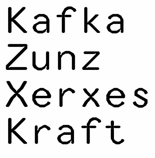
I couldn't sleep Thursday night, so I got up and drew some glyphs. I've decided to take a break before I finish Mondegreen's italics, to gain some perspective, so I had to do something else: A monospaced typeface, intended for screen viewing at small sizes. I always use monospace for coding and writing, preferably bitmap fonts. So this is an attempt to make an outline font that behaves like a bitmap at small sizes. I've eliminated all curves, and all angles are (as exactly as technically possible) 30, 45 or 60 degrees.
I've tried it in the text editor NoteTab, and so far, it looks like my theory works. There's almost no blurring at size ten (with ClearType on), and it's actually perfectly readable at size five, much better than Courier New. I'll upload some screen captures later, if anyone's interested.
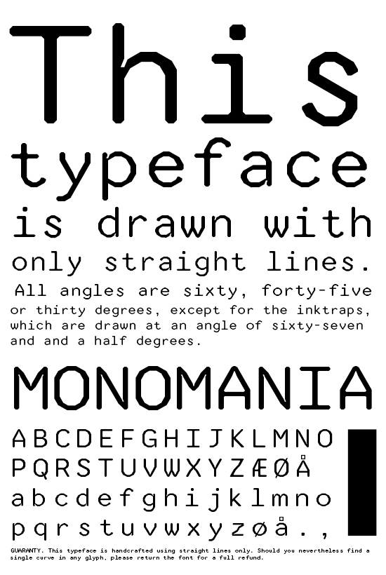
EDIT: For some reason, the .png posted here gets blurred on upload, probably some image enhancement routine. The small type at the bottom looks sharp on my original .png. Bummer.
| Attachment | Size |
|---|---|
| monomania.pdf | 34.25 KB |