I like to refer to this one as a "typographic seizure."

I like to refer to this one as a "typographic seizure."

Typos, revisions, illustrative lettering, good and bad... I bet his customers don't give a hoot. They know CHKN ain't fish : )
Don't ya just love the pink and green.
I have a friend that when I stop by his place he asks me to do a small sign or two. I learned the first time he said"make it more funky" not to take my lettering skills to seriously.
Michael

I like the evolution of "Pop" from top to bottom. The solid ring becomes these contained explosions, puckered 'P' counters, an exclusive loopy-fill, overlapping letters...

Christopher -- I don't mean to be a party-pooper, but I just want to point out that this is vernacular lettering. No type involved.
But yes, amusing nonetheless. Carry on.

Some love (& POP!!!!) went into this, that's nice to see. :-)
Kent — this is vernacular lettering. No type involved.
That depends how we define "typography". There's some great material in:
Ehses, H. (1976). Design Papers 1. Semiotic Foundation of Typography. NSCAD University. Halifax, Nova Scotia, Canada.
Last I looked, Lupton's latest definition was:
"Typography is what language looks like."
> That depends how we define “typography”.
Well, yes, I suppose so. Call me a traditionalist. Lupton's sounds more like a quip than a definition.

kent said:
> Call me a traditionalist.
you're a traditionalist! :+)
-bowerbird
Does anyone else have pictures to share?

If a "traditionalist" is someone who uses words to refer to the things they actually mean, Well, then I'm a traditionalist too, (to the best of my abilities). :o)
here's one from me anyhow though: vernacular lettering
Actually, the owner of the sign has a creditable web site.
-=®=-
Actually, based upon the slick design of Toronto designer & tailor, that sign would constitute "faux vernacular" ie: a slick graphic designer trying to make something look "quaint" as opposed to Mom and Pop actually making the sign themselves because they are broke and don't care.
:o) nope. it's a genuinly crappy sign. :p
-=®=-

What Kent said - and I'm not a traditionalist!
This is lettering. Why not call it that?
> “Typography is what language looks like.”
Useless and misleading.
hhp
I put this up in another thread about business cards, but I think it applies here too. This guy actually was a dirty carpenter.

http://vernaculartypography.com/
An interesting site with lots of pictures you can organize by category or place.

…a slick graphic designer trying to make something look "quaint"
Most graphic designers don't have to try very hard, once they put down their mouse and pick up a pen or brush.
Also, even if you are adept at drawing/writing on a small format -- mostly wrist -- things don't come out nearly so nice on a larger canvas once the arm comes into play. The slick boys there wield spray bombs.
Having said that, my local coffee shop has some sweet chalkboard menus, courtesy of a nearby tattooist.
@Nick: Any chance of taking a few shots?
*insert espresso joke here*

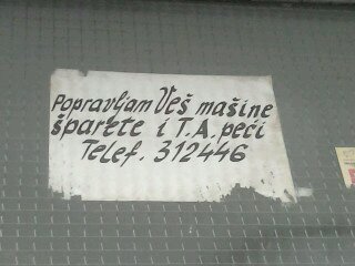
I have one to share. Recently my neighbor paste his add at the building entrance...I really love it. He put so much effort only for one sentence. For those who don't read Croatian language it says that he is offering to repair stoves and washing machines. But it's the numbers I love the best! Hope you guys like it. http://typophile.com/files/1347221866939.jpg

You should realize that with a thread title like this, I was expecting a discussion of non-Latin incunabula. Probably set in a textura face instead of Roman, of course...
Captured from web.archive.org on 19 Oct 2013. view this capture