Typophile

Reka Sans

Béla Frank

Hi Typophile community!

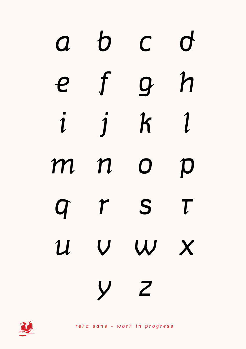
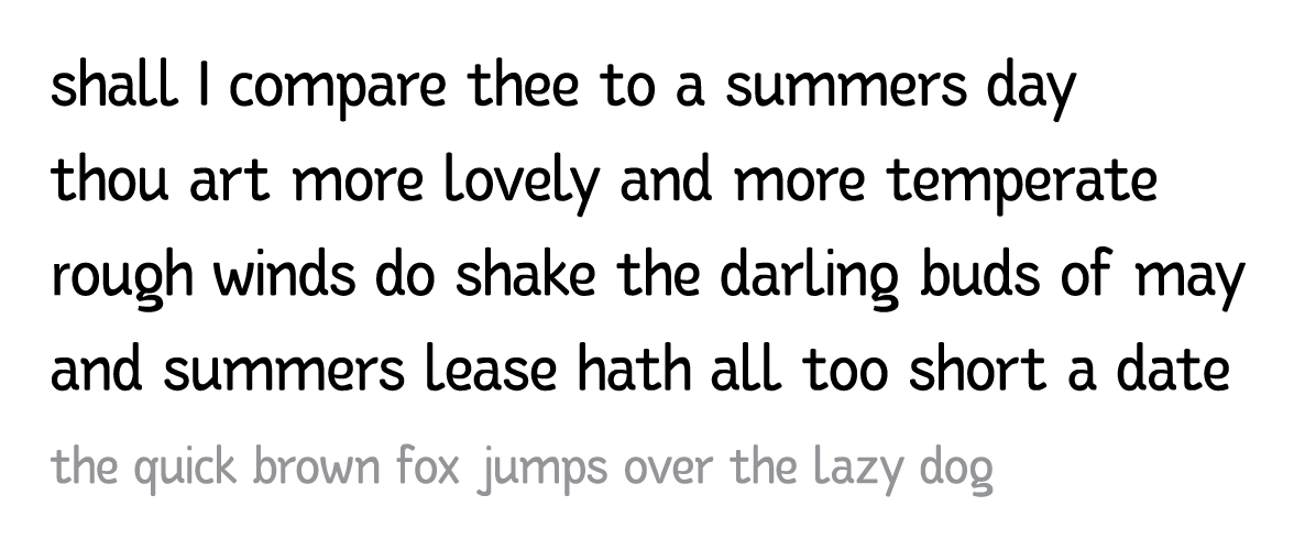
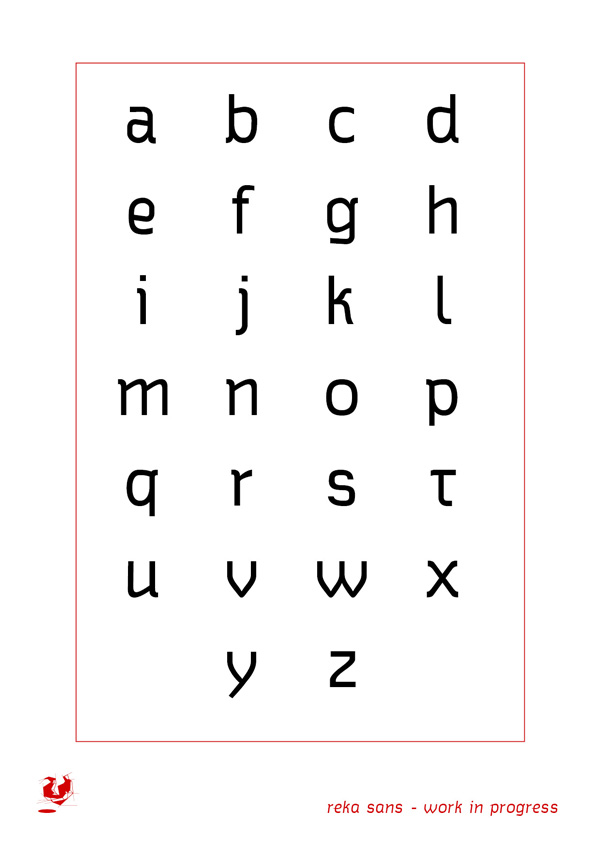
Here I present a type design project - very first impressions. Small case and italic designed, some italics are being drawn roughly, some other are (for now) only oblique - that will change however, caps and numerals still to come.

Would be great to have some c&c on it - thank you in advance.
AttachmentSize
specimen_06.pdf226.72 KB
specimen_07.pdf277.02 KB

New version of italics are here... the pdf attachmen is upgradef as well.

I think this is a quirky-looking but potentially promising project. The s is a bit bothersome; the lower terminal looks a little weak and the letter is falling backwards.

I think that the straight parts in a, e, d, b—which are working well—could be applied to p, g, q.

I'm not a fan of the i, j curls; I don't think they disrupt the flow of the glyphs.

-Eric MacLeod

Thank for your comment EricFromPTown!

The straight and curved parts are still not ok for me neither - I'm trying to improve the glyphs.

I was quite unsatisfied with the overall shapes, so am trying to redraw up from the sketches - love it more, it has something of personality as wall as the sketches - only lowercase for now.

Would be good to get some feedback - thank you!

Captured from web.archive.org on 14 Apr 2015. view this capture