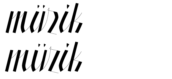
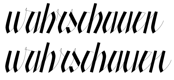
Even though I have two other fonts 'in development' (here and here), I just really enjoy drawing characters and I wanted to share the outcome of a recent doodling session with you.
A hard high contrast script that takes inspiration from cursive frakturs, old penmanship -- but with a sharp twist. Which, in turn might have been influenced by Underwares take on blacklettering with Fakir.
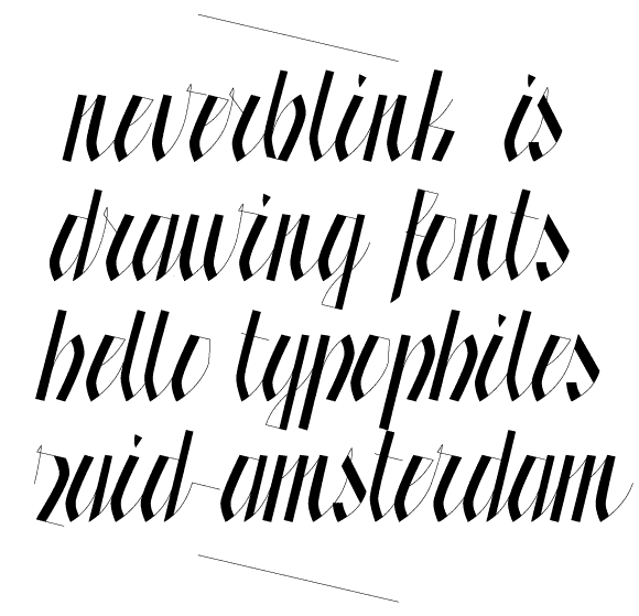
a-z + ß