Hello all,
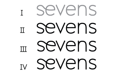
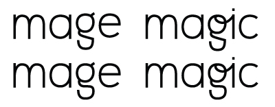
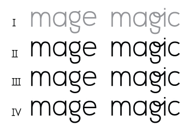
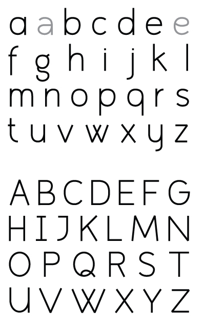
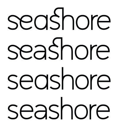
Although I frequently browse through these forums my contribution to them is still scarce. But I enjoyed making this 'typeface' so much I wanted to share it with you. Hopefully you can give me some feedback to improve it.
It's a monoline sans with quite a few (discretionary) ligatures, it was inspired by the ligatures in Avant Garde Gothic (alternates). It misses optical correction and inktraps at the moment and that will cause 'darker spots', might address those in the future.
Thank you!
Attachments;
monoline_sans_serif_ligatures.pdf shows the original design
monoline_alice.pdf updated letterforms and ligatures per 05/13/2009
| Attachment | Size |
|---|---|
| monoline_sansserif_ligatures.pdf | 116.11 KB |
| monoline_alice.pdf | 117.02 KB |