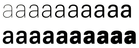
Of course the software had to crash before I had saved any of my work (and I had prepared extra-light versions of several other letters as well), but at least I now know how to interpolate. And I at least salvaged a screen-grab to prove it.
The heaviest a is from a grotesque I’ve been working on for the past few days. It’s quite heavy, almost a demi-bold, so I wanted to know that I could produce lighter weights as needed by drawing an extra-light extreme and interpolating. I can probably do the same thing for darker weights. This, of course, isn’t news to any of you type-design wizards, but it’s the first time I’ve tried this thing, all right? Please carry on...