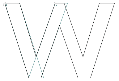
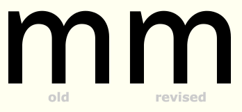
This is my first serious attempt at designing a sans serif. It's a neo-grotesque with a low x-height. Here's a preview, though the anti-aliasing is a bit wonky:
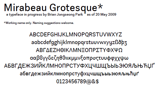
I would like this to be the seed of a versatile family, so I want the letter forms themselves to be quite neutral. The longer-than-usual extenders will give the letters plenty of character anyway. No kerning has been done.
I need to do more about regularizing the stroke widths; so far, my optical corrections have been minimal. I deployed ink traps only on a number of Latin capitals.
There's a lot of room for improvement all across the board, so I'd love to hear your critiques.
| Attachment | Size |
|---|---|
| Mirabeau specimen.pdf | 73.06 KB |