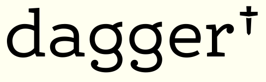
About the dagger:
1) Why is it full-height in so many fonts? Aren't daggers mostly used for footnote references (along with the the asterisk and double dagger)? So if it's going to be "superscripted" anyway, why not make it like that from the start, like the asterisk?
2) The only use I know for a full-height dagger is when people use it to mean that somebody is dead (a usage that Bringhurst limits to European typography). But then, they'd actually want a cross, not a dagger (one would hope!). So, does that effectively preclude all-too-pictorial renditions of daggers as shown in this older thread (scroll down to 2 April)?
Basically, I'm wondering if I can get away with a superscript dagger that looks a bit more like a dagger than a cross, or if I'd have to "neuter" it so that it can pose as a cross; and/or include an additional (full-height) cross. Opinions?