
I'm looking for information about the history of the
Dagger-Sign
I'm looking for information about the history of the
Dagger-Sign

I believe the symbols origin is a sign for death.
It was marked on coffins. I think.
A current use is to mark that a person is
deceased - in a body of text.
If anyone has a copy of E.T.S. handy ( mine
is at home ) I am sure there is a section on it.
If no one comments further I will provide more
info tonight.
-smc
Accidental double post.
I have read E.T.S. (you mean Bringhurst?).
But it's not quite detailed. I think in the later use the confusion
or double signing dagger/cross is of course there, as today, and in the
following the use as a cross and sign of death or religious things.
But the early term "obelisk" doesn't seem to reference to the
cross as a religious symbol. "asterisks and obelisks" has been
a term for pro and contra in theological scientific dicussions
in the 16th century (Martin Luther vs. Johannes Eck). And it results
from the signs used in the (biblical) text for marking marginals. In this
context it doesn't make sense if dagger/obelisk=cross
because asterisk and obelisk should be on the same level.
So my question is about the early development, the form, use and understanding
of the sign. Maybe there is any evidence for clarifying its first meaning
- or even its double meaning from the beginning.
Michael
Michael,
According to my Oxford English Dictionary, the obelisk was originally used in ancient manuscripts "to point out a spurious, corrupt, or doubtful word or passage."
Matha.
Perhaps this will help, perhaps not.
The division sign was[ circa 1659]... known either as the obelus or sometimes the obelisk, from a Greek word meaning a roasting spit. The idea seems to have been that such dubious matter was thrust through, as with a spit; the word is the same as that for a tapering pillar, another object with a pointed end. Confusingly, the word obelus was later used for the printer
Matha, sean: thank you!
interesting info!
There seem to be a lot of implications. But most of them come
from a later view (especially those connections to paganism).
To me it seems that the pointer root (or roasting spit - nice!)
is the most early. It makes the most sense, for with a pointer you can
optically point out best those spurious or interesting passages within a text.
This would imply that first there was no reference to religious symbols
may it be the cross or any other.
And as far as I know those theologians (I myself studied protestant theology),
they were much more rational and functional in their work.
Maybe they didn't have a cross or something like that in mind.
Otherwise - I think - there should have been some reflection on this use of a symbol.
Very interesting for me: Those mathematics-use.
But I'd like to trace it to the ground: Does any of you know early manuscripts
or prints with the dagger where its form and meaning can be seen?
Michael

Michael, try to get your hands on "Pause and Effect" by M B Parkes - it has gobs on the history of punctuation marks. I had a copy from a library, but no longer.
hhp
Hrant, thank you.
I immediately tried to find it, but I didn't succeed:
Not abebooks, nor amazon, nor german-european used books site gave me any
reference to Parkes :-(
Do you know any special site to look there?
Stephen, thats a very interesting thread.
I didn't know it before. Thank you for leading me there.
Maybe I'm wrong, but I like to dig out a natural understanding and use of that symbol.
I think it's much more nice, humanistic and feeding visual competence
to use asterisk, dagger, double-dagger and pilcrow for marking marginals and similar things in some cases,
than those always boring numbers, who always remind of scientific essays.
But with (mis-)understanding the dagger as a cross, its use is reduced to a few things.
Michael
If bookfinder.com can't locate a copy, it's pretty bad...
Your best bet is a good university library - you might need to do an Inter-Library Loan request.
hhp
The obelus or dagger is still used in scholarly editions of classical texts to mark passages that are seriously corrupt.
David

There are some interesting things going on here, asterisks mark a beginning, birth, alfa and daggers an ending, a death, omega. Maybe the Alfa/Omega thing is coincidental. Does anyone know when the dagger first appeared?
I don't agree with interpreting Egyptian obelisks as purely phallic, Obelisks are meant to be 'solidified rays of sunlight'.
Here is what I've found scanning my fonts:
Caslon 14, Centaur /italic, Electra 


Kinesis, New Baskerville, Nicolas Cochin 


Quadraat, Carol, Savoy 


oops, looks dangerous
Michael

That's it! I'm not entering the field of typography. Looks too
Ha Ha!
Do not forget about the sex though.
It is all about the sex and violence.
-smc
Heler's essay is hilarious, thanks for the link.
Any other aspects of type (besides sex and violence) I should be aware of?  Anyway, back to the topic!
Heller's essay is hilarious, thanks for the link.
Any other aspects of type (besides sex and violence) I should be aware of? Anyway, back to the topic!
Sex, violence and endless hours of kerning and spacing.
but not necesarily in that order.
Daggers were discussed at Typographica last June.
Can anyone recommend more beautiful daggers please?

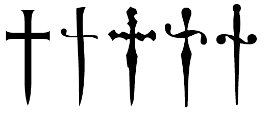
I use footnote-sized daggers all the time but never looked at them enlarged like that. Wow, some of them are amazing.
Thanks Nick, appreciate it. I love the Scotch Modern!
Does anyone know any daggers with a more rapier/sword feel to them?
Also...are there any sans-serifs with unusual daggers and not the standard christian cross!?
Sounds like you should be making some yourself! :-)
hhp
Touche hrant!

Let's see someone put something like this into their dagger glyph...
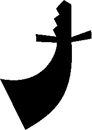

From the font I'm developing:
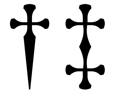

Love the Fontesque one! :-)

>not the standard christian cross!?
Not a sans, but here is the one from Williams Caslon Text Regular, which for some reason looks less like a Christian cross :)
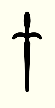

Here is the dagger and double dagger from Malabar… . The dagger is based ever so vaguely on one of Charles Martel's swords, since the typeface's working name at Reading was Martel.
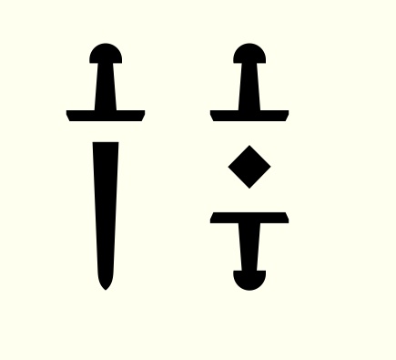
Nice Dan.
Nina, won't you show off yours?
hhp

Ah, dagger time again!
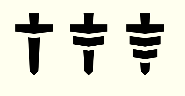
Some other nice/cool/interesting daggers:
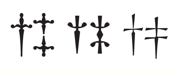
Captured from web.archive.org on 21 Mar 2015. view this capture