
In my previous thread (Beginning with/Besides the "g") I obtained an unsuspected result in shaping an individual character, that obvioulsy influenced the rest of the typeface:
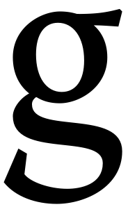
Being the basic structure is almost done, now it's time to make some subtle adjustments.
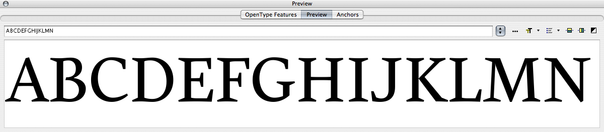
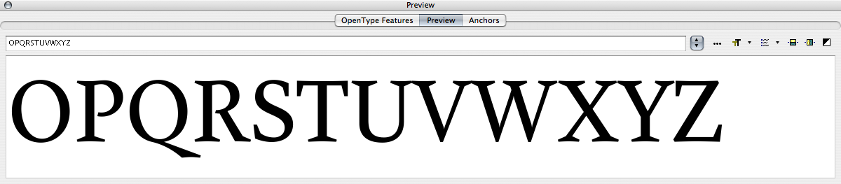
This is the current uppercase alphabet:
And these are some samples of what I'm starting to do about trap (BTW, thanks to Hrant Papazian's technique guidance):

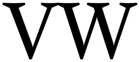
[I'll post a PDF for best viewing, beyond the lack of hinting]
I'd like to hear some critique, the harder, the better.
Thank you.

