
[Edit: This idea started in the Fix Arial Type Battle]
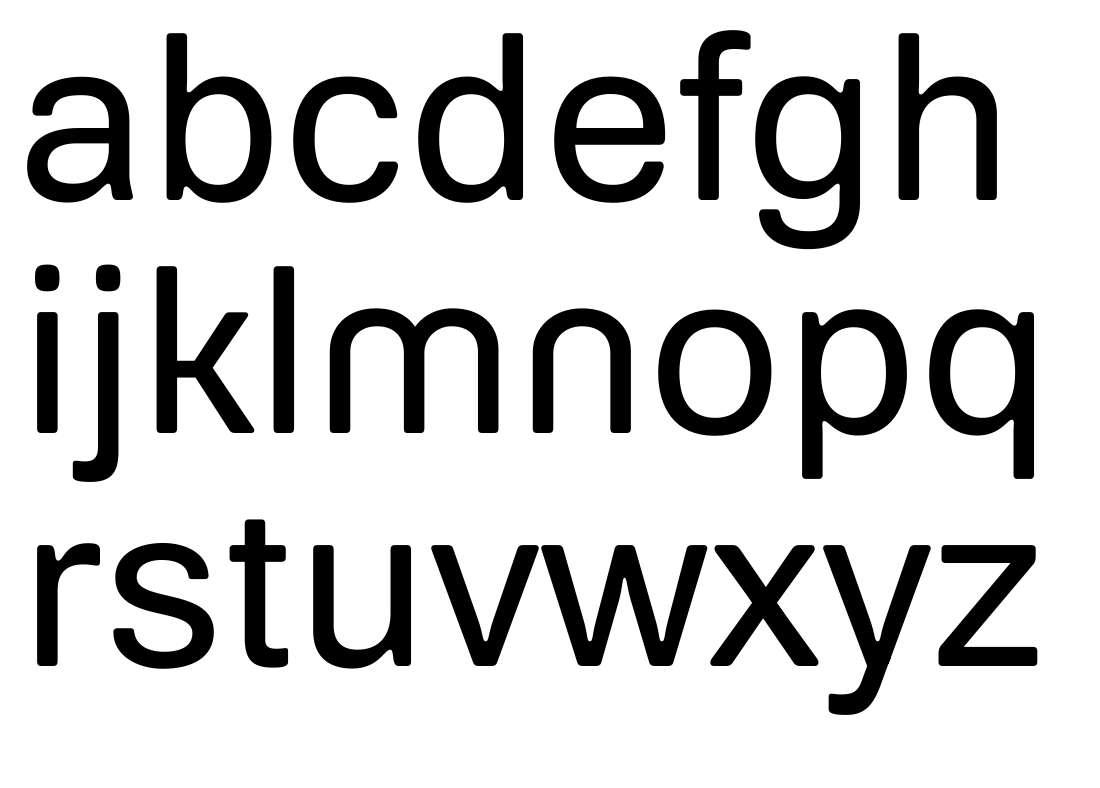
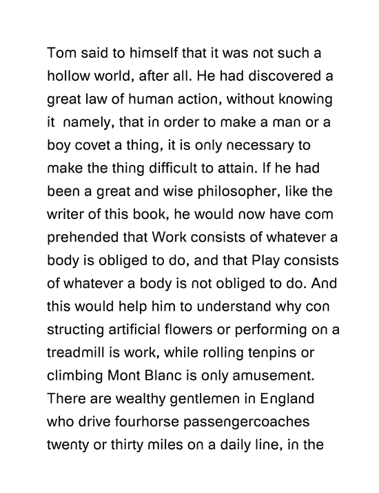
I was casting around on a client project for a sans where I could modify the n & m to match the geometric look of the logo (stemless) for their identity package. The project gave me an excuse to tinker on the Arial alphabet. Here's the lc (with alt n m) and a text setting:
I don't expect this to go further anytime soon. There's just enough to meet the deadline for the stationary package.


