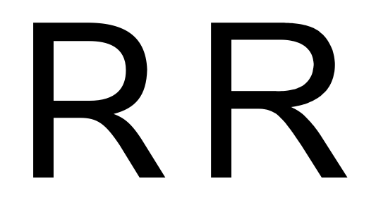
/ THE CHALLENGE
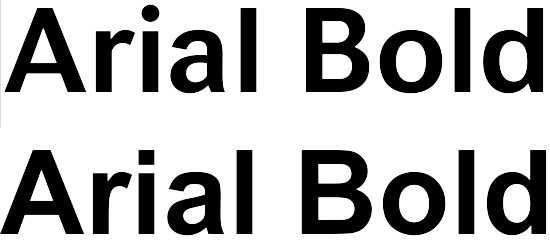
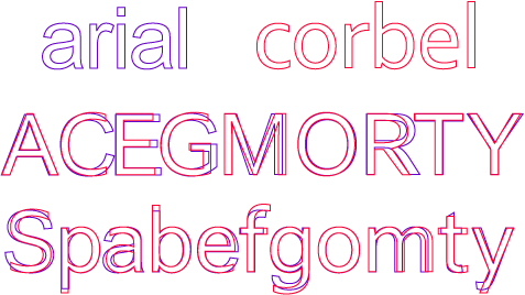
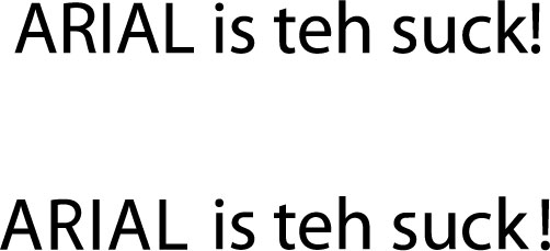
Arial was created as a substitute for Helvetica, but most graphic designers consider it a poor substitute, and avoid using it if they can.
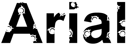
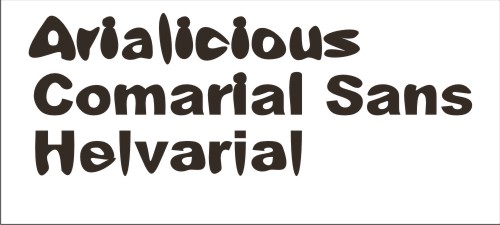
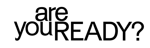
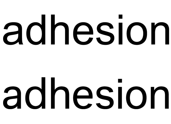
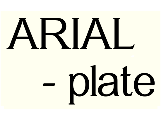
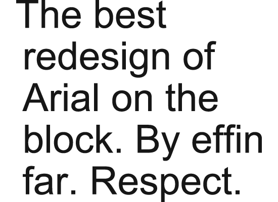
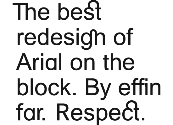
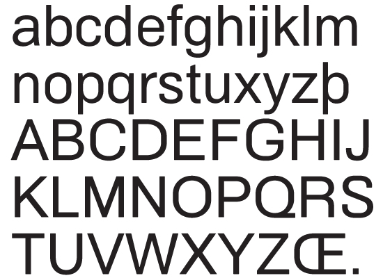
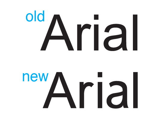
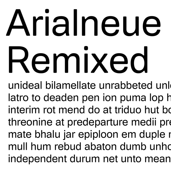
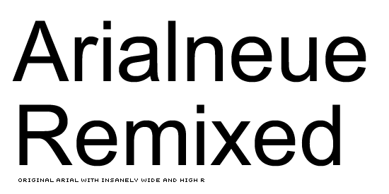
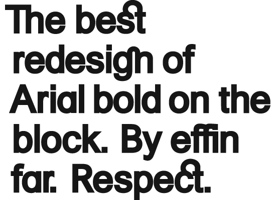
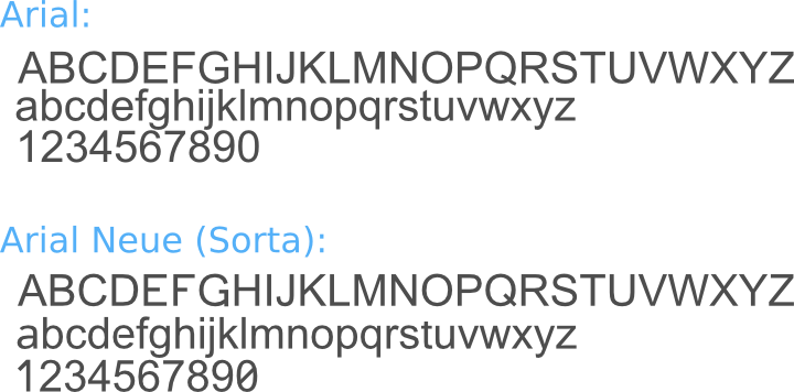
The challenge is to redesign Arial, perhaps with small changes, perhaps with major changes, but to make it into an alternative to Helvetica that a designer could love, maybe even prefer. Making it look like Helvetica is not allowed. Making it more easily distinguished from Helvetica is a plus. Just as Arial's metrics are identical (or nearly so) and its weight and proportions similar, so should the "fixed" version.
Winner take all, no holds barred. May the best designer win.
// REQUIREMENTS
- Image size: 550 width x 400 height. 72 dpi*
- Color: Black and White
- Format: JPG or PNG (make sure there are no spaces in the name)
*Please try to keep your file sizes to a minimum! 50k per file max.
// ABOUT TYPOPHILE TYPE BATTLES
This is your chance to stretch your type muscles on a weekly basis. You have one week to create and submit your entry. Anyone may submit a design response to the challenge. You may enter as often as you wish. Post anytime. Critiques and comments are welcome throughout the game, from participants and spectators alike. Smack talk is encouraged.
As with any street battle, there is no panel of judges and no prize — only the ability to call yourself the best on the block.
Link directly to this battle: http://www.typophile.com/battle36
Link to the battle directory: http://www.typophile.com/typebattles
*Thanks to Mark Simonson for this week's battle idea!