Hello fellow typophiles.
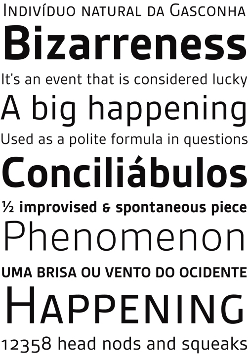
I'd like to show my new release. It's a sans called Gesta.
Gesta is a friendly versatile sans serif typeface suitable for corporate and editorial purposes.
With its generous x-height and slightly curved strokes, Gesta combines a distinctive and warm feel with a modern look.
It is available in four weights from light to bold with four matching italics and its OpenType features include small caps and old style figures for every weight.
it is available at MyFonts. http://new.myfonts.com/fonts/r-type/gesta/
I would also like to thank Typophile and the typophiles for your help.
This where I got help and great suggestions: http://typophile.com/node/53140
Warm Regards.