hi,
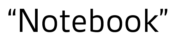
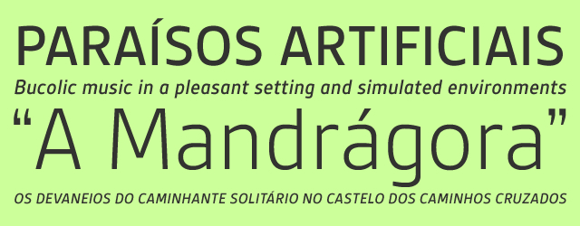
I'm now finishing my new type design. It's a sans family called Gesta.
I wanted to show this here before closing it, and hear any suggestion you might have.
Is there something you feel it is awkward or not working, or something you might do differently?
Thanks in advanced. And a great 2009:)
| Attachment | Size |
|---|---|
| gesta.pdf | 106.7 KB |
| gesta Spec 3.pdf | 106.63 KB |