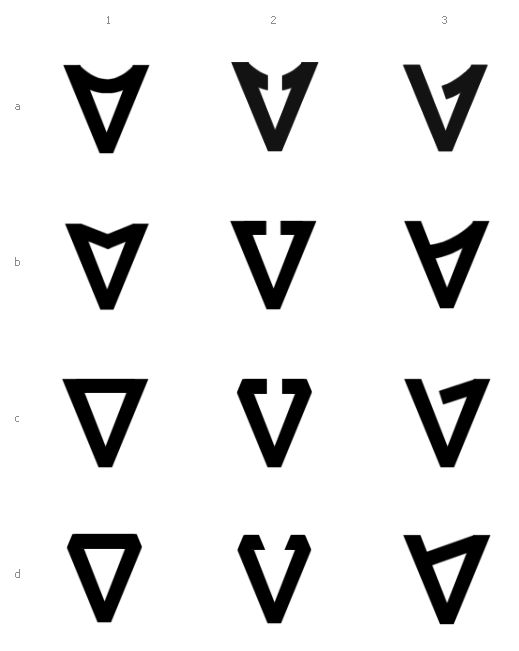
In continuation of this and this threads - I'd very much like to hear any thoughts or impressions on these two versions of the mark.
It is for a logo and an application icon for a file backup software called Bvckup. The mark is based on the V and it is meant to resemble flipped over A as well as incorporate a form of an arrow indicating a motion (of either stashing the files or recovering them).
Thoughts ? Good/bad/blah/interesting/unremarkable/etc ?
Thanks