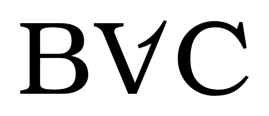
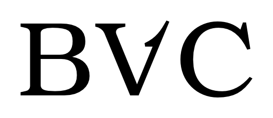
I'm in process of trying out ideas for a wordmark, which includes customized letter "V". Its basic shape is like this:
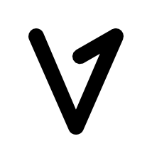
.
The goal is to make "V" resemble a flipped over "A" and include a pointy, arrow-like element to render a concept of "bouncing back".
I thought I'd try and see if/how it would look in a Serif font, made few sketches and that's when I realized that I am seriously out of my depth here. I mean they look OK to me, but I just can't tell if the Serif option is something that's worth pursuing.
Any thoughts, advice or comments on the following pair of sketches ? Either specific or of a general nature (e.g. "don't mess with a good typeface").
Thanks.