Hi guys,
Throughout the past few years I've become more and more obsessed with typography. So much so, that I've now decided I'm going to create my own.
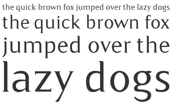
I present to you: Camber - a delicate and tiny seriffed type.
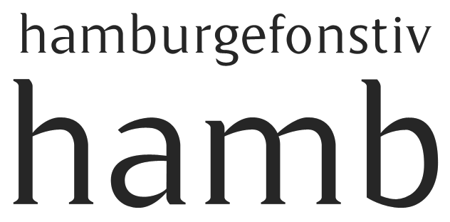
Please be aware that this is my very first attempt at a typeface, and not yet produced in a font editing application, so nothing is set in stone just yet - especially the letter spacing.
I'd just like some feedback on my lowercase before I move on to CAPS or numbers. Please let me know what you think.