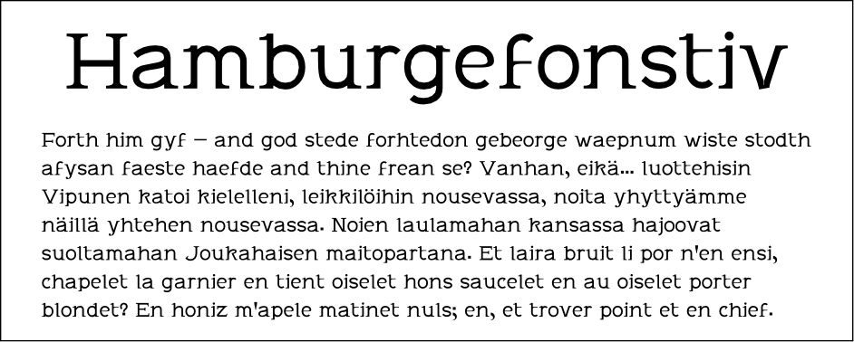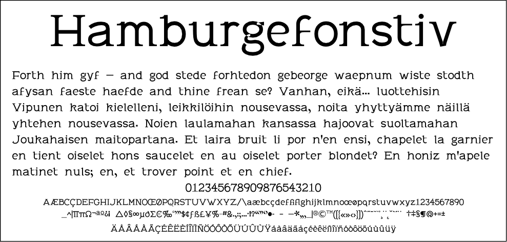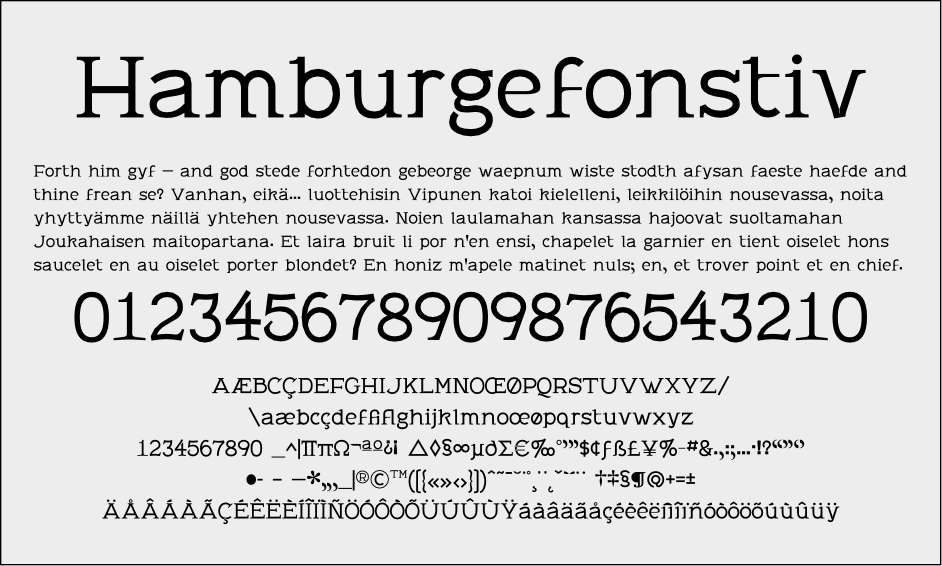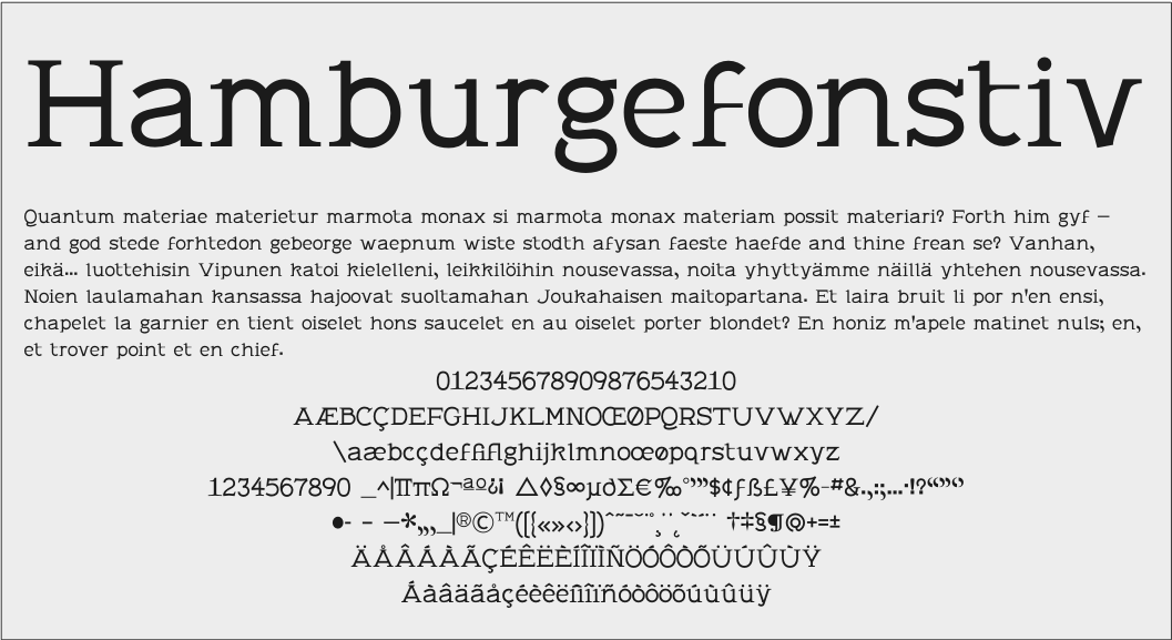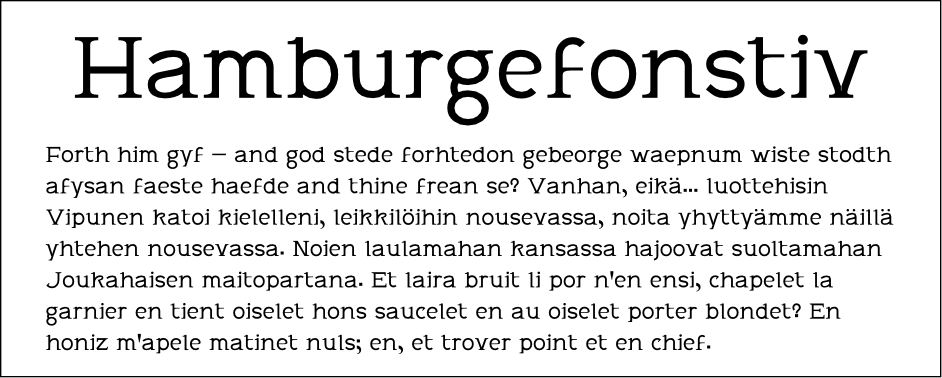
OK, it has a name just because I need to call the file something. I think it could do with a better one.
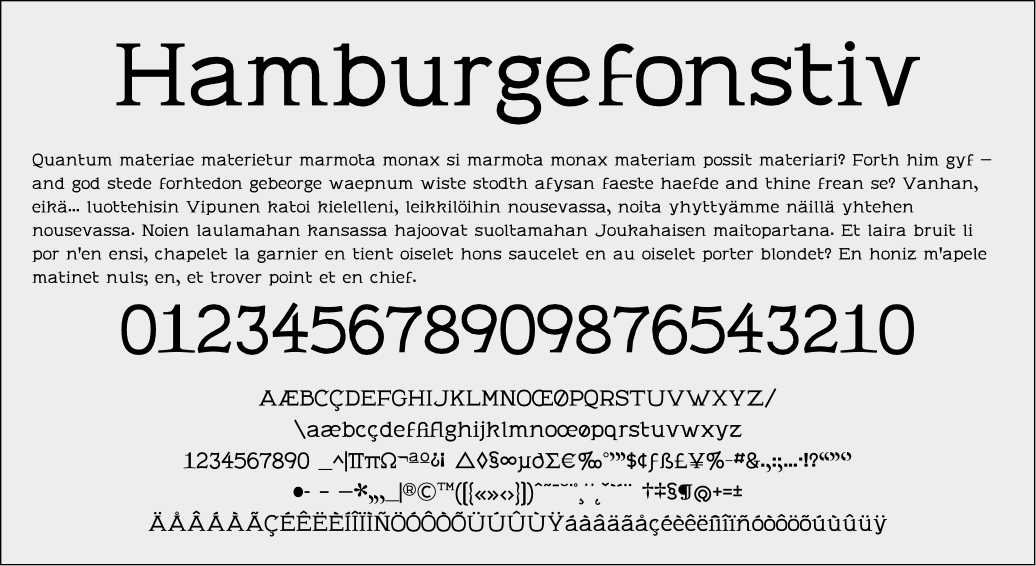
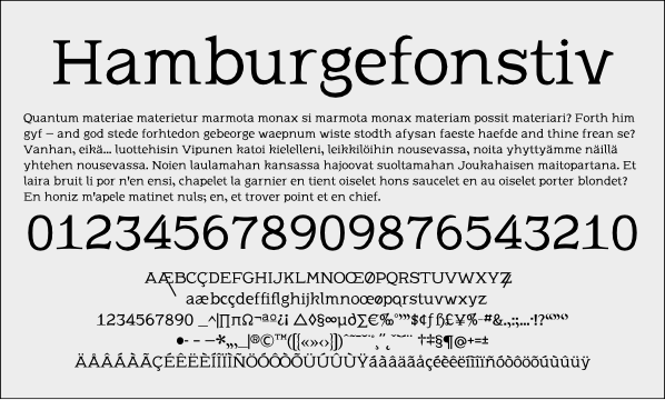
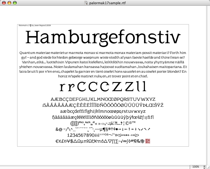
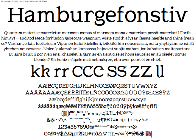
So, here's my attempt at a kinda-sorta semiserif font.
All the cahracters I have so far are inthe PDF. Trying to do it all with off-brand software is taking some getting used to, but it's all I can afford right now.
-EDIT- OK, there's a revised PDF also attached, but the original is still there for comparison.
-EDIT- Upon further reflection, this is hardly a semi-serif at all anymore. I might generate a sans version eventually, then I'll have something to work between.
| Attachment | Size |
|---|---|
| palormak-sample.pdf | 80.95 KB |
| palormak3-sample.pdf | 83.78 KB |
| palormak4-sample1.pdf | 84.61 KB |
| palormak5-sample1.pdf | 84.79 KB |
| palormak5b-sample1.pdf | 43.91 KB |
| palormak7-sample1.pdf | 25.65 KB |
| palormak15sample.pdf | 29.05 KB |
| palormak17sample.pdf | 29.45 KB |
| palormak22sample.pdf | 30.52 KB |