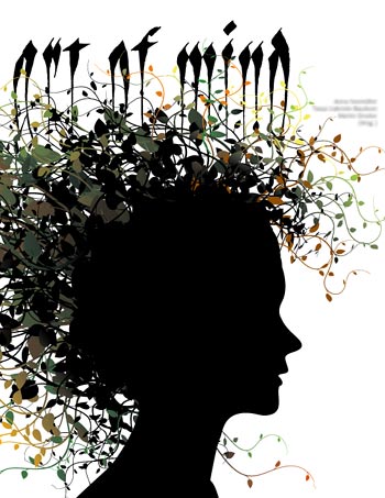
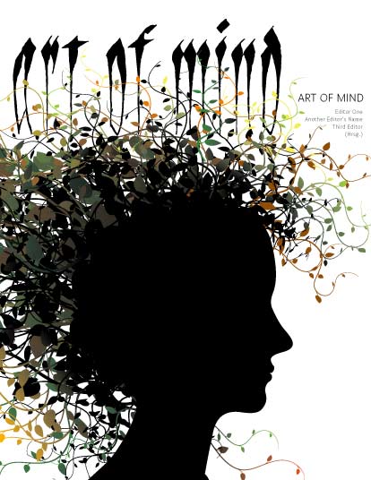
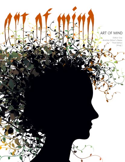
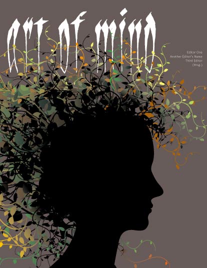
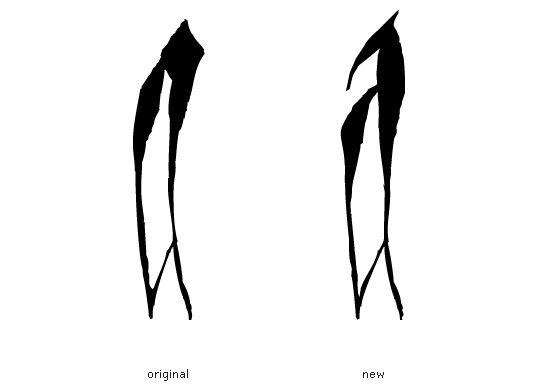
I've been asked to make this little art exhibition catalog for an association I'm a member of. This is pro-bono work, so I can't spend two weeks on it (or license any additional fonts)… and still of course I want it to become at least nice enough to put my name on it.
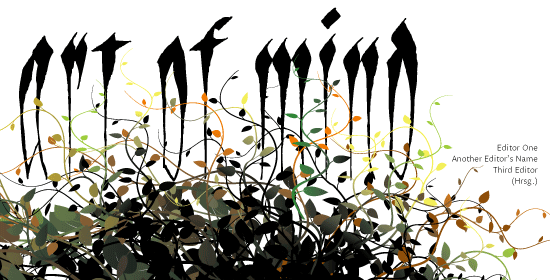
Below is a sketch for the cover (really rough still). I sent it to the client today, and he said he loves the illustration (which isn't mine btw), but the type is "too hard to read". He suggested Frutiger or something. :-/
I've also asked a few laymen to read out the headline; while some of them read it instantly, others were struggling.
Now consciously inducing (or at least tolerating) legibility problems would not really be something I'd be very proud of; on the other hand though, I feel this book can do with a bit of uncommon design at least on the outside (it's an art book! Come on).
And I guess my main problem is that I'm really badly in love with how Sangue connects to the illustration and seems to "grow" out of the girl's head/brain – which seems to make a lot of sense. So I'd really hate to change the basic concept, or the font.
There's the dilemma. Here's the question:
Do you guys
1) see a chance of changing this in a way that would improve legibility of the title without completely changing the concept?
2) think this sucks, my client's right, and I'm deluded?
Thanks.