Typophile

Excellent but seldom used fonts

Yehan

I'm sure we all have certain typefaces we know are really brilliant but somehow they never seem to get the exposure or publicity the rightfully deserve as examples of great type design.

One of those for me is ITC Mendoza. I very rarely see it but it seems to me that it's a really lovely typeface.

Anyone else knows fonts like this?

(granted, this is all personal opinion)

Mark

Photina, Linotype Centenniel, Melior, Quorum, the list goes on...

Photina, Linotype Centenniel, Melior, Quorum, the list goes on...

Vialog and Aptifer are probably some of the best stuff to hit the Linotype line in recent years, and nobody uses them. I find this particularly surprising in the case of Aptifer, because it has a killer range of slab weights that I expected to be a big with the recent revival of slab type.

helvetica.

I collected some of my favorite underused fonts for the QBN Typecase and ITC Mendoza is one of them.

@hashimpm - my girlfriend recently read Shopaholic and Sister (UK edition i think) which surprised me when i flicked through it as it was set in melior.

which at first i was happy about cause i love melior, but for some reason i really didn't like it in that book... i think it was too loose and light.

hmmm...

Noa, Bohemia, Merlo, Today Sans, and I have yet to see a book set in Clifford.

Joc Line

Also Indigo, PTL Speech, anything Maniakers, Arrus, Sirenne, Fleischman from Bitstream, Kennedy from Galapagos, anything Pampatype, Lazurski, anything Anatoletype, Nevia BT Pro from Bitstream, Gilgamesh, Iowan Old Style, Really by Gary Munch.... and Prado from Berthold Types

> I have yet to see a book set in Clifford.

I have a beautiful example I'll have to post on Typo someday.

Plantin

I love this font, I have used it for my own corporate identity. I have only seen it used one place before, but I'm glad it's not used too much. The italics are sublime.

Plantin: most prominent recent use is probably Monocle magazine.

Silica by Sumner Stone.
Italian Old Style by Frederic W. Goudy.

Amen, Jürgen. Join me in pestering Sumner every few weeks for Silica italics.

Stephen: I would even offer him to produce it. I have this in mind for ages ...

when i read this thread's title, the type nerd living inside my head screamed ITC Mendoza, and, slightly less exited, Silica. how late can you be to join a party...

luckily, there's more. i've yet to encounter Bodoni Egyptian in use, and i'd love to see ARS Maquette printed somewhere other than FontShops own promotional material. (if single weights were available, i might even take matters in my own hands.)

Mendoza is a fantastic typeface. Its low contrast makes it great to set type in small sizes.
I actually found I owned a license (bundled with some old software, I don't recall if it was Freehand), and I hope some day I will have the opportunity to use it…

I do not have a similar feeling for recent faces, besides it seems there are so many gems to de discovered among 1980s designs (which went overlooked because of the frenzy of the digital avant-gardes, pursuing more display-oriented letters).

>> I have yet to see a book set in Clifford.

> I have a beautiful example I’ll have to post on Typo someday.

Please, do it soon.

Is there any OT Pro version of ITC Mendoza with CE diacritical marks, etc?

I do not think that there is yet. Sorry :(

In the case of Elsner & Flake, their website is a nightmare to search. Bad marketing might apply to some of the others.

Forgive me, that should read "was". They've apparently updated: http://www.fonts4ever.com/foundry_detail.php?f_shops_id=8

And: I'll add Stilla to the list. I've only seen it used once.

I have a Lord of the Rings set in Plantin. It's a delight. Nice and dark too.

And: I’ll add Stilla to the list. I’ve only seen it used once.
Stilla is great, although you have to be skilled to use it well…
But I think it's one of those typefaces which do not benefit from an excessive exposure.

It may be just me, but I don't remember seeing Kepler used very much, or Alisal. This despite Robert Slimbach (Kepler) and Matthew Carter (Alisal) not being exactly unknown type designers.

i’ve yet to encounter Bodoni Egyptian in use

I just saw it used in the kid's section of the latest J. Crew catalog. I think it was the Roman or Thin weight, not sure as I don't have it in front of me. But I remember noticing the type as it was the first time I had seen it in commercial use.

David

I have yet to find a book set in FB Alpha Bloc Corde with footnotes in Adobe Ponderosa.

I feel empty inside.

André

The only place I've seen Kepler used is the Cornell Daily Sun.

The Ascender Originals almost never come up in discussion but are actually pretty nice.
Miramonte is lovely. Metro and Futura’s love child.

Thanks Stephen. I'm gonna have to buy that typeface. It's amazing!

Wow..I gotta check out all these faces. To be honest..I'm quite sick of the same stuff being used over and over again...not that they're bad; but we could all use some variety once in awhile.

Just had the opportunity to set a book in Mendoza and I've absolutely fallen for it:D

Jay Rutherford
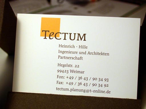
I used Mendoza along with Interstate Bold for a corporate identity project a few years ago. They go great together! I built a font package with Mendoza normal, Mendoza Italic, Interstate Bold in the bold position and Mendoza small caps in the bold italic position. The contrasts work well, and it's easy for the architects to use on their PCs.

I also used Clifford some years ago for a book – the documentation of a typography conference we held here in Weimar in 2001. It was never actually printed, rather the PDFs were burned onto a CD and sold that way. Clifford reads really quite well on screen, as well as being an excellent text face for print. I'll upload an image when I get to a computer where the drive works.

Jay Rutherford
Here's the image:

Interstate Bold is used on the back, set in 10 pt., for the partners' names.

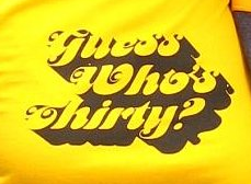
I used Stilla recently on a t-shirt for friends surprise birthday party.

http://www.flickr.com/photos/typegirl/3048139893/sizes/l/

Oops! You don't have permission to view this page.

Tiffany, it seems your Flickr settings allow viewing all sizes for friends and family only.

Fudge.

That's Motter Femina, not Stilla. Similar feel, though.

:-X I knew that. Today has not been my day for logic. At all. What so ever. FAIL.

Still, another great face that doesn't get used much.

Jürgen, Stephen, if you manage to convince Sumner to add italics to Silica, I will never forgive you. Don't soil such a pristine thing with the impurity that is Italic. Silica has a fine weight gradation for a reason - it doesn't need italics for emphasis, or anything else.

http://www.flickr.com/photos/stewf/18634518/

hhp

@ Jayar where did you get the OSF for ITC Mendoza. I don't remember it having OSF? Or did it?


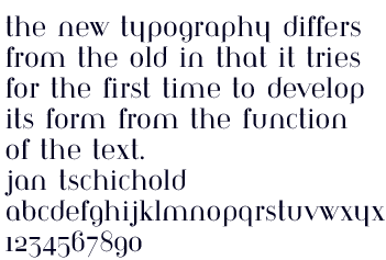
Architype Bayer-Type is based upon Herbert bayer's 1931 experimental, universal modern face.
I love this one.
You can find it at: http://www.foundrytypes.co.uk

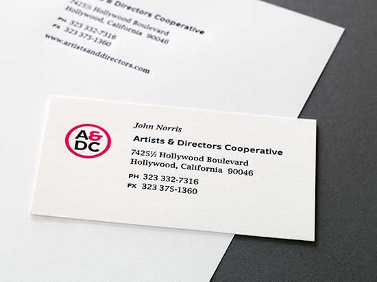
Jay’s example reminded me of pairing Metron with Lucida Bright on a friends card. Printed on a Heidelberg Windmill. This was before Metron fell into a legal mess.

Joshua Darden's Freight
Sumner Stone's Cycles [Eleven]
Jean Francoise Porchez's Parisine Plus

Hrant - You are alone in your hatred of italics. The rest of us want versatility, not your imagination of "purity".

1) Well, not really hatred.
2) Nobody is ever alone.
3) Versatility does not exist in a vacuum; things you can't see are tugging on it. And integrity has a versatility all its own.

hhp

BTW, to reply to the original post: Octavian, Legato, Sangue.

hhp

WHOA that Sangue is incredible (sorry for shouting)!

There are some really interesting suggestions in this thread. Great input.

Parisine Plus
I've used this a bunch of times, but feel it's quite difficult to make it not talk
in a somewhat conceited girly voice (that descending "G", uhh). I think
the "original" Parisine family is excellent, though, and amazingly versatile.
Could probably also be used more.

Legato
Amen.

> Joshua Darden’s Freight

Freight's a fine face, but hardly what I would call "seldom used" since it's used all over a few prominent magazines. Better Homes and Gardens comes immediately to mind. The other titles escape me at the moment.

Macworld is another one that uses Freight

Yehan: it was a long time ago that I did this, can’t remember exactly. It may be that I opened the file in Fontographer, the oldstyle figures were in there and I just copied and pasted them into the normal positions (I have done this with a few faces). When I open the font now in FontLab, though, they aren't there. I also don't remember where the small caps came from – if I find them, that may be where the OS figures came from. A little detective work is apparently in order. I’ll get right on it.

Corgi Books used Plantin to set some of the pocket book versions of T. Lobsang Rampa's output.

One typeface discussed here that is rarely used and which deserves more use is Emerson but then the only revival now available has short descenders.

Our Ben Mitchell might have something to say about that...

hhp

Just took a look at Silica.

Yes, it has enough weights that one could use an intermediate bold instead of italics. Doing so still limits flexibility in choosing which weight to use for normal text, though: if this is what is intended, it should have had twice as many weights as it does.

Also, I do have to admit that the design does not seem well suited to a companion italic. However, there are many quite similar typefaces out there which have italics, so I suspect that it isn't that badly suited to one.

If there's a more faithful revival of Emerson out there now, that's really good news.

I love Silica for its lack of Italic.
I was disappointed to hear that Stone would actually like it to have one:
https://twitter.com/sthoths/statuses/368819562239643649

hhp

Well, his comments there at least indicate that he is in no rush to add an italic, and intends to make sure that a companion italic is suitable before adding one.

Since this thread has come back up, and since typophile is working, I'm going to throw this in:

http://www.ambplus.com/pa/3c.html

Newut may be the first typeface I ever licensed (apart from through other software). I like the uniformity of the grey blocks you can make out of it. And it reads well for a unicase.

Thanks, Hrant for pointing me to this thread. I've been working on an Emerson project for the last couple of years, and I'm taking a very broad approach, digging up lots of interesting history, pattern drawings and correspondence, reading about Blumenthal and comparing the foundry type with the Monotype conversion. I've settled on my approach, but progress is slow as I have plenty of other projects on the go, but here's a sneak peek. There's still a need to even out the colour but this shows the overall proportions, weight and styling I'm aiming for. There are some interesting unpublished italics which I intend to revive too, along with bold and possibly other weights.

I'm interested in the comment about the long extenders; are you referring to the Nonpareil revival?

I don't see typefaces by TEFF often (some exceptions), though with good reasons. I love Ruse for example but the only time I've seen it is in Noordzij's "The Stroke". I don't think I've ever seen Geronimo in use. Trinité I see a couple of times per week because there's a little book store in Rotterdam called "Boekhandel v/h Van Gennep" which features its name in Trinité on the window.

I've seen Melior and Plantin often enough not to think of them as particularly rare. Aldus, the "book" version of Palatino, on the other hand, seems to turn up only in books typeset in Europe, particularly in German-speaking areas, so I would put it at the borderline of this category.

But there are many excellent typefaces that truly are almost never used - they probably number in the hundreds, if not thousands.

Despite the fact that Sturgeon's Law also applies to typefaces, and poor ones vastly outnumber excellent ones. Actually, despite that in one way - if poor typefaces outnumber excellent ones so much, how can so many excellent ones exist - but because of that in another - since so many inferior typefaces exist, sifting through them to find good ones is arduous, so it's simpler to rely on a "gatekeeper", and only consider the most popular typefaces from the biggest font suppliers.

Captured from web.archive.org on 23 Jan 2015. view this capture