
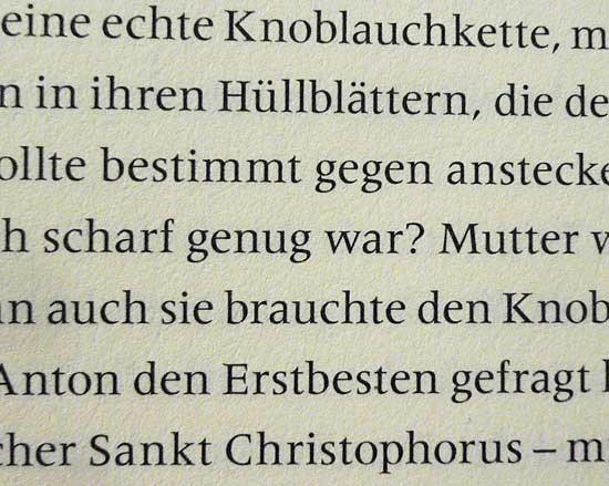
I'm assuming this is Meridien. Please correct me if it isn't.
The typography and typeface used really have me struggling to read this book. These sharp serifs alternately pinch me in the eye, or seem to disappear into the paper; the type seems distracting, and it feels too light. But maybe that's just me.
I'd appreciate to hear your opinions on what you think about Meridien for books – immersive reading, novel type stuff. (And if it "isn't just me", I'd appreciate some good reasoning why the above might not be optimal; I might need (OK, want) to steer a client into a different direction.)
Cheers!


