
Not a typeface per se, but some letters I'm working on for a client. I'd love some crit! (Weight, curves, widths and such)
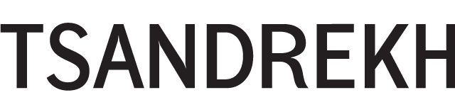
Not a typeface per se, but some letters I'm working on for a client. I'd love some crit! (Weight, curves, widths and such)

For a start:
S and R are too wide. The head of R is too big and too wide. There is too much weight difference on the S, make it more monoline. The upper curve could be shallower. A is too narow. E too wide. K too narrow, the upward stroke should sit higher. What happened to the H, man? Wasn’t there enough space? It’s the narrowest letter in there, very awkward.
The spacing is very tight. Not a problem at this size, but if it’s going to be set smaller.
Best, Jürgen
Thanks, just what I'm looking for! I'm trying to do something along the lines of the irregular grotesks.
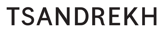
Second iteration. I think the R is what makes it charming. Thoughts?

Good improvements.
The break from horizontal to curved in the D seems too abrupt.
Is this the size it'll be? I find the ink traps a little distracting.
I agree on the ink traps. It'll be displayed in lots of different sizes.

At this size, the S looks somewhat thin in terms of stroke width.
In addition to the two comments above:
The head of R hangs down (bottom curve), the leg is too light.
K: upward stroke a touch lighter, downward stroke a touch heavier and a bit steeper.
If it will be for lots of different sizes, i would do a version without ink traps for display sizes.
Captured from commoncrawl.org on 28 Apr 2015. original URL