This reminds me a bit of Lexicon with the mini flourishes. I think the bottom of 'S' needs work. The curve looks too flat to my eyes.
-Eric MacLeod
Oxymoronic? Maybe. I don't know if I'm setting myself up for failure with those parameters, but whatever. I'd like to hear some suggestions on improvements. Are the mini-flourishes just looking weird when on a squarish face? For anyone who cares about how it started.
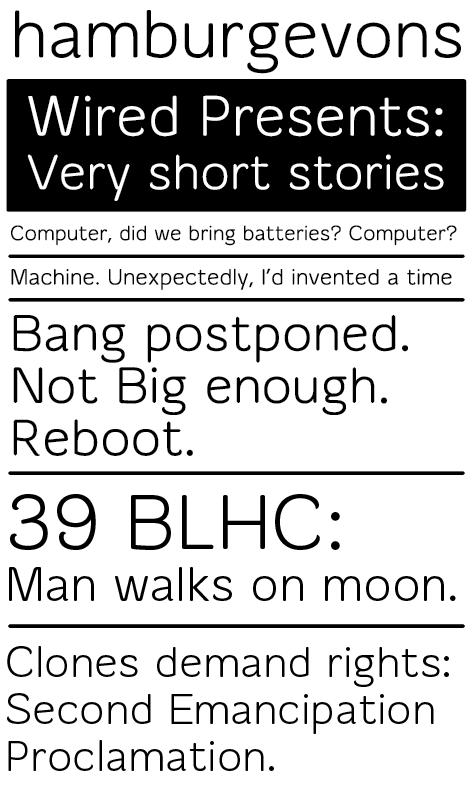
This reminds me a bit of Lexicon with the mini flourishes. I think the bottom of 'S' needs work. The curve looks too flat to my eyes.
-Eric MacLeod
Thanks for the input, it's actually the s/S which I'm having the most problems with.
Interesting, challenging project. The curved terminals have charm but are a tough fit as you acknowledge. Maybe if the strokes weren't so insistently monoline (introducing a slight consistent contrast, or thinning bowl strokes as they intersect more dramatically), the thinning flourishes would be a better fit.
Are the flourishes on the figures much more pronounced on purpose? That 9 seems unbalanced, and also may be violating the open apertures you talked about on your website.
I'd make the ear of the g more old-fashioned, curved and "flourished."
Captured from commoncrawl.org on 26 Apr 2015. original URL