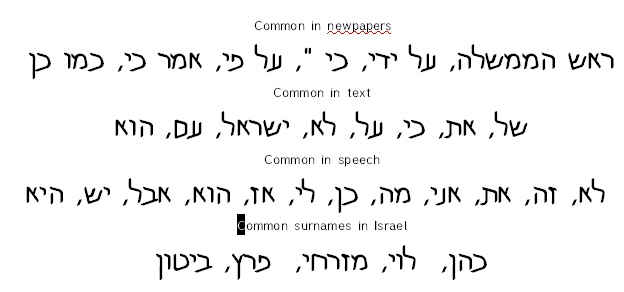
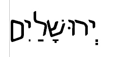
The nights are already longer. My sailboat is out of the water. This morning the bird bath was frozen. Now is the time to start thinking about the next release of Mike Hebrew! Generally the next release will be ready at the time when Cabin Fever prevails in the surrounding forests....
In this topic, I like to share some of my design issues in the hope of receiving practical comments.
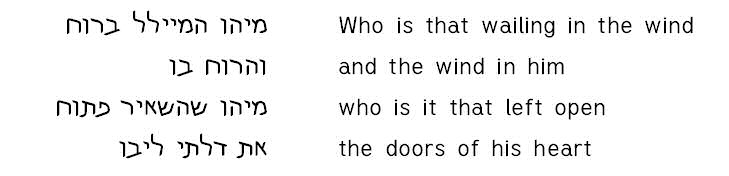
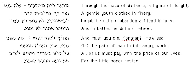
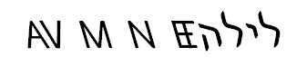
In this example of Mike Hebrew Web, I pasted bits of English text at random into a Hebrew newpaper article using the same font and size throughout.
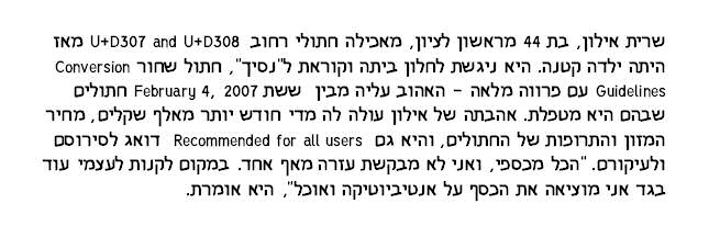
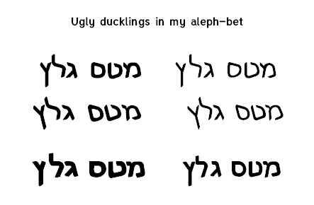
An example of side-by-side usage of Mike Hebrew Web with a single point size.

The Design Process
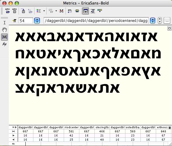
I started with setting the size of my Hebrew characters so they would look good when displayed or printed without nikud or cantilation in Hebrew-only text. Next I tweaked a little to sqeeze them in, however the intent is modern Hebrew usage with little use of nikud.
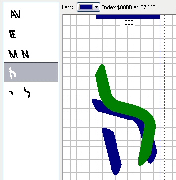
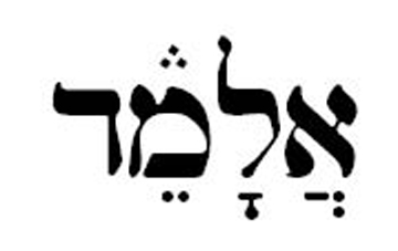
Define “Hebrew Height” as the top of most Hebrew characters such as dalet and het. Lamad would be as high as possible. What heights should I use for the latin characters and numerals?
A choose the cap-height to be higher than the Hebrew Height but much lower than the top of the lamed.
The x-height was chosen to be much lower than the Hebrew Height. Numerals are a little less than cap-height.
So you see I started with my Hebrew design and choose the metrics of the Latin and numerals to match it. These characters were adapted from the free font Tuffy.
I have my doubts as to the suitability of Tuffy and would like something than matches Mike Hebrew more closely. However the font should not draw attention to itself. It should also be free. Any ideas?