Typophile

Priva pro | help | question about the cyrillic/russian alphabet

VectorM

Hi there,

Hope someone could help me out here… deadlines are horribly tight and I’ve got a small problem here I think…

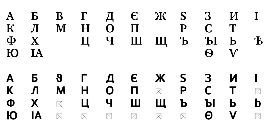
I’m working on a project in two languages. Priva is one of the typefaces selected for the project, and noticed something a little weird with certain characters.

1) One of the strange things here is that the charcter ‘B’ in priva looks a little weird. Compared to Charter in this image and other typefaces we have, it looks different. Is this some sort of alternate version of this character?

2) This other is that in Priva the character ‘э’ gets inverted and looks like the western ‘E’. I am basically copying all the text from Word and it inverts this character whenver Priva is used. Why is this?

Anybody here ever dealt with this situation?
Any recommendations? Sadly, budget’s tight… and looks like we can’t change the typeface as this is the typeface the client uses on their material.

:( This is the first time I have to deal with a foreign language other than Spanish and English. Help! :o)

AttachmentSize
Picture 1.png32.74 KB
Picture 2.png30.61 KB

I’m not sure why it does it, but as a speaker of Russian I can assure you that ’B’ and ’э’ characters on the 2nd slide will not be recognized by the Russian audience.

Fedra Sans Pro has a simular feeling.
http://www.typotheque.com/fonts/fedra_sans/

It looks like the glyphs are alternative versions of the characters.

Pieter

Thanks so much for your comment.

But would those characters just ‘be not recognized’? or are they simply ‘wrong’?

I’m sorta freaking out. Got tons of pages to lay out with this typeface and no cash to spent on a new typeface.

Any recommendations from anybody on a new Sans?
Will try to propose (doubt they will go with this) a new alternative. I needed a sans sorta ‘modern’ (NOT pragmatica, or helvetica-ish) with like 3 weights and italics. It has to be somewhat affordable.

Thanks Pieter but Fedra was initially a proposed typeface was not accepted due to the cost.
It was perfect for this project. This is a very unrealistic and cheap client… plus there’s some ridiculous deadlines.

I already went through Fedra Sans, paratype (nothing with the feel) and Enelka & Vida from Stormtype. :o(

Maybe I’m missing some other type foundries… some obscure ones…

That there is an alternate Greek theta that got dropped in the wrong slot. Luckily, you could replace it with a Latin B. The worse problem is that э and є are two different Cyrillic letters.

I would guess that if you contact the creator about these two mistakes, he would probably be glad to correct them and replace the font, because it’s something that can affect future buyers and he would want to know about it.

The glyph sample you show doesn’t show all the letters of the Russian alphabet, and instead has several archaic letters (Ѣ, Ѵ, IA, Ѳ) and a couple of Ukrainian letters (Є, І).

Some of those archaic letters have questionable designs in Priva pro. For example, Ѣ looks very strange considering it is supposed to be a capital letter. Also, I’m not sure how acceptable a Ѵ that looks like a V is.

There’s also something funny going on with the outline of the Х as well.

I would strongly recommend that you run the typeface choice by typographically-trained Russian eyes. As wonderful as Dino dos Santos’s Latin typeface designs are, these Cyrillics don’t look really professional.

Yeah, thats a good point too, there are quite a few Cyrillic characters missing from that sample. Regarding whether it’s wrong or not, I was born in Russia, and if i saw those characters used in text, I won’t know them. So I guess that makes them wrong.

Thanks again everybody for your thoughts.

*Hope more Russian fellows keep posting ;o)

I will contact my bosses right away to see what could be done with the extremely tight budget and deadline and cheap client.

-> Any suggestion or alternatives for a Sans with a modern feel? Will have to propose something new I guess. Cost is extremely important. Sadly, they’d rather have wrong characters than dropping more money on a decent typeface :o(
Fedra is out. Enelka maybe. Vida nah. Most of paratype’s catalog bores me and is not that modern in this sense.

Thanks again people

Some glyphs look like they’re misplaced and others look like they need a refinement.
Just send an email reporting those errors and I’ll be glad to send you an improved version of the typeface.

best,
Dino dos Santos
DSTYPE

Thanks Dino

Just sent you an email.

Will talk to my boss regarding this issue and will probably contact you early next week because the deadline is hard to beat this time around.

Thanks again!

Captured from web.archive.org on 23 Oct 2008. view this capture