Typophile

Origin of the "pot hook" italic

Nick Shinn

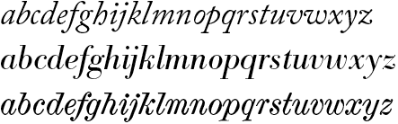
Top to bottom: Caslon, Bodoni, Scotch Modern

There are two main characteristics of this late modern style:
Firstly, the g and y follow the model of connected writing, with a monocular g, and y with parallel sides.
Secondly, the ‘entry’ stroke of all characters is hooked, a rotation of the ‘exit’ stroke.

There is a specimen by P. Didot of 1819, shown in Updike, which has all these characteristics.

It seems likely that the style emerged piecemeal, as there are varying degrees of implementation of the letter forms in early 19th century italics, with the serifs gradually growing longer.

While the form of g and y may be attributed to emulation of scripts, the universality of the entry hooks goes against the “joining principle” of scripts.

Another possible factor leading to the style may have been the difficulty of making old-style g and y in the new fat face genre.

Something else apparent in specimens of the era: roman and italic have almost identical word counts. Perhaps this is another aspect of the style, although it’s hard to tell from subsequent revivals, where the metrics may have been significantly altered from the original.

As far as I am aware, there is not much written about the history of the italic, compared with the roman—what are the standard works? Does my assessment seem reasonable? Comments welcome.

Since the pothooked characters seem to reference scripts that were engraved into copper plates; thus the name copperplate; would this account to some degree for the piecemeal implementation that you mentioned? The punchcutter referencing a technique that comes from an engraver seems a substantial break from the norm.

The Caslon references the Italic broad-edged pen, but the Bodoni Italic strives for a more geometrical balance. Not sure if the Didot fonts of that time came up with their proportions as seen in the rounded strokes by seeking that kind of balance or if their was reference made to engraved scripts.

I think the entry strokes are simply an interpretation of the way in which x-height entry serifs on italic letters mirrors the baseline exit serifs, a convention already long established in oldstyle italics. If you compare the Caslon and Scotch Modern italics in your specimen, you will see that the pattern is basically the same.

Bodoni’s model is consistently different.

Very true; they do both have that even if they have very different weights and lengths. I do notice, however, that the transition in weight from beginning and ending strokes of the Scotch Modern Italic is similar to the type of transition that engraved and written copperplates scripts share. The Caslon weight coming into the main downstroke is more like that of a broad-edged pen. Since both are essentially drawings for metal type, th

Captured from web.archive.org on 1 Dec 2008. view this capture