Hi Typophilian mates!
Well I love try to design some fontface cuz I'm just a begginer on this discipline, in fact, my start is this year and my previuos experience is on Calligrhy.
I come to tell to all of you that this is my first full character set designed and I would like take your opinion and critiques about this work and so you can help me to improve it, please.
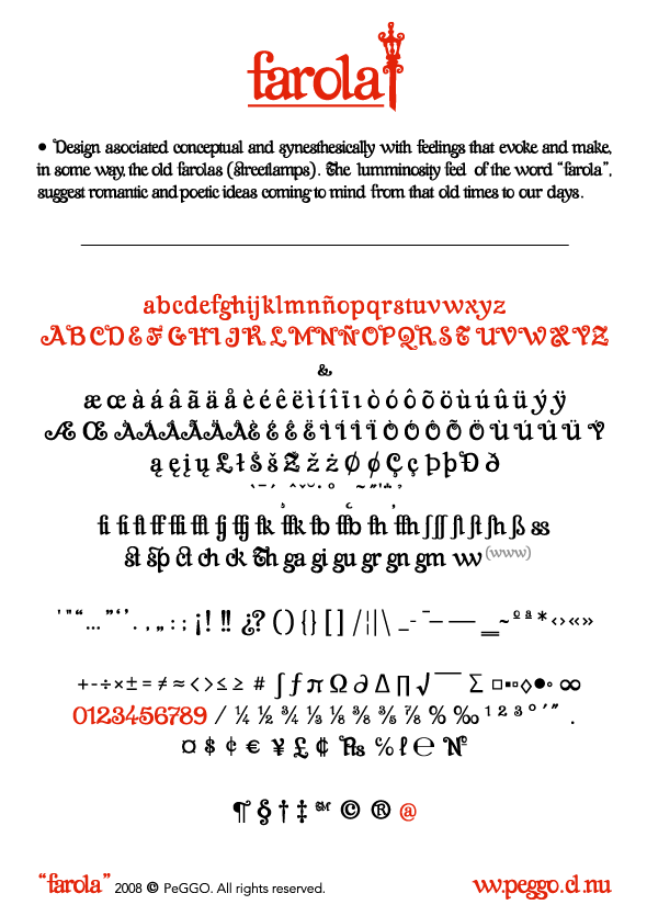
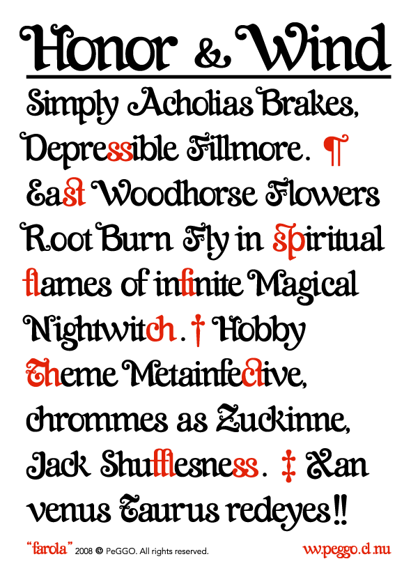
"Farola"
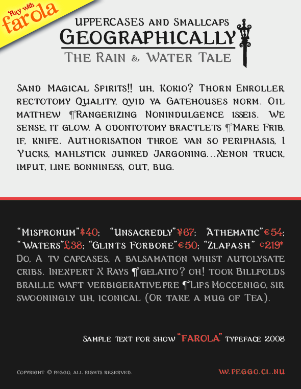
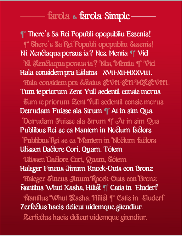
The uppercases Farola are very decorative then its lowercases are most regular for keep a little of equilibrium.
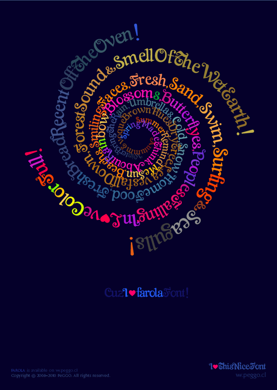
This is a Display font is done to be used on big sizes, titles or logos.
here an example:
Respects and Regards
Pedro [PeGGO]