
Following up on these thoughts, I’ve sketched (in pencil, pen, and FontLab) some ideas for my “low-branching” idea. Here is a FontLab example (ignore the horrible lumpiness), along with another idea on the left: instead of branching from the bottom of the initial stroke diagonally up and to the right, this one loops backwards.
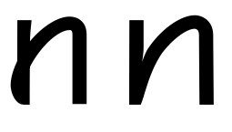
By doing this looping, the arch can spring from a more “normal” midpoint of the first stroke, but the whole retains the feeling of a letter written without lifting the pen off the paper.
The question arises: does the loop form a teardrop shape that will be too spotty and distracting to work in continuous text. (I did move the right side of the straight stroke in at the bottom to mitigate the thickness a bit.
