
What existing upright fonts have branches that come out of the bottom of the stems? I’m imagining and sketching letters that have that feature. A better example is the h/n/y here:
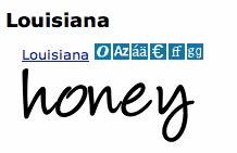
It’s obviously a handwriting-like cursive feature, but has anybody tried to make a more formal, regular sans with that kind of branching?
I can see the first problem I’d run up against is cloggy spots where the strokes are doubled up. That would involve some serious thinning of the monoline treatment of the rest, or some other solution. Maybe a horizontal spreading of the strokes, as we see in the vertices of capital M’s in some sans that almost look like IVI.

