Typophile

Logo for Job Agency

Tintin81

Hi,

A friend of mine asked me to design a new logo for his business. The business is essentially a job agency and the name is derived from the English word “time” and its German equivalent “zeit”.

Please have a look at the attached file and let me know what needs further improvement. Thanks a lot for any input!
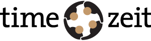
Honestly, I don’t really like it.

It took me a while to see what it was supposed to be. Why does the guy at the top left not have his arm behind the guy at the top right?

I’m also not sure that the combination of 4-fold rotational symmetry and a German name is a good idea - the negative space sort of looks like a swastika.

- Lex

to be honest, my first thought was its some sort of swastika or KKK throwback. It scares me. I just don’t get it. Even after reading the comments i have no idea what the mark is supposed to represent. Do you have any other ideas? Have you thought about a word mark without the symbol?

I’m going with the other’s comments. I don’t like it either. I am a big fan of your work, normally, but this doesn’t appeal to me.

Sharon

Captured from web.archive.org on 22 Nov 2008. view this capture