Typophile

Rosetown Logo Critique

christopher.martens

Here is another town logo I am doing, this time for Rosetown. Again, looking for any comments & critique, also if you have any ideas as to more of a “rose” like symbol, ideas would be great.

Requirements:

  • Discover Rosetown text used in that order
  • The color red that is seen in the logo
  • A symbol representing a rose

Again, looking forward to your input.

http://freshnewthing.com/rosetown_logo.jpg

I like this one. It’s nice and subtle and balanced. Funnily, in this one the “.com” doesn’t bother me as much. I think it might be because everything else doesn’t lend itself to an online company that it doesn’t take it over the top.

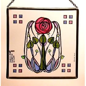
I like the subtle shade changes in the rose mark, however, I would suggest changing the perspective. Right now it doesn’t look much like a rose. I think a head-on perspective (looking into the center of the rose as opposed to the side) might work better. For some reason, a Charles Rennie Macintosh rose came into my mind when I read the name. Here’s an example: http://ecx.images-amazon.com/images/I/5158M2VM5GL._SL500_AA280_.jpg

It’s a nice simple shape and I think would work well with the overlapping, transparent petal feel you have right now.

penn

@penn: How odd - that’s exactly the type of rose I envisioned, too, although admittedly not as specific.

—
Nick Hladek

It’s 100% better than 99% of all city logos. That said, it has a very dated ’web 2.0’ feel to it and might not hold up that well over time.

Thanks everyone. I actually had some other logos sketched up with a very similar rose to the one suggested. I’ll continue to play around with a few more and repost them. I agree that it’s not very rose-like.

Captured from web.archive.org on 23 Oct 2008. view this capture