Typophile

Ibis - first attempt at new serif

Greetings all!

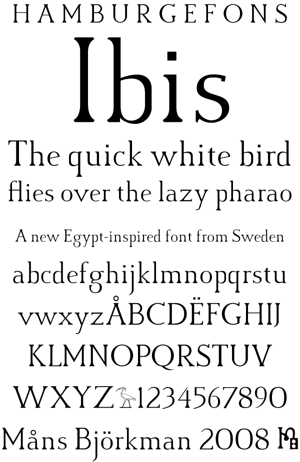
Below are some sketches for a new serif font that for the moment is called Ibis. It is inspired by ancient Egyptian art and architecture, though it's not based on any specific model. I did not start on it with any particular function in mind, though I guess it might find use as a display font.

This is my first serif typeface, and my motivation for it is partly to learn, so any and all feedback is welcome.
AttachmentSize
ibis_draft.pdf245.67 KB
ibis_draft2.pdf274.94 KB

This font has an interesting feeling but there is not enough consistency of weight between characters. So M & N are heavy, but the O is light. Why? It is almost always a good idea to make the glyphs seem to have a similar optical weight meaning the look like they are rather than being literally the same weight. How do you think someone might use this?

Eben, I agree the weight was too inconsistent in that draft. I guess I was too anxious to get feedback. I have now done more work on the weights and added new samples to the first post - I hope these look better.

I wrote in the original post that I thought "it might find use as a display font". Now I believe the font could also work for shorter paragraph text (see pdf #2). What do you think?

As before, all suggestions are greatly appreciated.

Måns

It is getting better but I have my doubts about it becoming a text face. But I suppose it depends on where you take it. Especially if you are aiming at a text oriented design in time I think you will have to continue to look at the weight that each character seems to have. I say seems because it's just perception. Following a plan and measuring won't get you there. You have to do it by eye. The bottom of the i & m and so on still catch my eye. They are so heavy compared to the bases of letters around them! In contrast the top & bottom of the s are very light. This makes the type seem to flicker as you read it which is not comfortable over a paragraph. Keep on going. But also look closely at other designs. I am not saying copy them but between styles you may see that similar approaches are used to solve for an even feeling or look. Consider using those.

Captured from commoncrawl.org on 28 Apr 2015. original URL