Typophile

Wiki Logo Critique

ikovic

Hi everyone,

I discovered Typophile just recently, but was instantly charmed by it. I love the fact that a lot of people are so passionately engaged in discussions. For example, you can witness first hand how some logos have transformed and became 1000 times better thru comments and suggestions from numerous members.

I haven’t contributed to this community yet, so it seams undeserving for me to ask for your help, but I really need it and it is for a good cause.

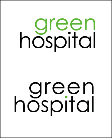
I am trying to design a logo for a wiki called Green Hospital. The idea behind it is to provide relevant information to hospital decision makers which will allow them to transform their hospital into more environment and people friendly facilities.

Thank you for your time and critiques.
AttachmentSize
green_hospital.png20.15 KB

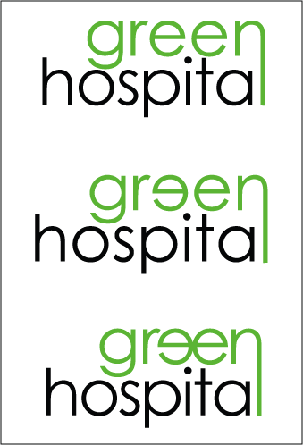
Seems sort of arbitrary to me. What’s the significance of the n becoming the l? Why is one of the es backwards?

Green n is becoming l (which is suppose to be black) to visualize something like green thinking pouring into hospital. Backward e in version 2 and 3 has no meaning. I was trying to avoid stuff like green leaves, water drops, trees and other thing so often used in this sort of logos.

it reads ’Green Hospita’

In your top example here, shouldn’t “hospital” be green since, after all, you’re calling it green? Black hospital is just plain grim.

Have you experimented with green medical ideas? A green “Red Cross” logo comes to mind.

I’ve been working in the medical industry and know how wasteful it is, so kudos for the idea.

You said “green thinking pouring into hospital,” so why not play with the l as a droplet? I think you could customize the font a bit and this could work. Also a bit bolder weight might help. I like the n turning into an l, but the I think the whole logo should be the same color.

Thanks for all your suggestions. I will get back to work and keep you updated.

Captured from web.archive.org on 23 Oct 2008. view this capture