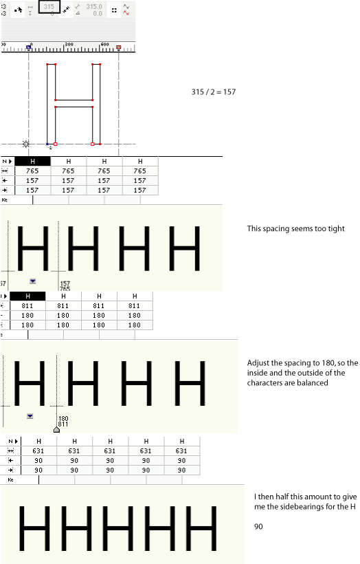
I've been following the spcacing method in "Letters of Credit" - Walter Tracey.
The spacing of the Uppercase H seems to be the most important glyph to space, but I'm slightly confused by the description in the book.
The way I understand it is :
1. Measure the inside distance of the "H".
2. Half the number and place it on each side the "H".
3. Place 4 "H"'s next to each other to check the spacing.
4. The space on the inside and outside of the glyphs should be balanced, adjust spacing until the balance is correct.
5. When they are balanced I half the sidebearing to give me the correct sidebearing for the "H".