Dear Members,
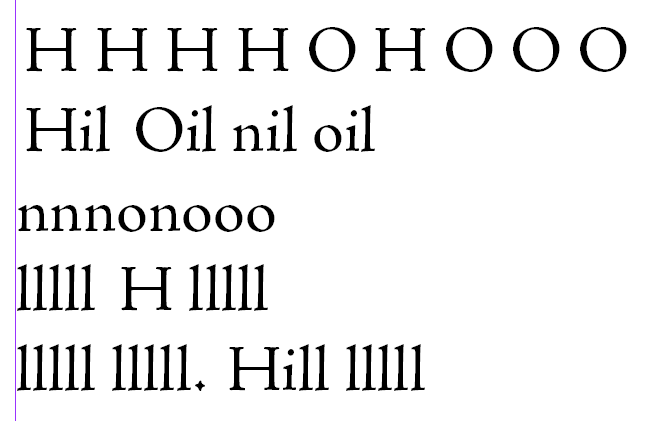
I am currently working on my third typeface Terra Nova, but it's the first one to leave the ambitious draft phase and enter the serious precision work phase.
Until now, when testing the face, i relied on Indesign's "Optical Kerning-Feature", that did the job passable for now. The further i get with the font, the more necessary it gets to think about spacing and kerning, but actually I have no experience yet, so i just don't know how to do it right, and fiddling without a plan does not lead to anything...
Is there a well-tried and documented method to do the font-metrics for a serifed font (in fontlab 4.6; targeted font format is opentype)? What about kerning, where do you start, where does it end? What is it about class-based kerning? You see: I am an absolute noob on this...
Thanks for any direct answers, links, etc.
sebilar