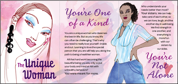
This small Z-fold brochure folds down to 3 x 4.25" (with the cover title, "The Unique Woman.")
I've been trying to pair two complementary handwritten typefaces that work nicely with the brochure's artwork.
I've used Prater-script and Handsome-nib and like them both, but I'm not convinced they are the answer. I don't think the goal is for them to be written in the same "hand," as much as it is for them to blend well with the free spirit of the piece and create an overall harmony.
Any feedback, suggestions or insight is appreciated—I've never been involved in a forum before and I miss being part of a critique.