
I´m working on a logo for some interior architects and would like som feedback before I present anything for the customers.
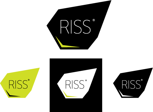
I´m working on a logo for some interior architects and would like som feedback before I present anything for the customers.

I would be immediately concerned about the reversed type printing correctly at small sizes (particularly on newsprint, for example) as it’s such a thin weight.
Can you give any more background on the company? The mark looks quite nice, but it’s difficult to know whether it’s suitable without some more context.

my initial thoughts were ...
wow, they’ll make a messy interior. there’s no structure to the ... structure.
—————
Paul Ducco
Graphic Design

I could see the dark text on green version working very well if the client’s work is really cutting-edge stuff. If they’re more of the throw-pillows and Crate-and-Barrel types this is a no-go.

Agreed with the above statements. This does look it would only attract a certain type of clientele so their work needs to back up the unique look of the logo.
It would be nice to see a few examples of what they’ve done to see if the logo would match.
Also I would thicken the weight of the type. I don’t think it’ll lose anything in doing so.
I dig the colors and the possible variances is nice.

I find the random shape a bit odd. Not that I don’t like it, just that it doesn’t say much to me. Really like the colors and the type though.

I’m with ratbaggy. It’s an interesting mark, but doesn’t fit the ’orderly mind’ of an architect, IMHO.

I could buy the idea if it represented the outline of one of their most famous designs, or something along those lines.
Thanks for all the feedback.
They do interiors, and the logo is a bit to modern and cutting edge for most of their work, but they are at a point where they start getting more young designers working for them, and if the designers can´t be in front who is supposed to be? I just have to mention that the other direction for this logo is a straight Aksidenz Grotesk Black or, only typo(nothing to show you at this point).
They do mostly restaurants and cafés. You can have a look at their old website, which I´m going to redesign, and that´s the reason for changing the logo. They are not quite satisfied with their old logo and the website is not updated since 2004 or something, have a look for yourselves
Captured from web.archive.org on 12 Oct 2008. view this capture